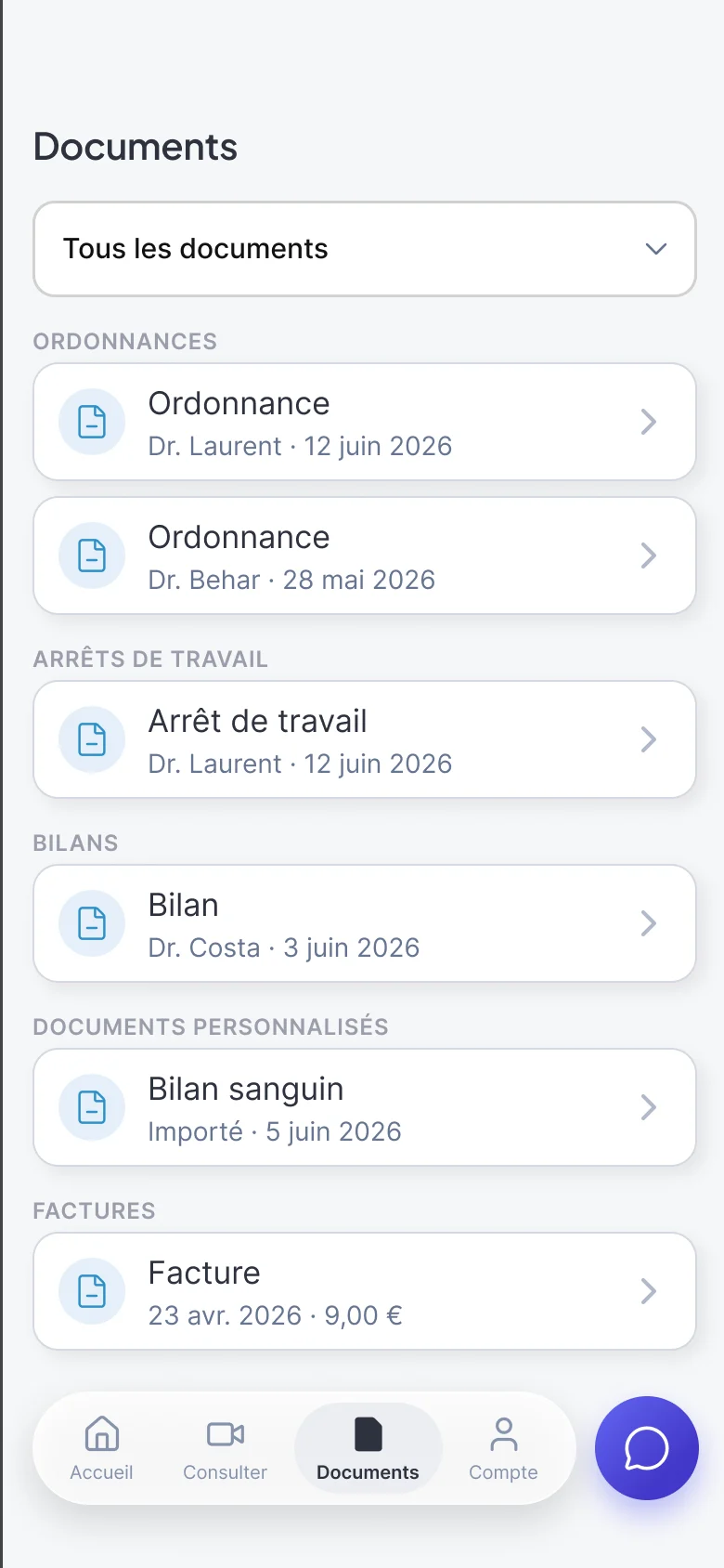
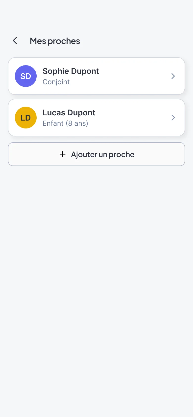
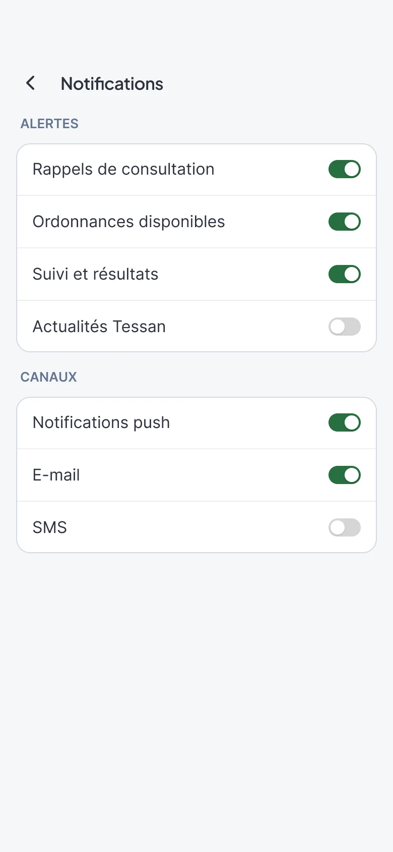
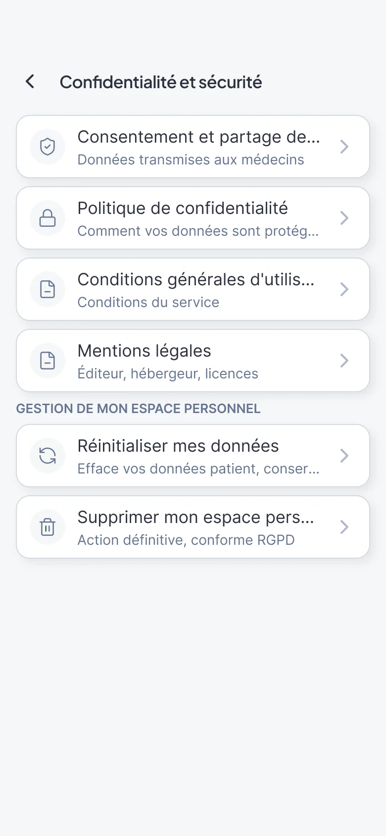
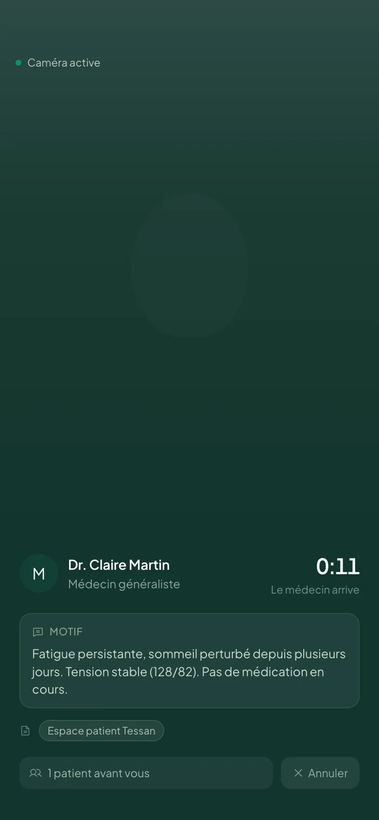
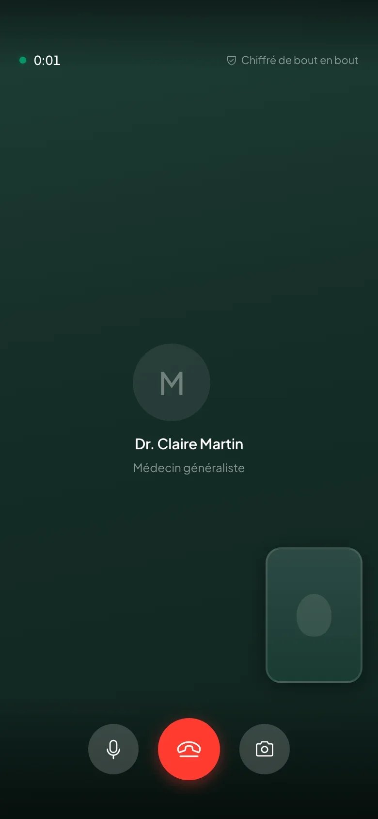
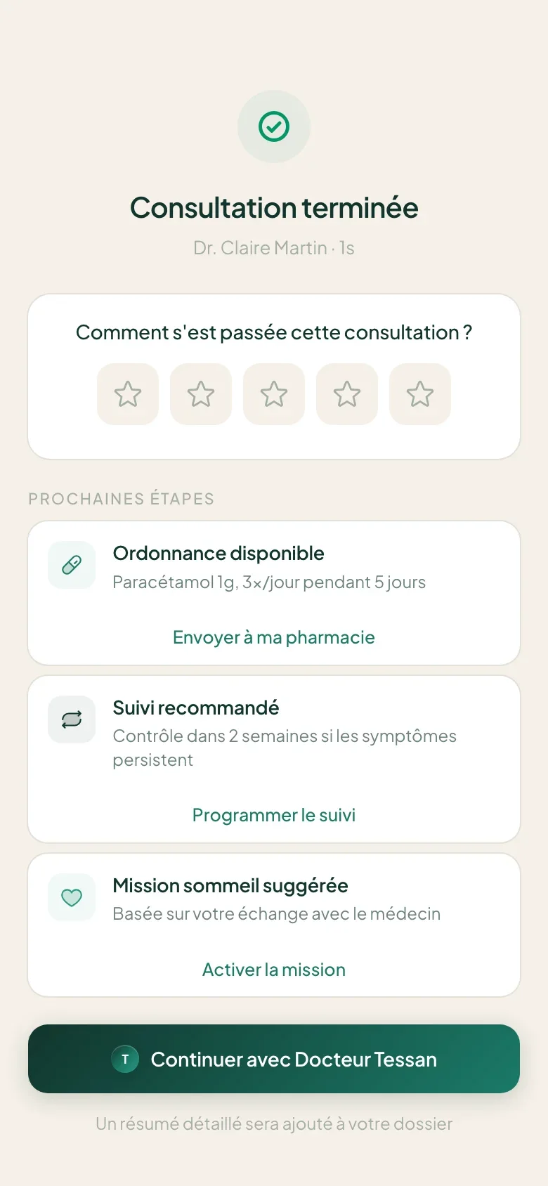
On June 15, we rebuild the app in native around the consultation. A lighter funnel, an assistant that does not diagnose, three builds in two weeks.
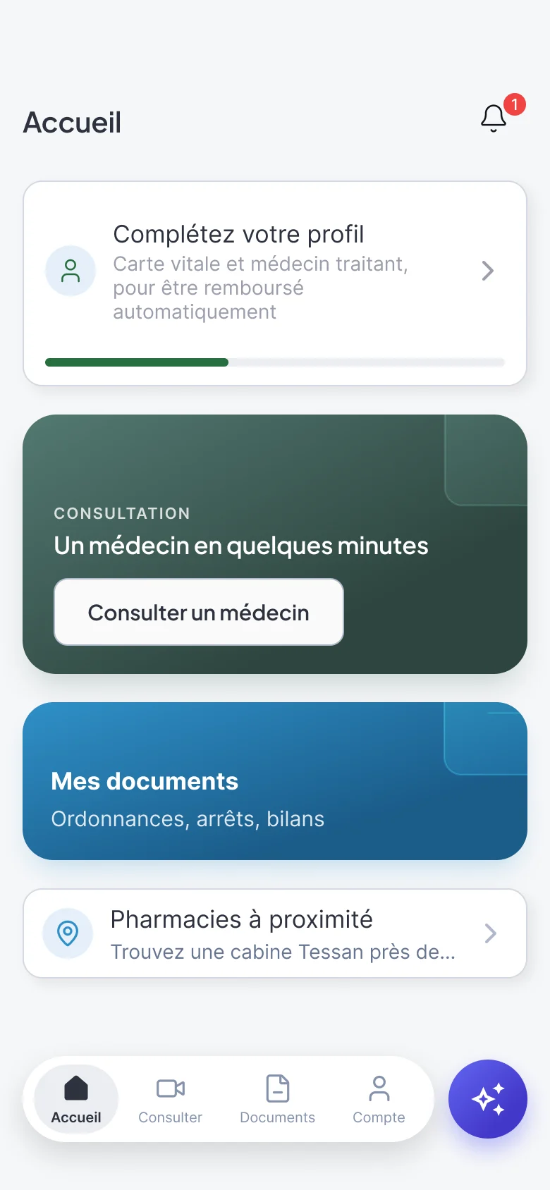
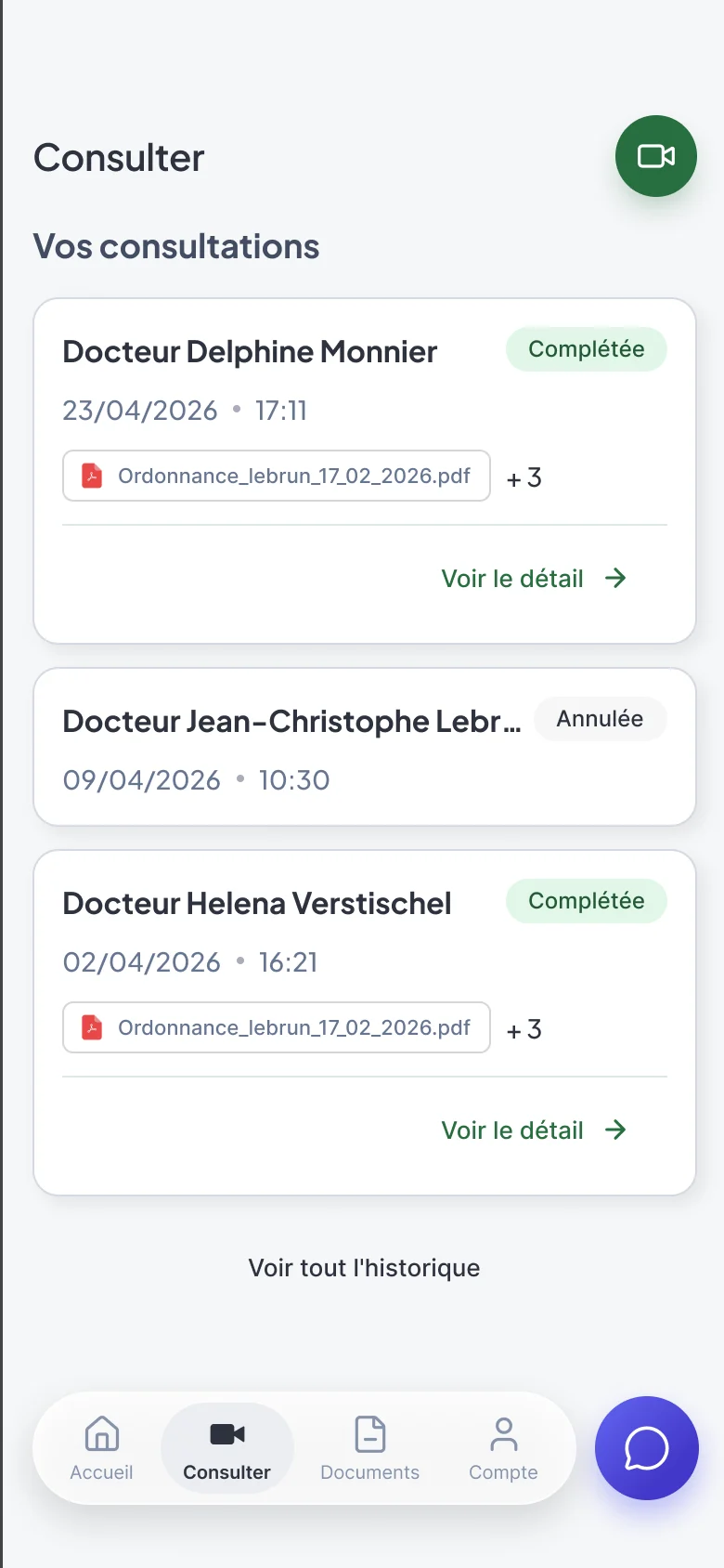
The existing app did not serve the consultation: fragmented session, double navigation, a funnel of 8 to 13 screens. The goal: a first version centered on the consultation, ready to submit to the stores before July 15.
Design lead and product owner of the patient app, with a tech lead and two developers.
Patient app
iOS and Android
Consultation funnel
audit of 25 screens, reworked journey
Health Assistant
four journeys, guardrails
Interactive prototypes
wireframes and booking
On June 15, two decisions frame the rebuild. We go native, because reworking the old shell would have kept the double session: only the teleconsultation engine stays encapsulated. We also remove what was most attractive. Connected health, the score and the subscription exposed the product to a medical device requalification, 18 to 36 months of certification against 30 days.
01 / 08
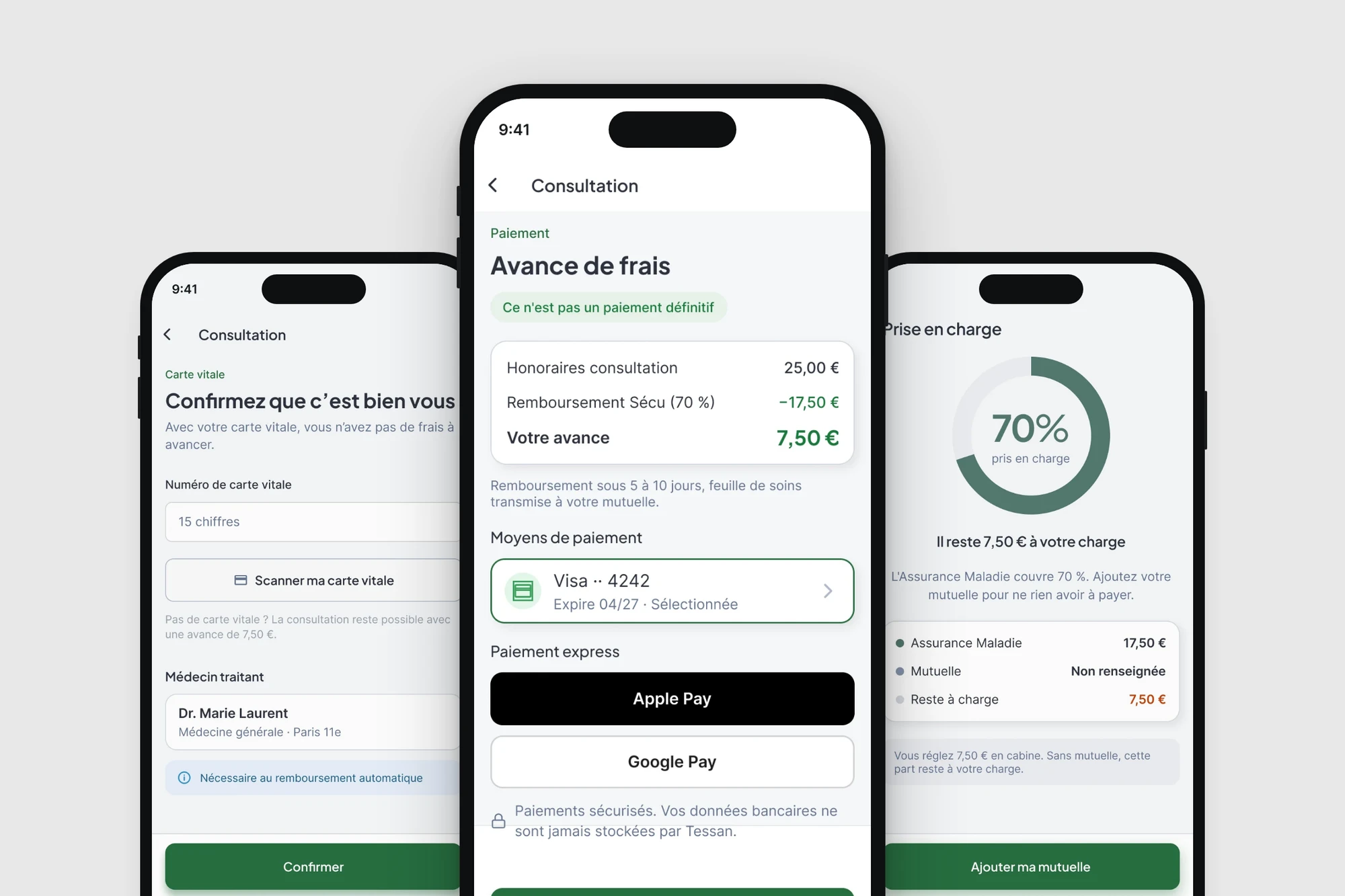
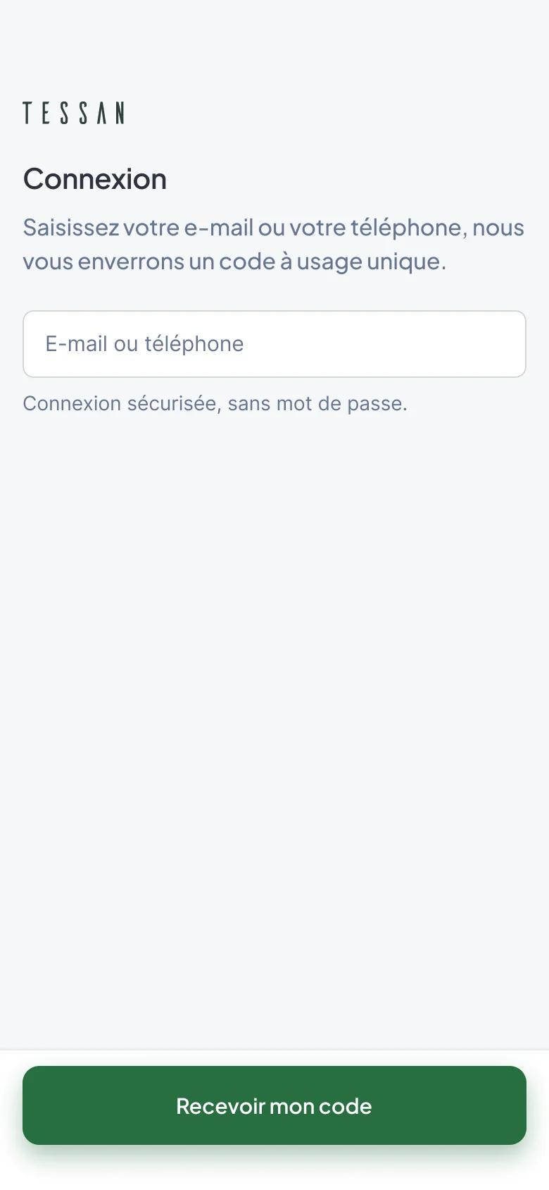
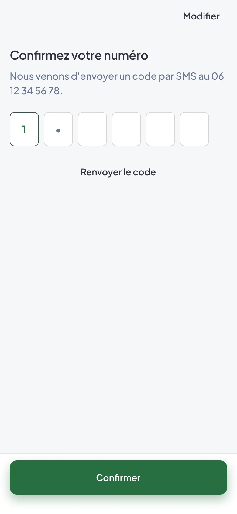
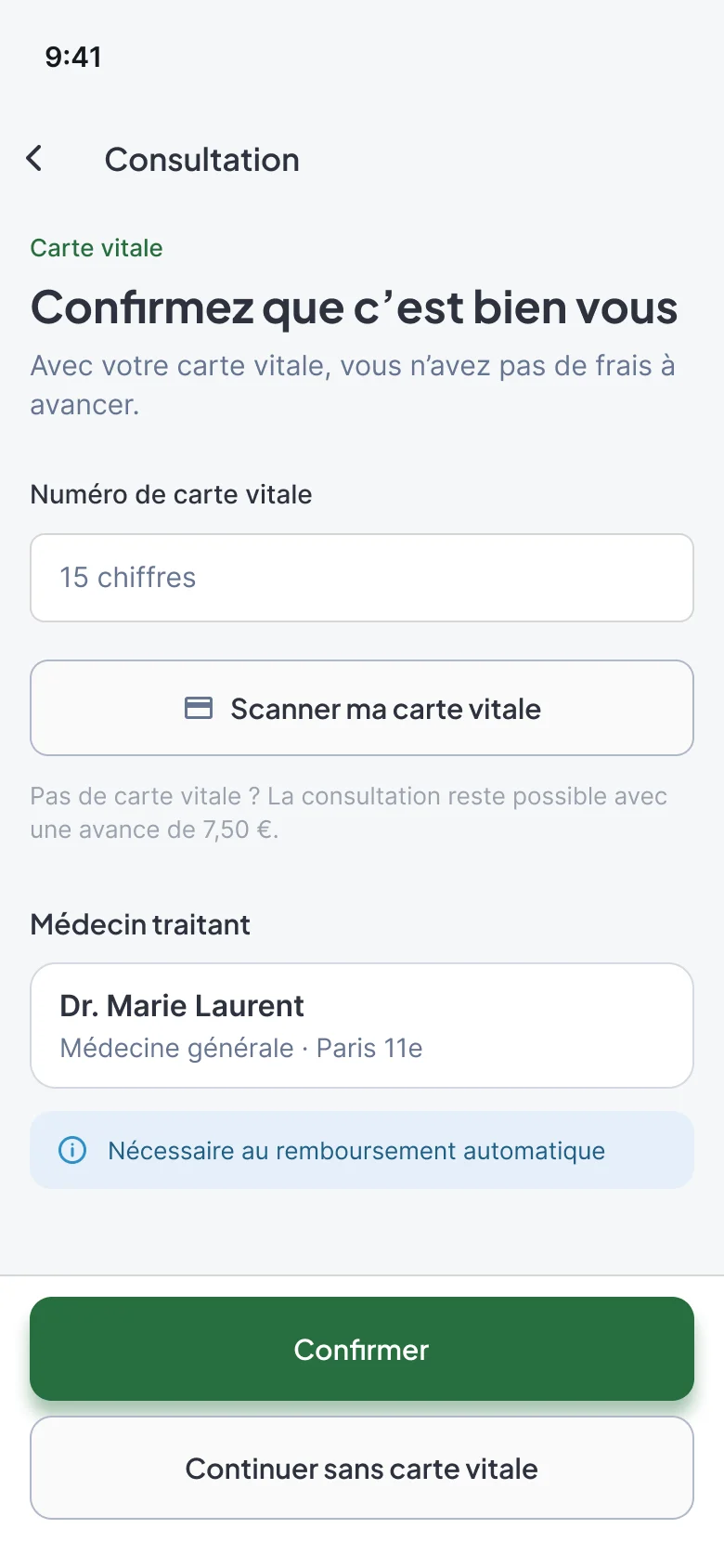
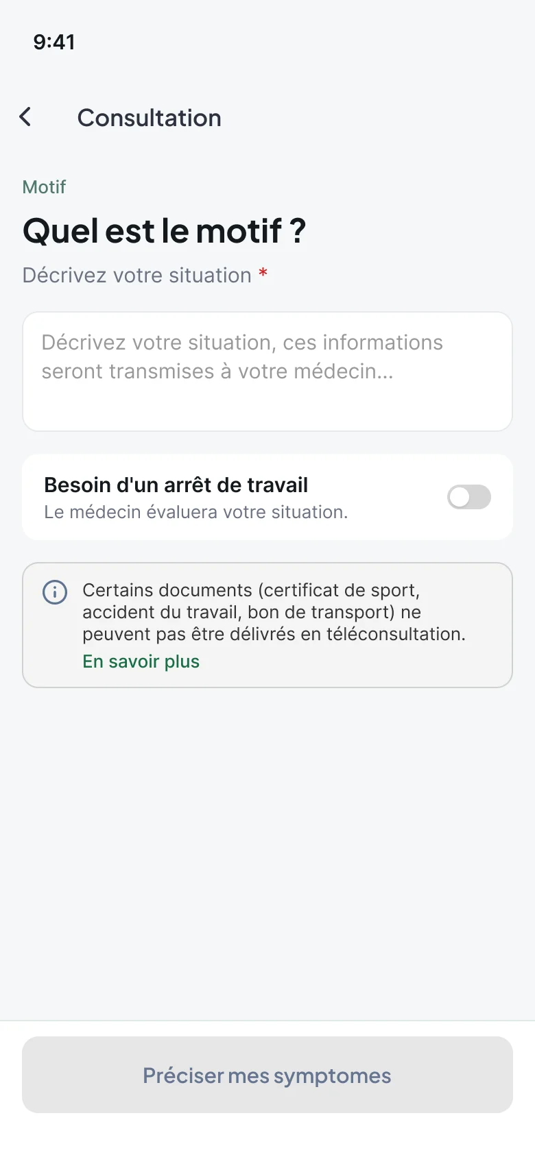
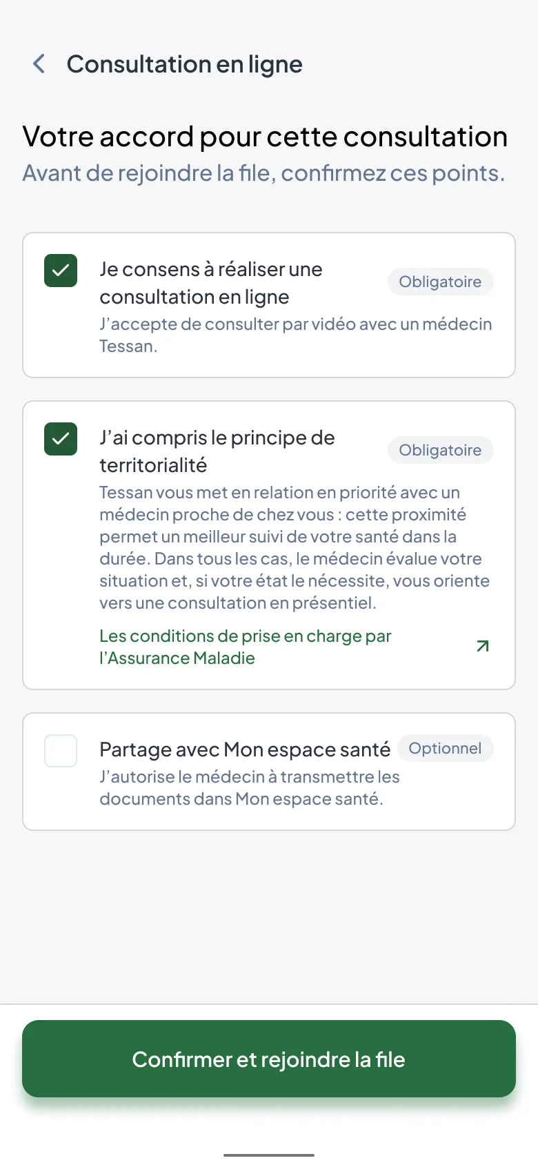
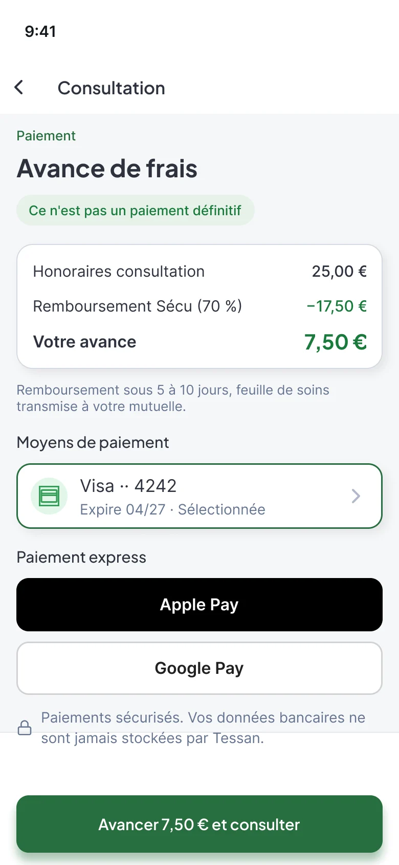
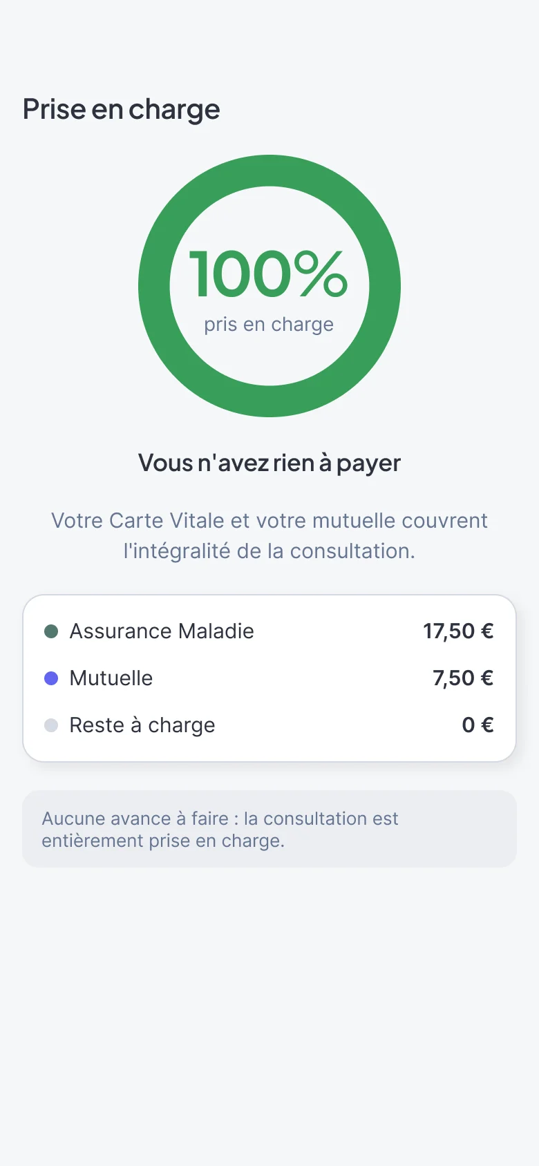
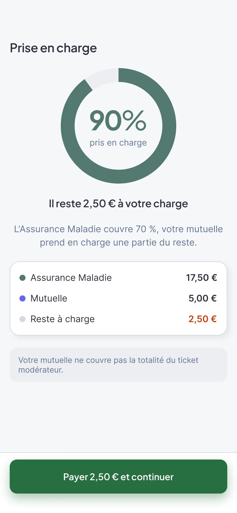
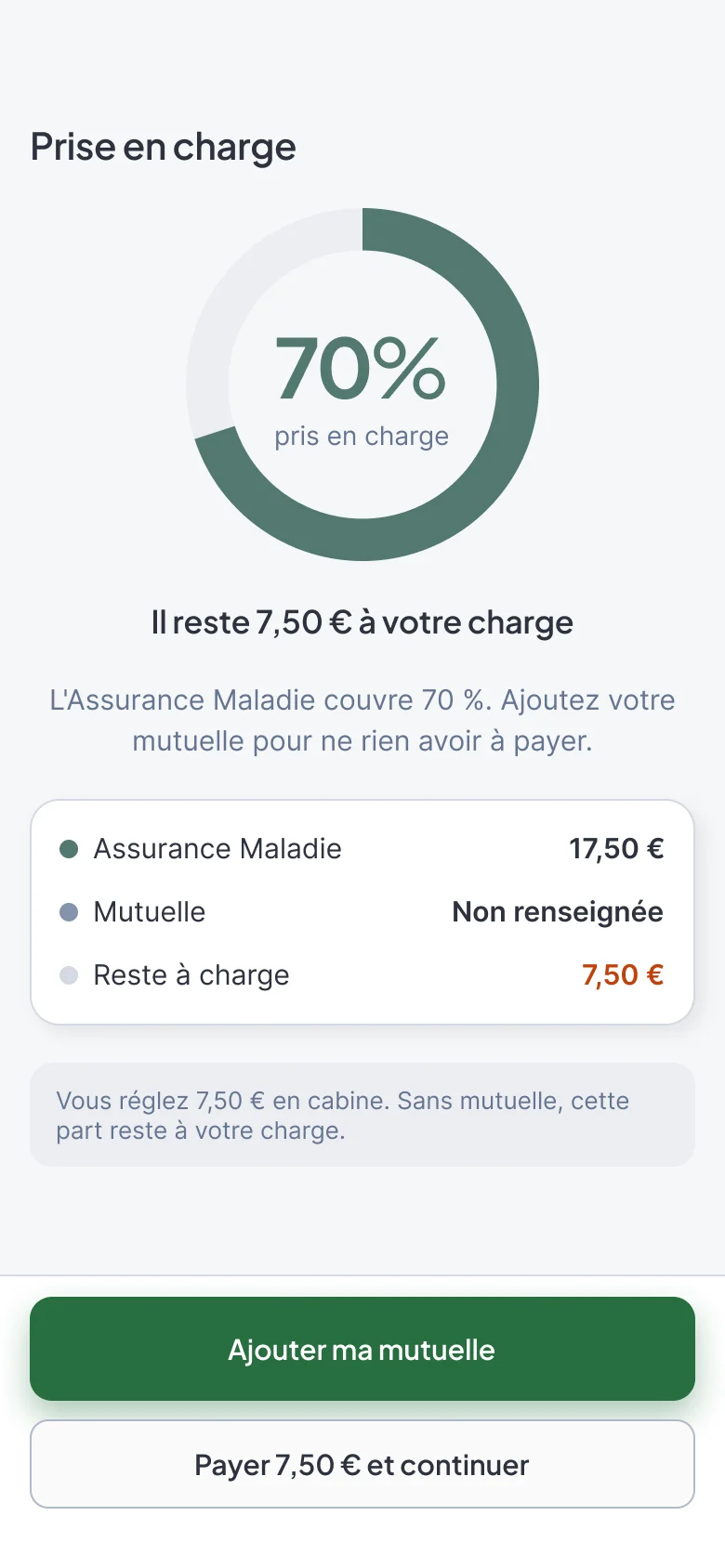
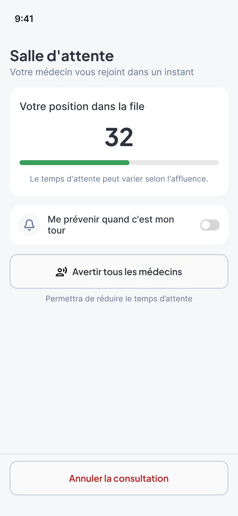
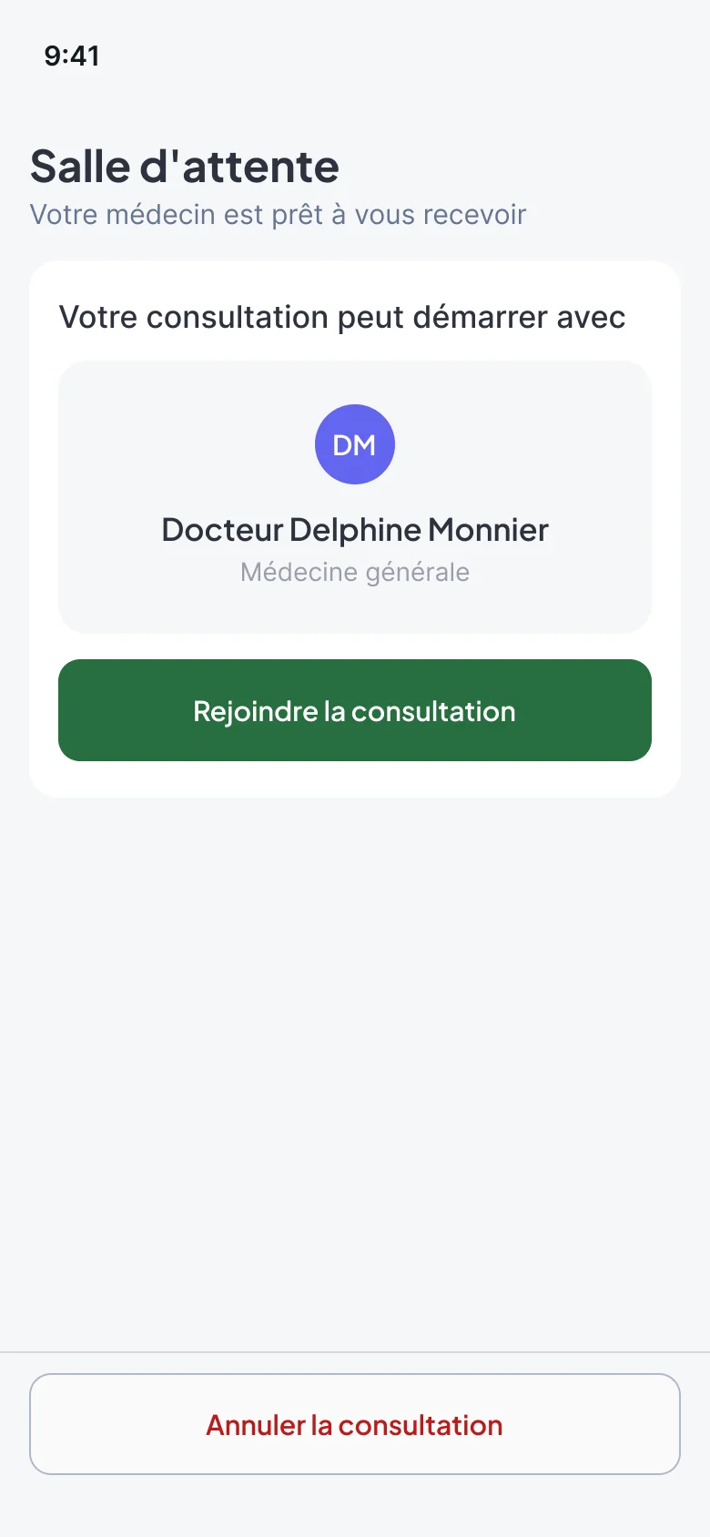
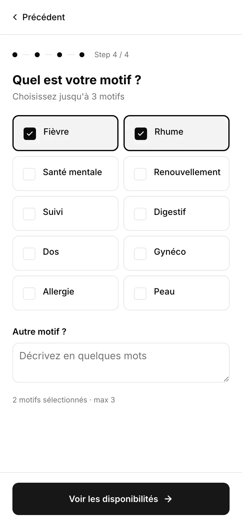
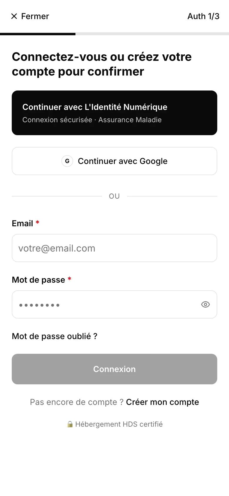
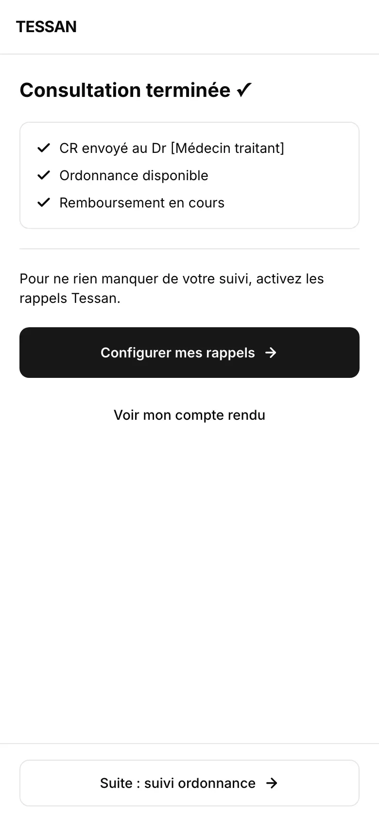
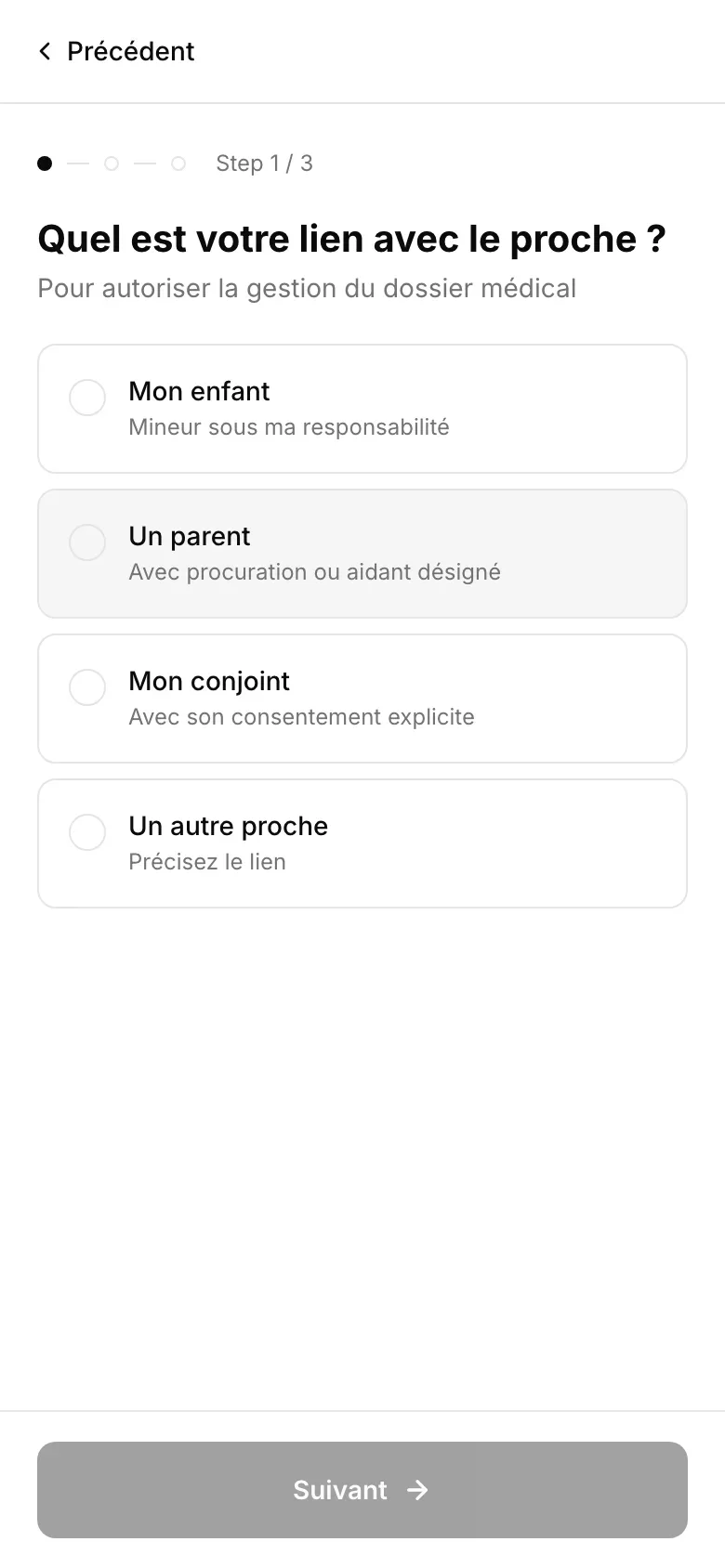
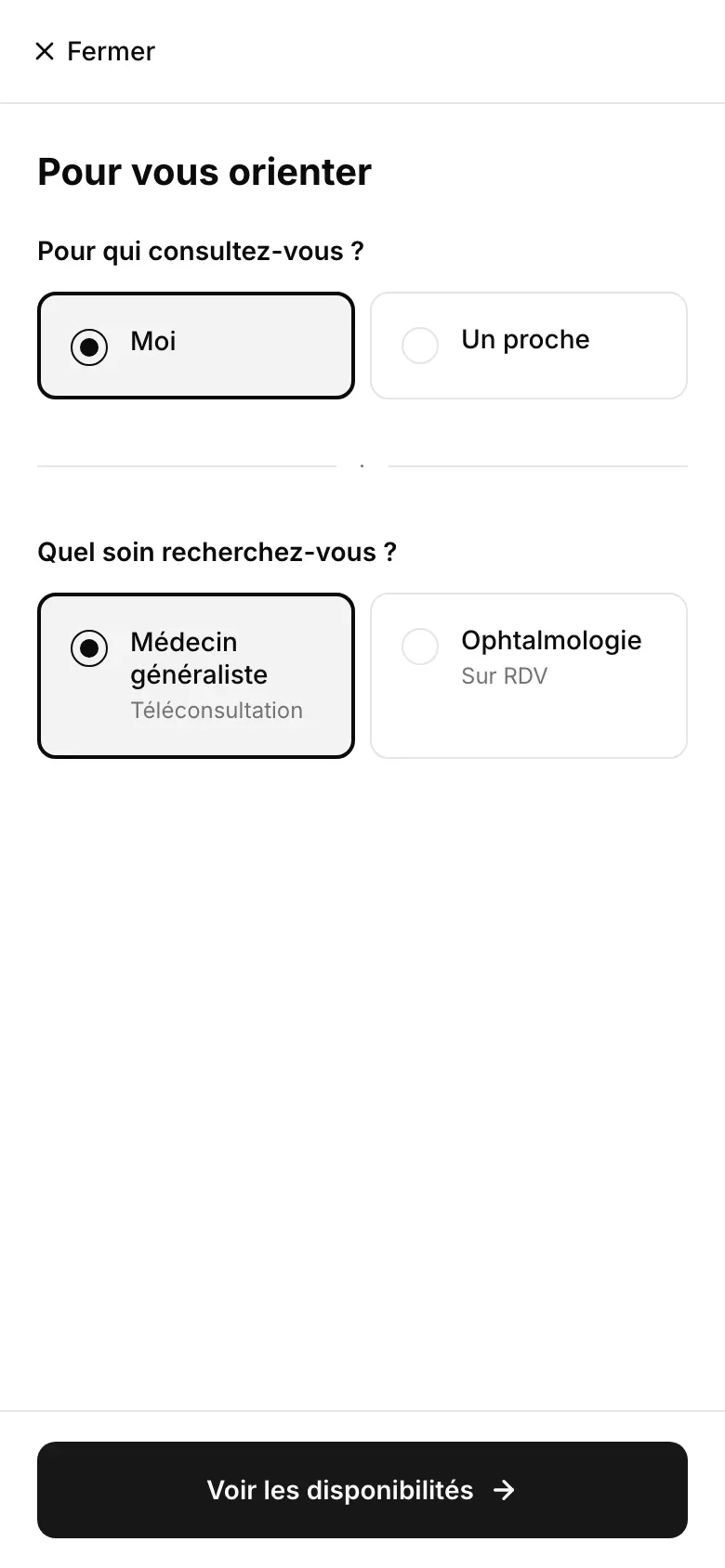
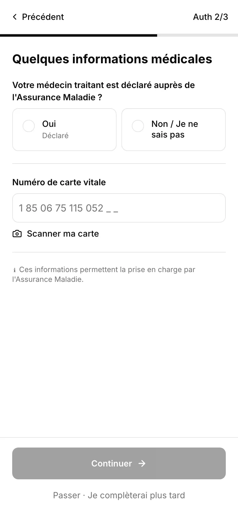
Eight to thirteen screens depending on an invisible router, and 3% of health insurance entries completed. The insurance entry leaves the funnel for an advance payment, sick leave becomes an option of the reason for the visit, and the waiting room shows a position rather than a timer that would lie.
01 / 09
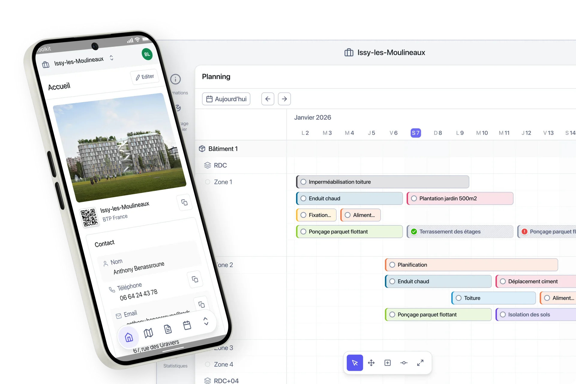
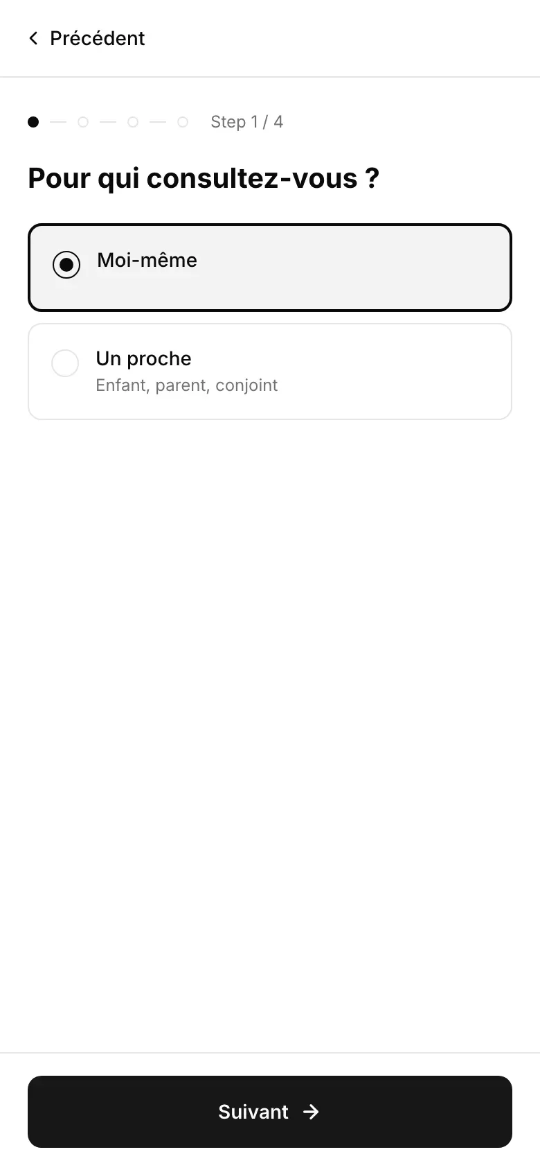
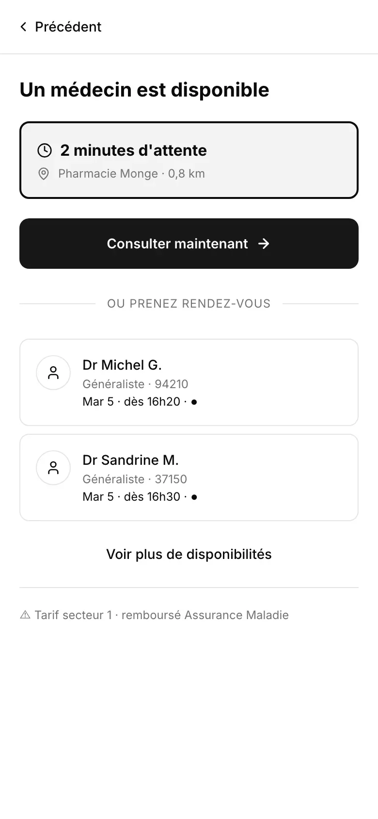
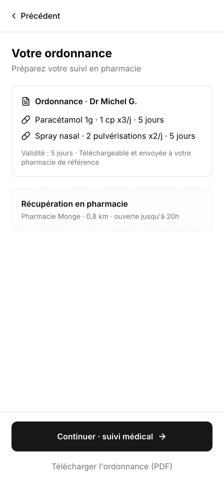
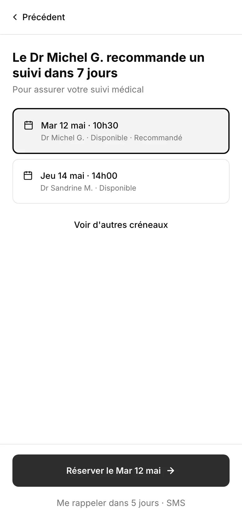
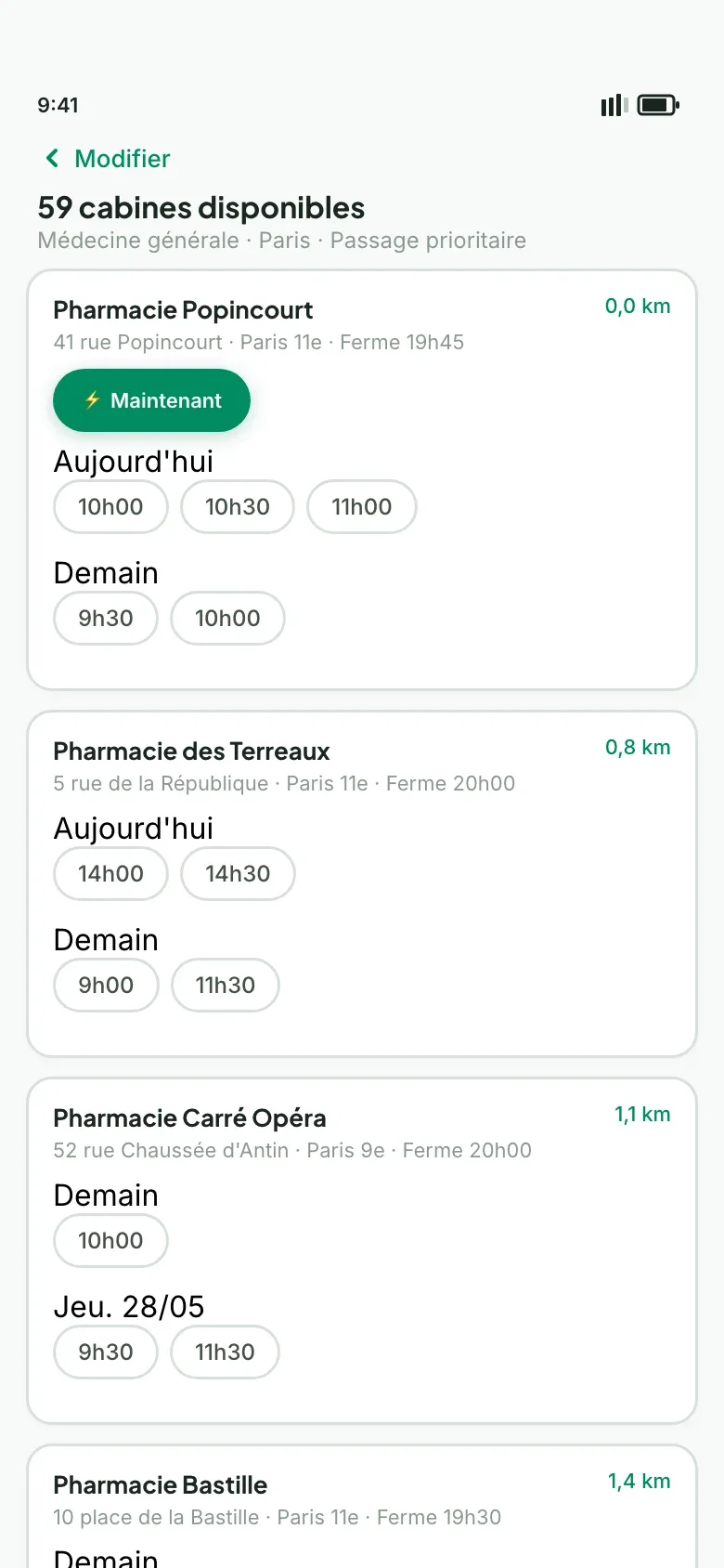
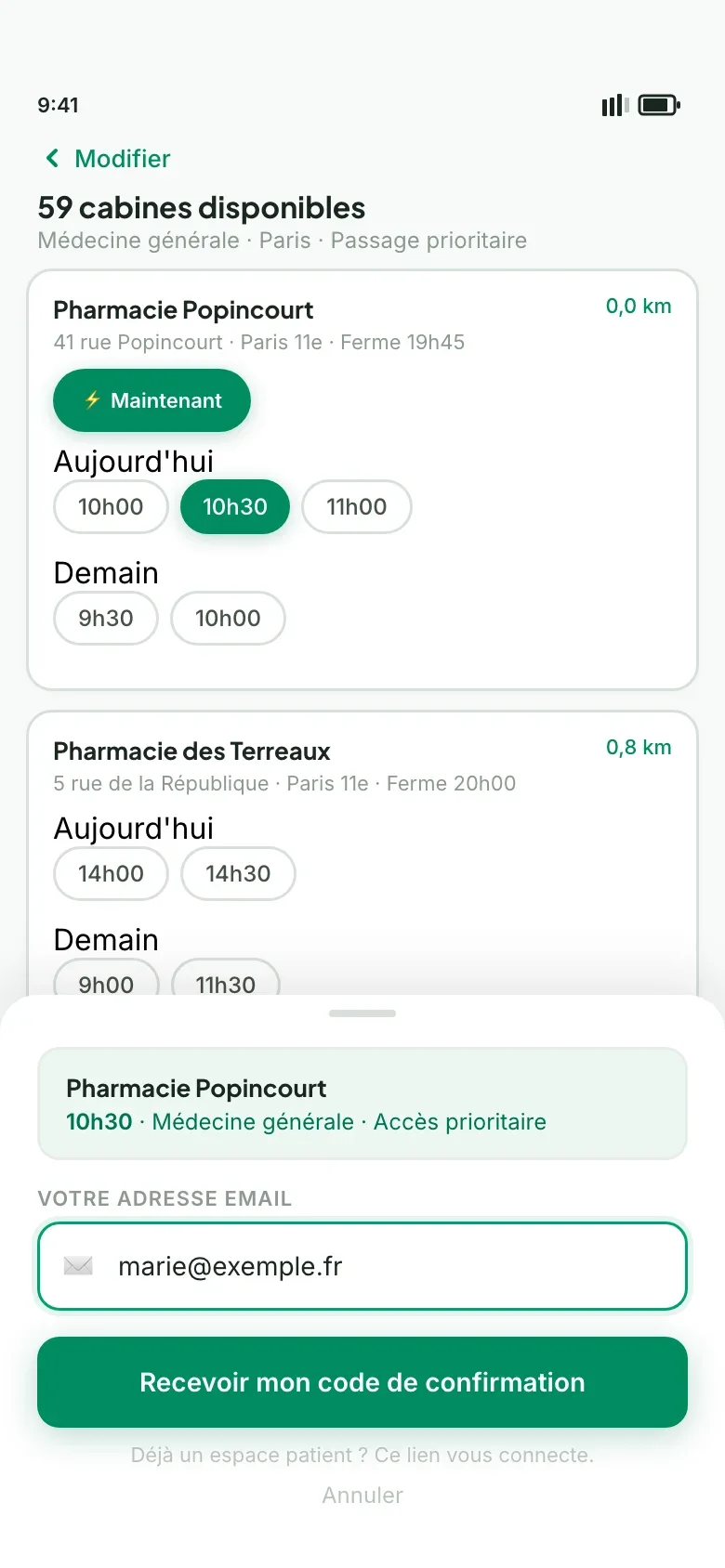
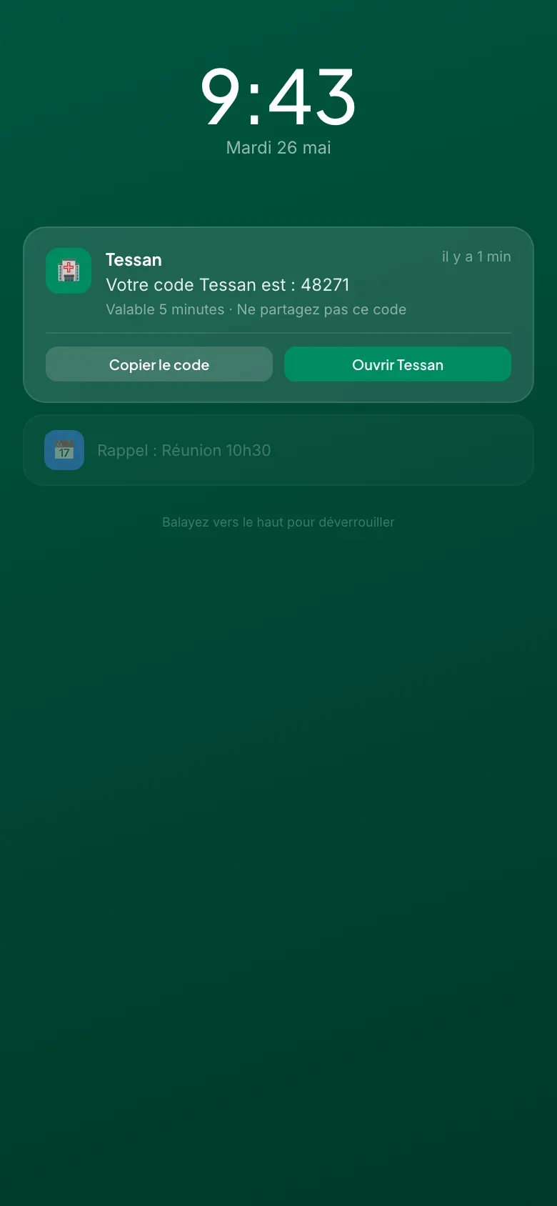
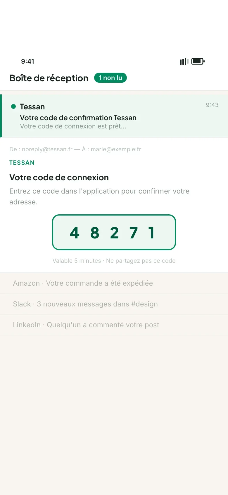
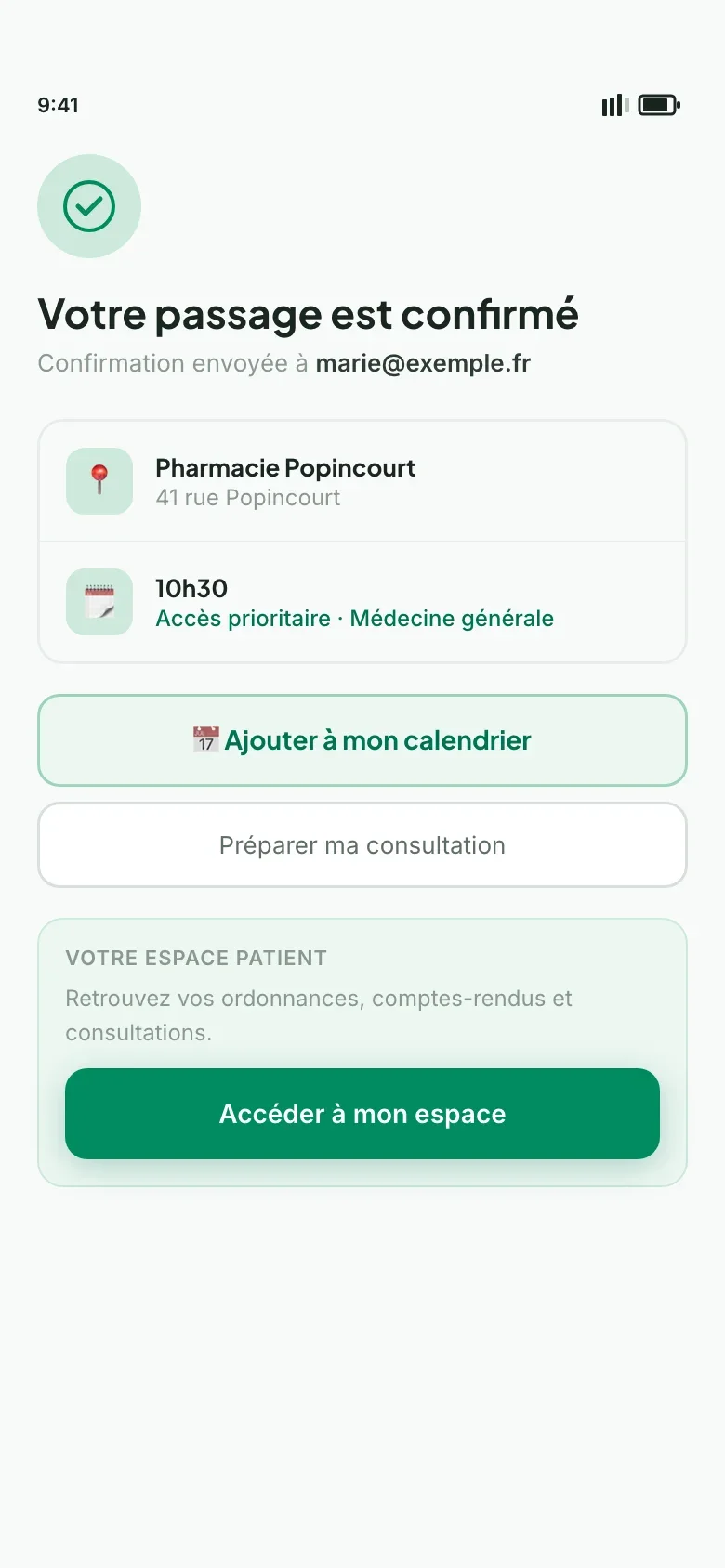
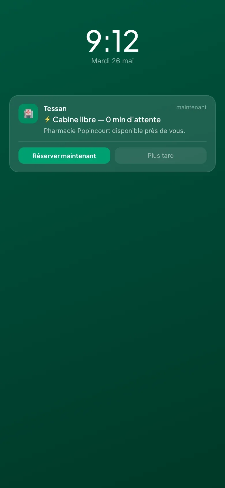
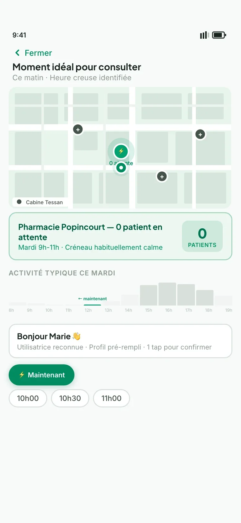
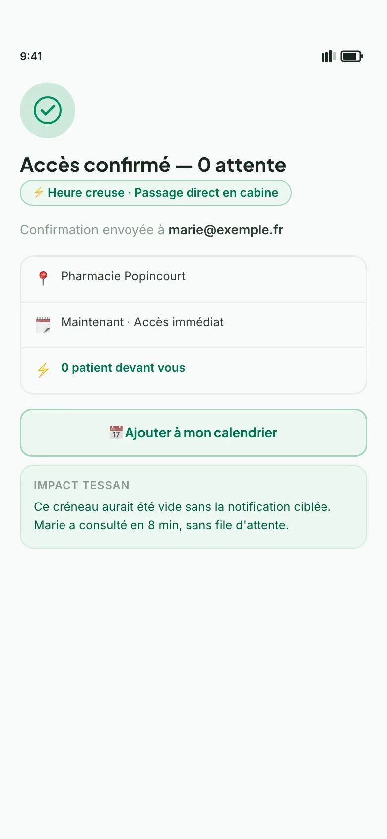
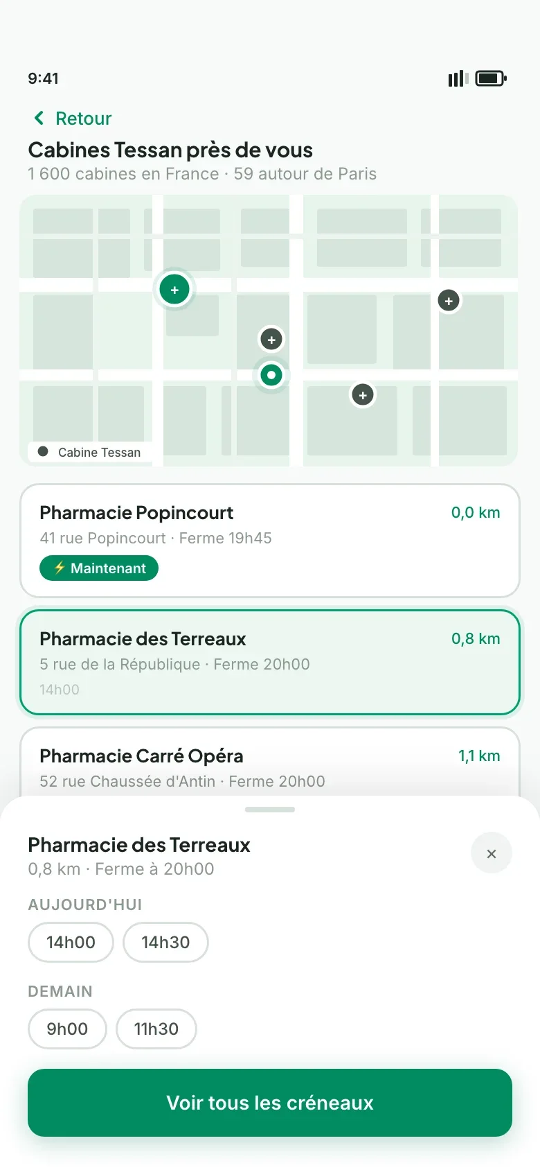
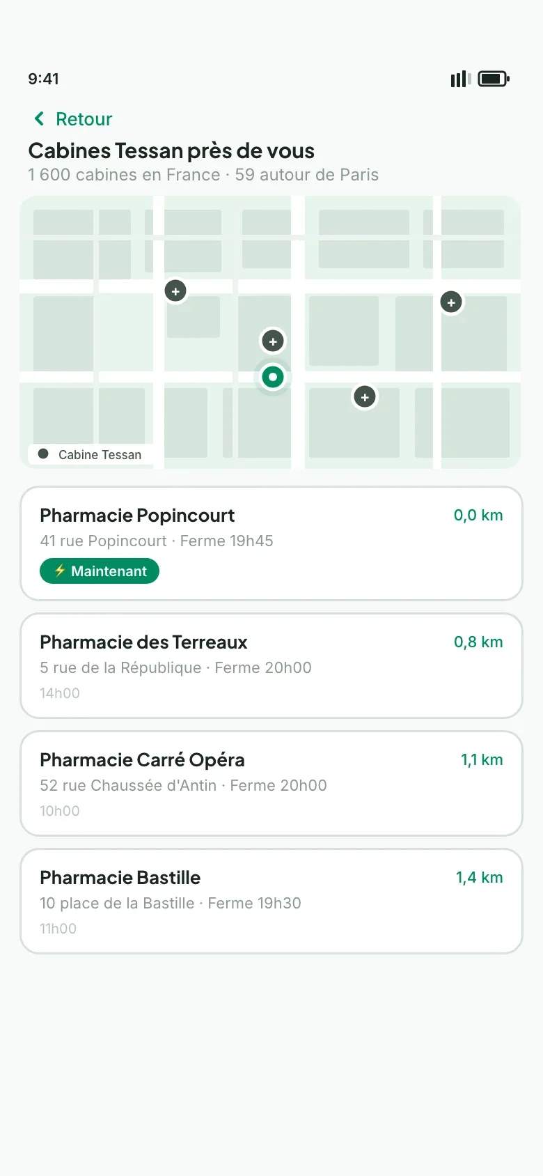
Interactive black-and-white wireframes, reviewed with product leadership, fixed the order of the screens before the mockups. A booking prototype then simulated slot booking in a pharmacy, from the booth map to the confirmed access, with the real pharmacies around the booths.
01 / 05
01 / 10
01 / 10
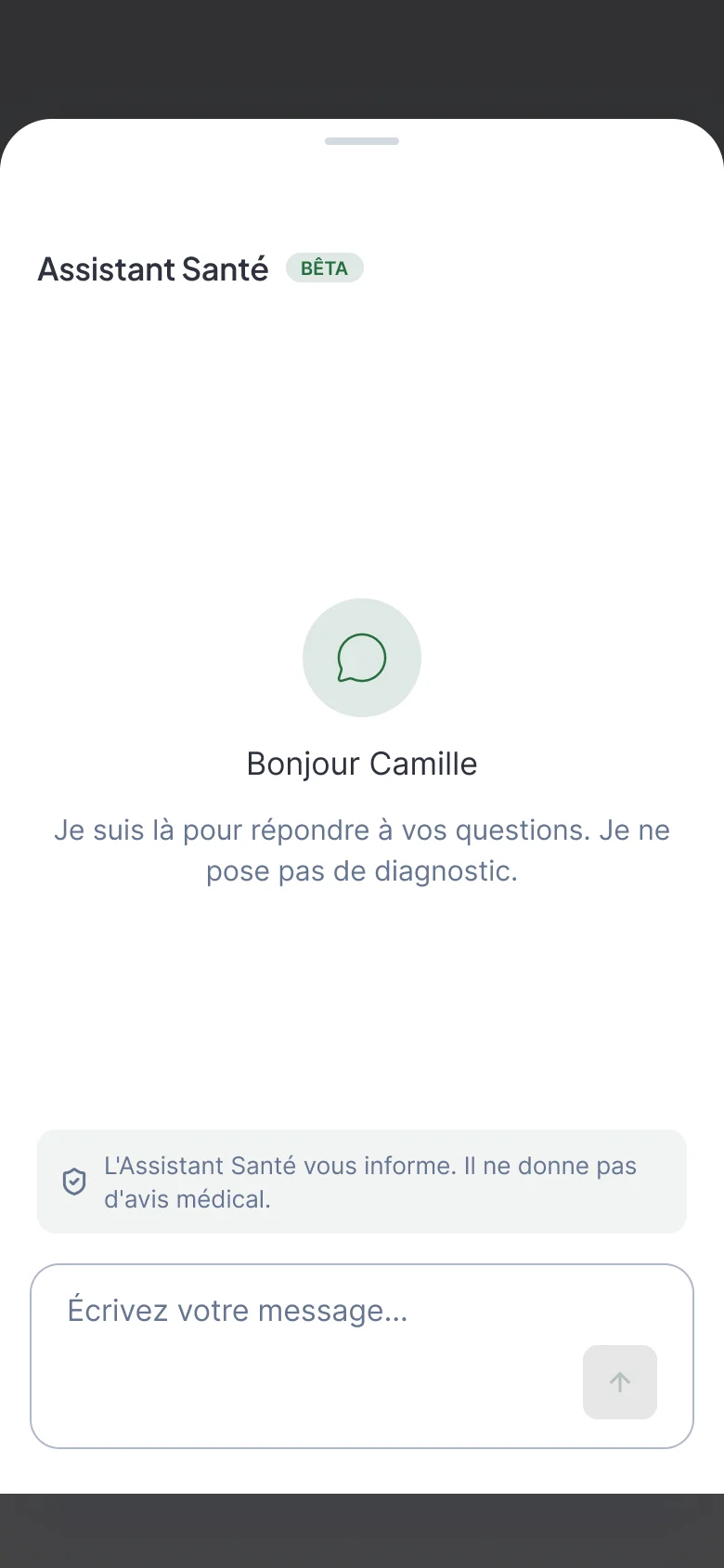
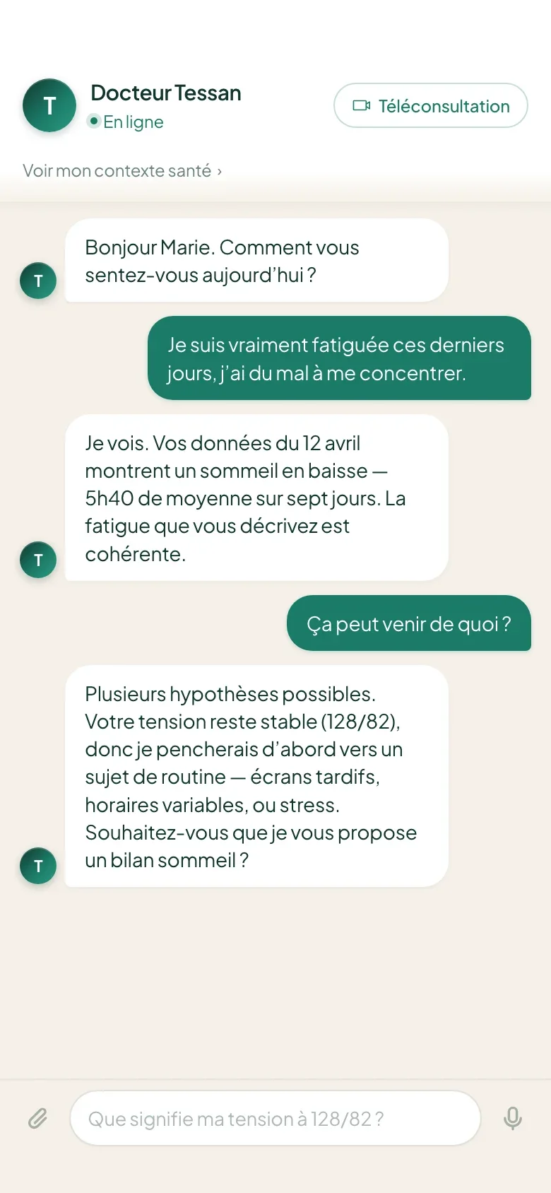
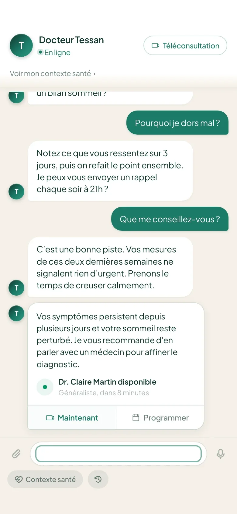
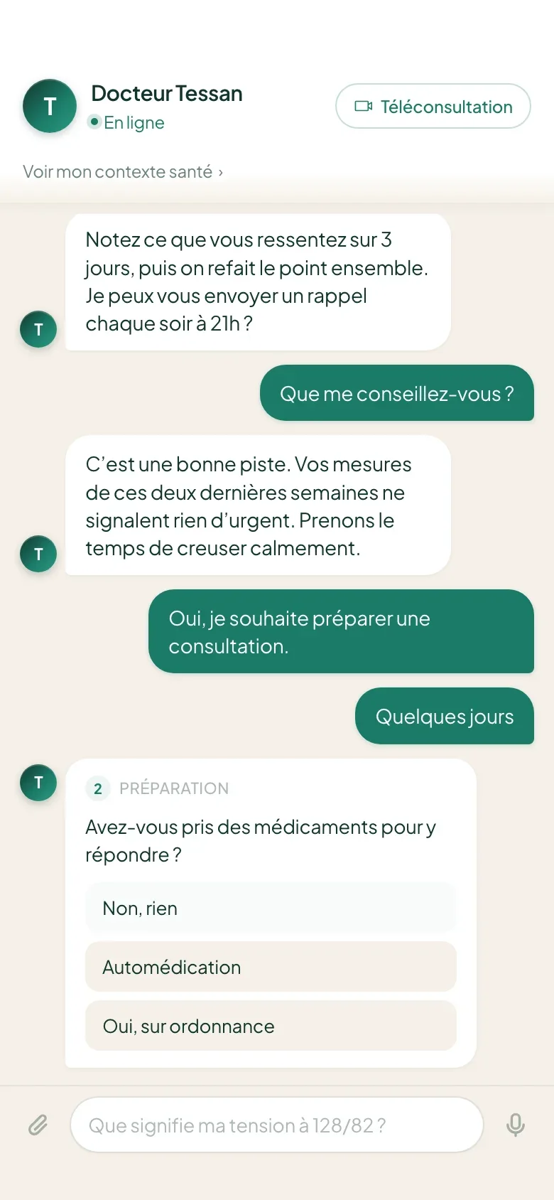
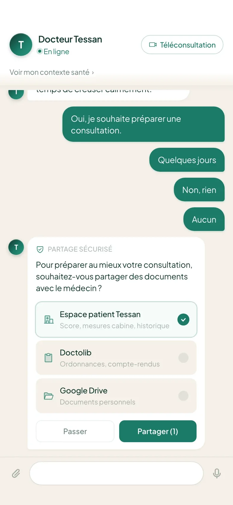
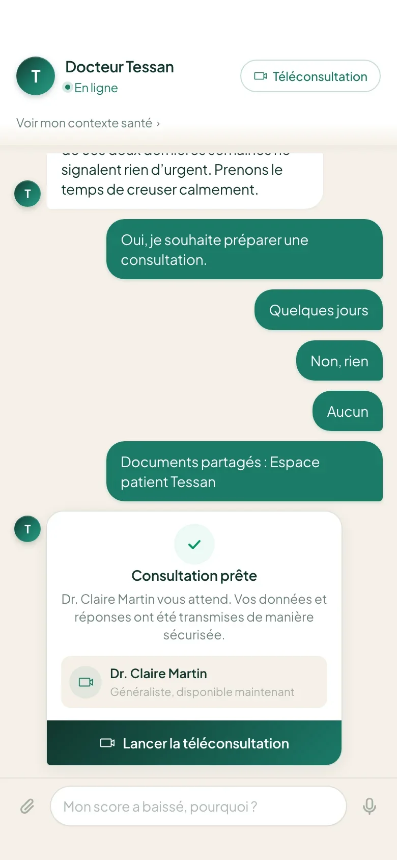
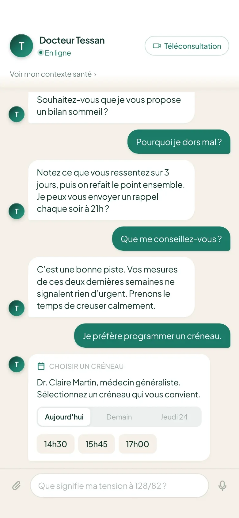
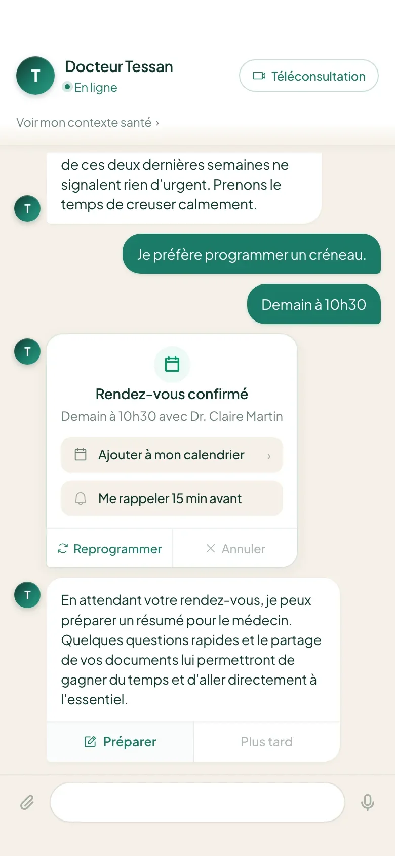
The assistant is not allowed to diagnose, and the limit lives in the screen: a permanent scope banner, escalation to a doctor triggered by the content rather than a counter, a first name never sent to the model. “Health Assistant” replaces “Doctor Tessan”, whose title promised too much.

01 / 10