Two years modernizing the PagesJaunes app, installed more than 22 million times. Homepage, search engine, onboarding, maps and a design system roadmap across iOS, Android, web and Android Wear, as Product Designer then UI Team Lead.

“Victor is passionate about UX and keeps himself up to date with latest trends and methods. He is a very capable designer who can do the legwork but also take a step back and advise on more strategic aspects of an interface design or the project as a whole. Highly recommended as part of a UX or product team.”

PagesJaunes reached more than 15M monthly visitors but was still designed like a web directory. The mobile apps had millions of downloads, with a heavy experience. The product had to move from static listings to a fluid, personal, mobile-first experience, without breaking what worked for existing users.
I joined as Product Designer on web, partnerships (TheFork, Renault R-Link) and login flows. I then became UI Team Lead: coordinating 4 designers, owning the mobile app redesign and running weekly syncs with the iOS and Android developers.
Homepage redesign
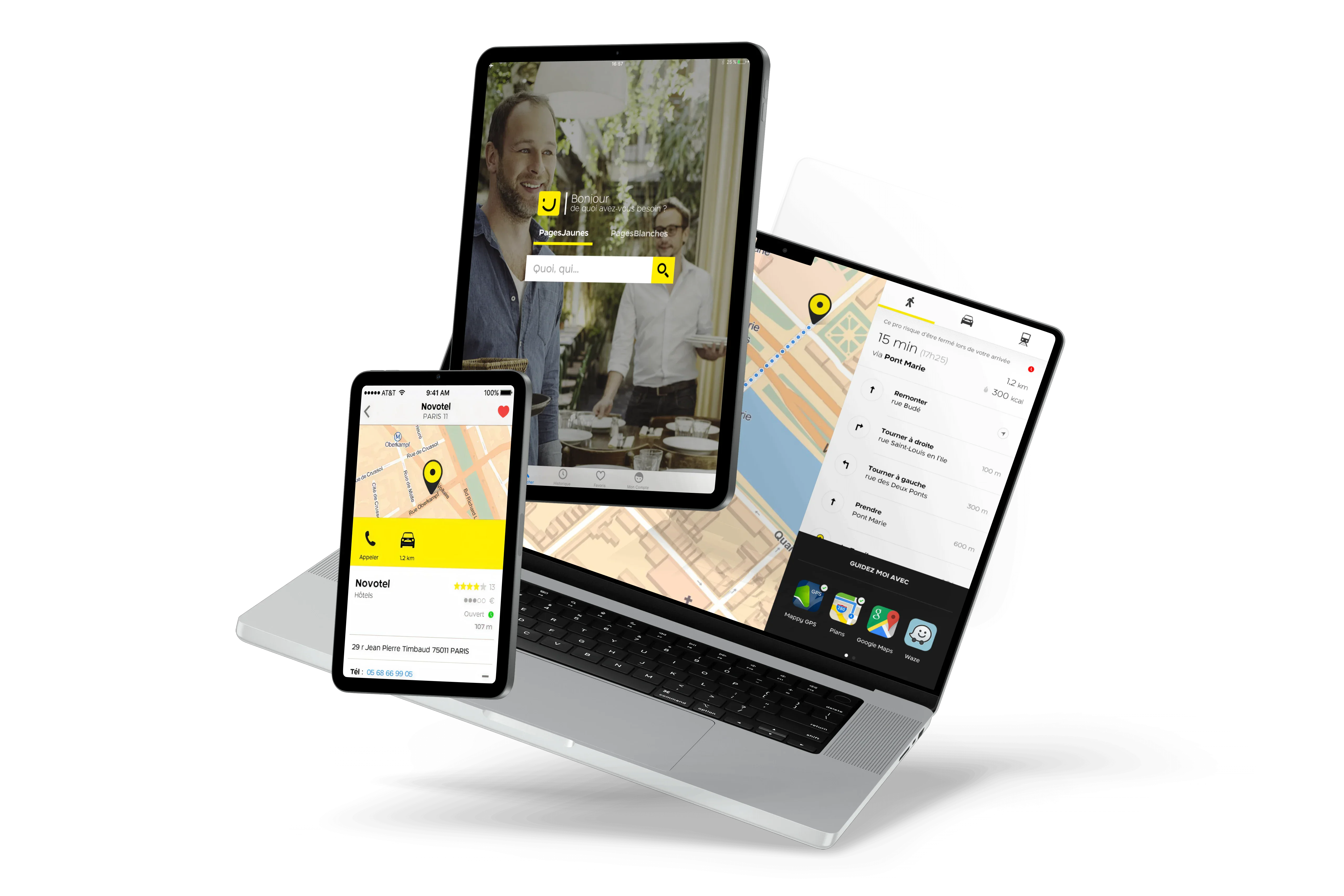
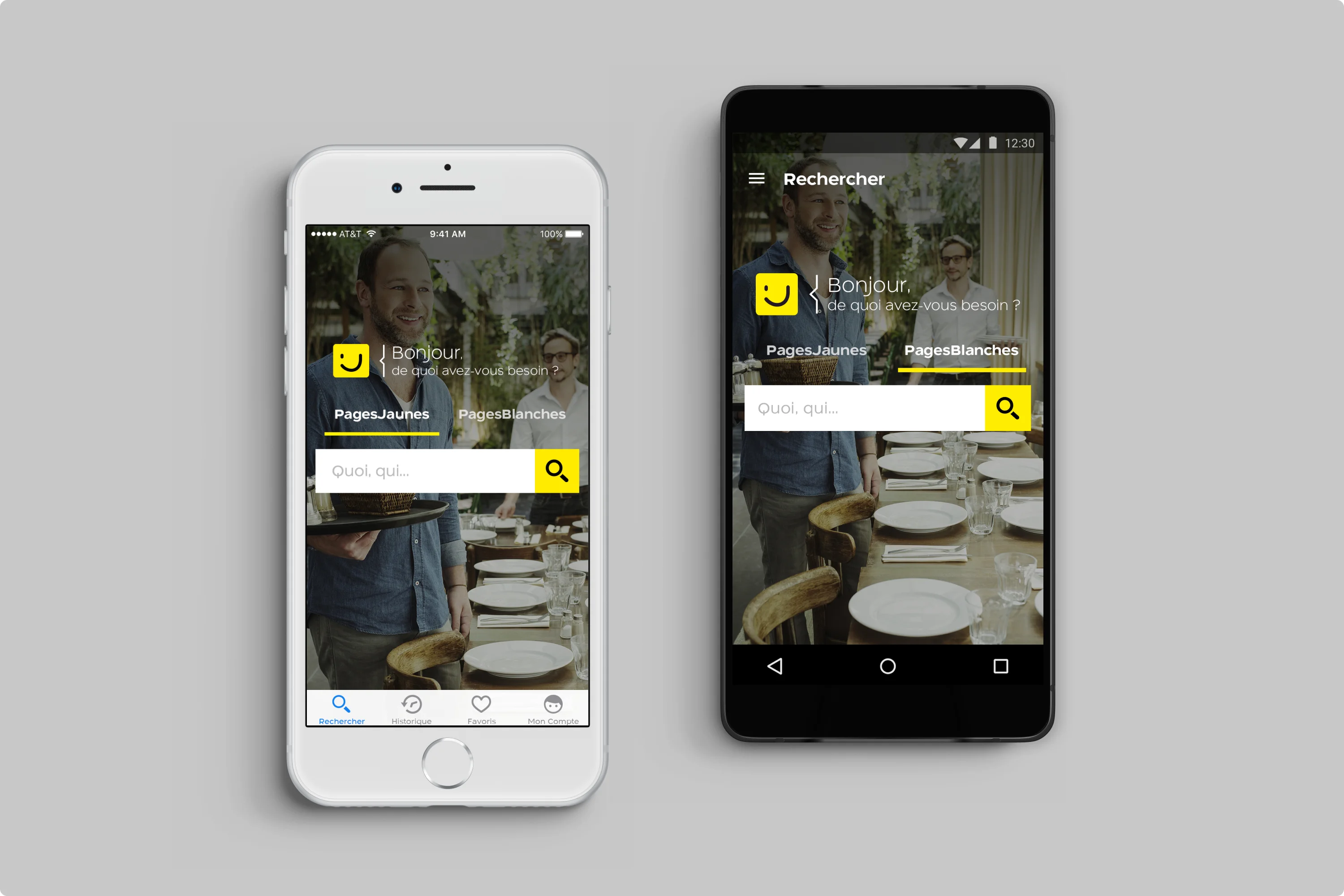
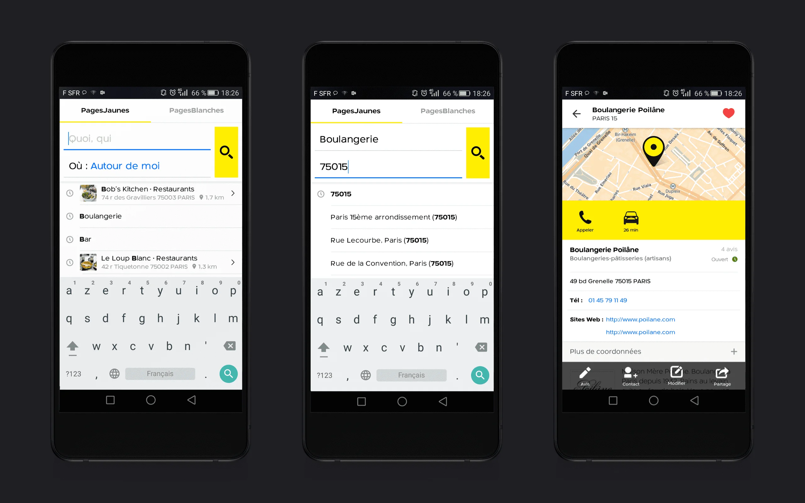
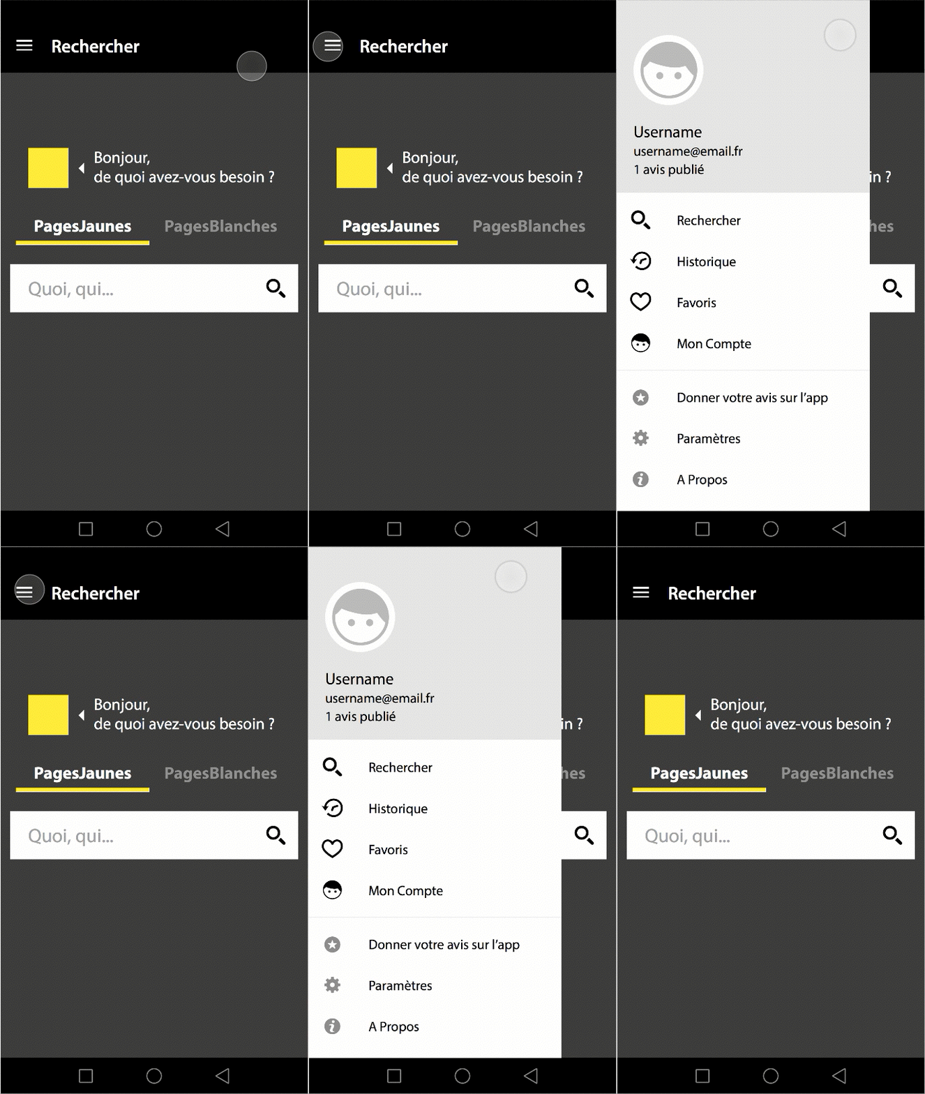
A conversational greeting and a single search bar replace the two-field directory search.
Native onboarding
Short, non-blocking animations at first launch: CAAnimation on iOS, Material Design transitions on Android.
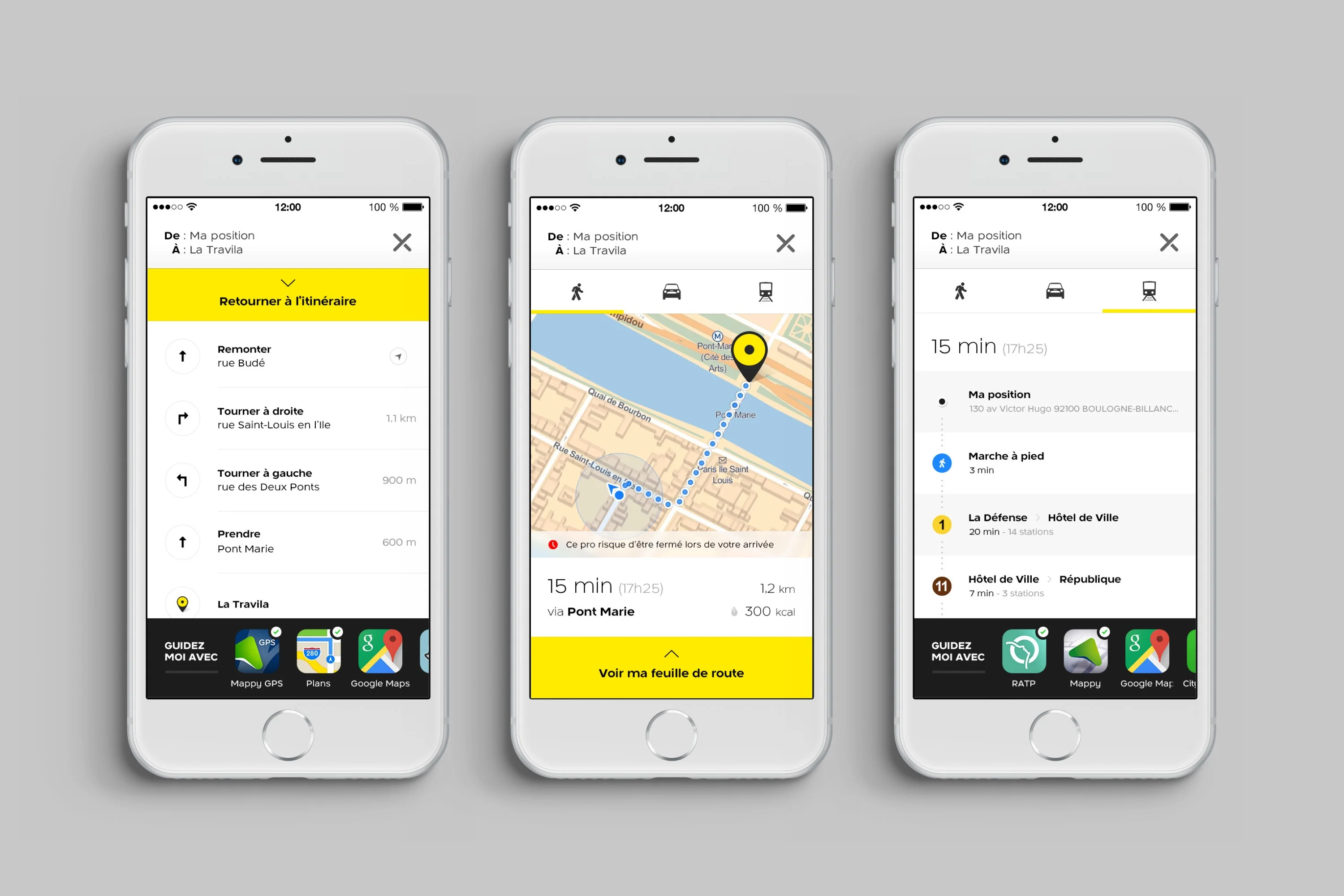
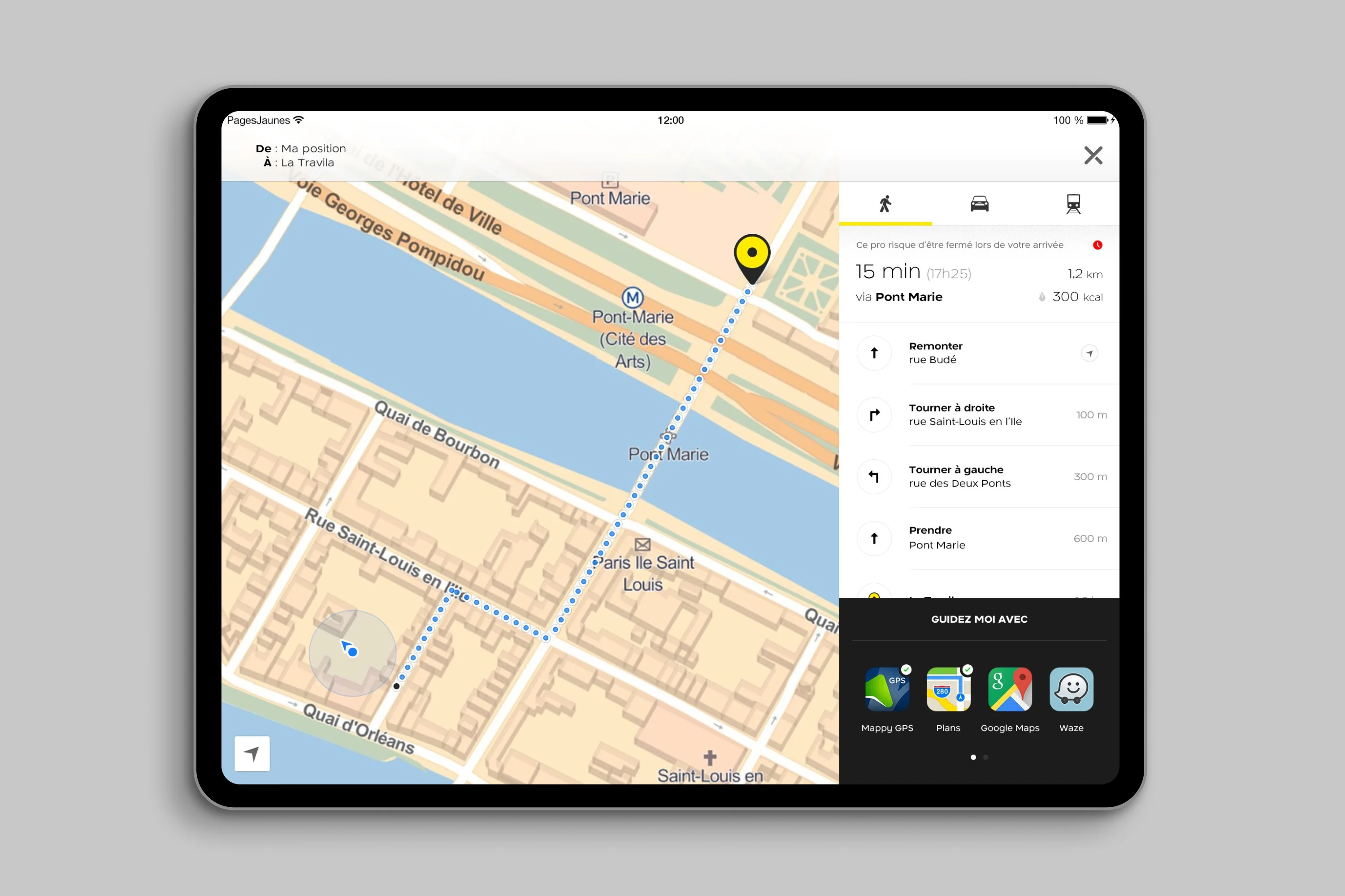
Maps and walking itinerary
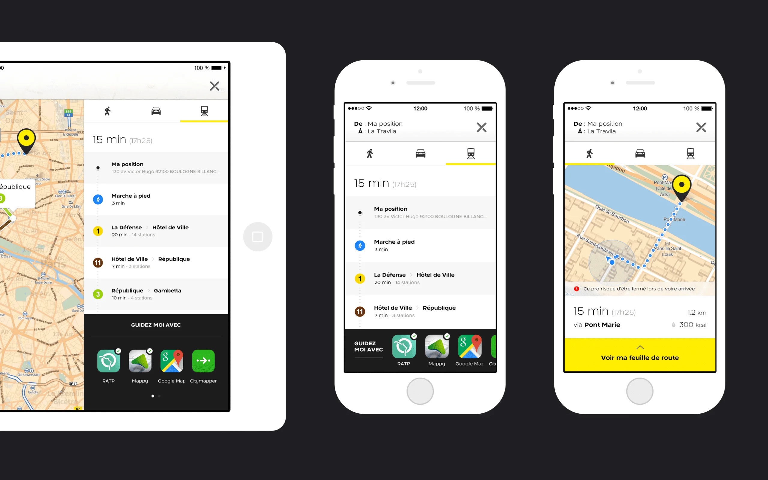
Pedestrian routes on the Mappy API, with handoff to Waze, Google Maps and Apple Maps.
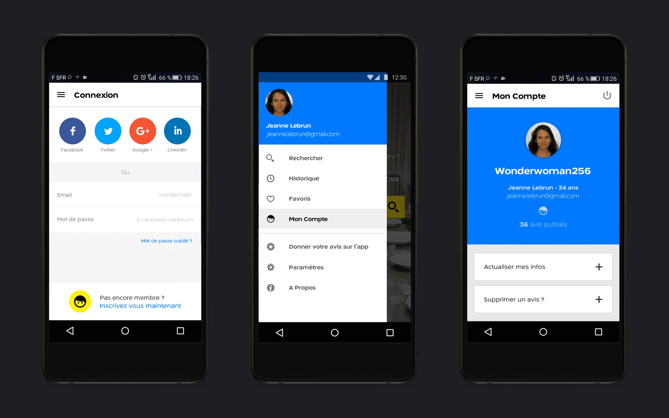
My PagesJaunes
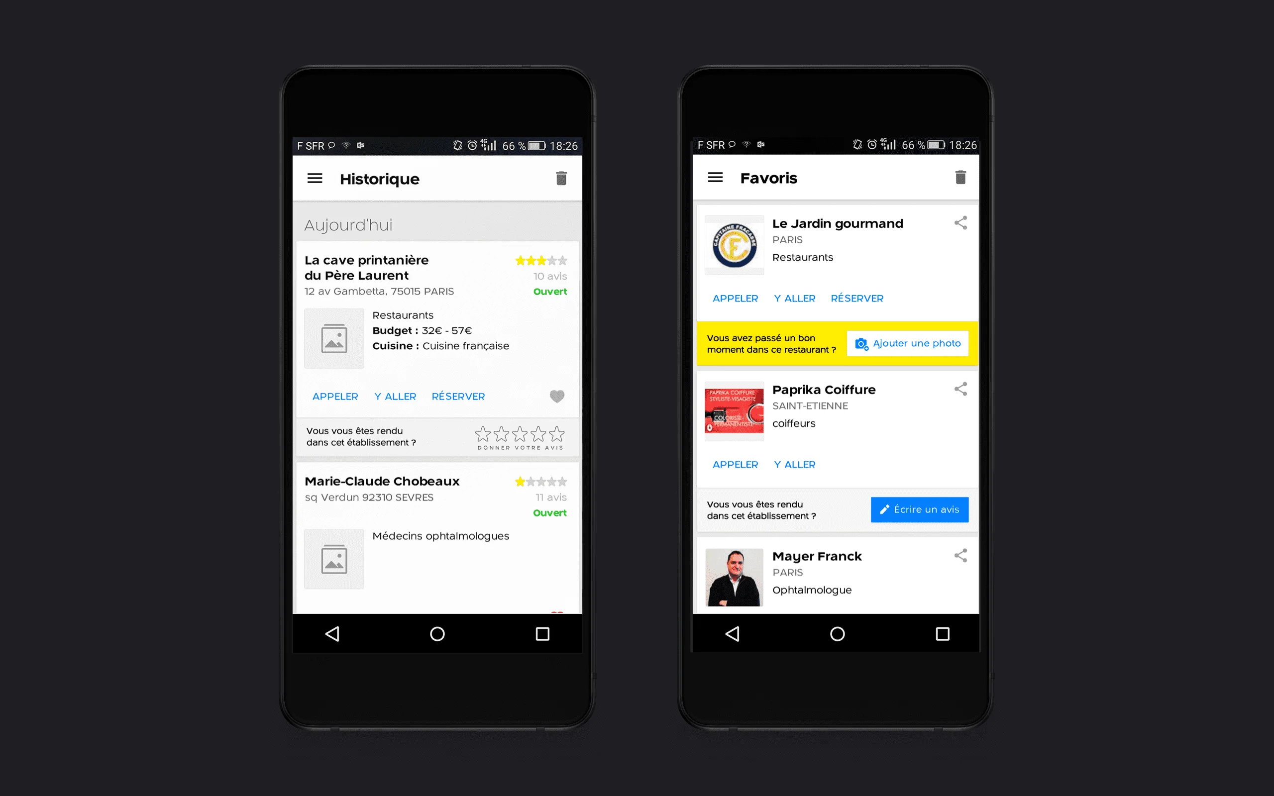
Favorites, history and contributions, redesigned to support retention.
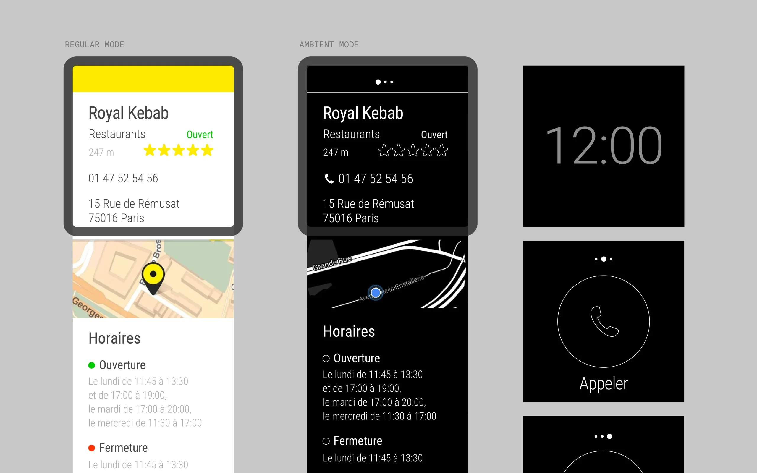
Android Wear app
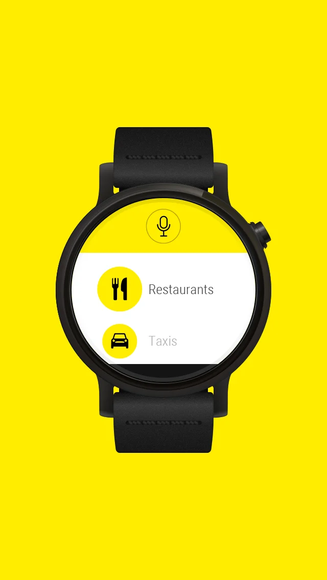
Built in duo with an Android developer, from concept to Google Play in two months.
Design system strategy
Audit across iOS, Android and web, and the Yellowstrap component roadmap.
The search engine carries the business model: close to €500M in annual revenue depends on the ranking and visibility of professionals. Touching search meant touching revenue. At the same time, millions of users had settled habits, notably the two search fields, “Who” and “Where”. The product had to be modernized without disorienting them.
Four goals ordered the redesign: a homepage guided by intent, native onboarding on iOS and Android, pedestrian navigation on the Mappy API, and a design system audit with its roadmap, Yellowstrap. A fifth workstream supported retention: My PagesJaunes, with favorites, history and contributions.
The central UX team defines the cross-platform design strategy and the visual direction, where I started as Product Designer. A dedicated feature team, which I ended up leading, carried the homepage redesign, the Material Design integration, user accounts, favorites and history.
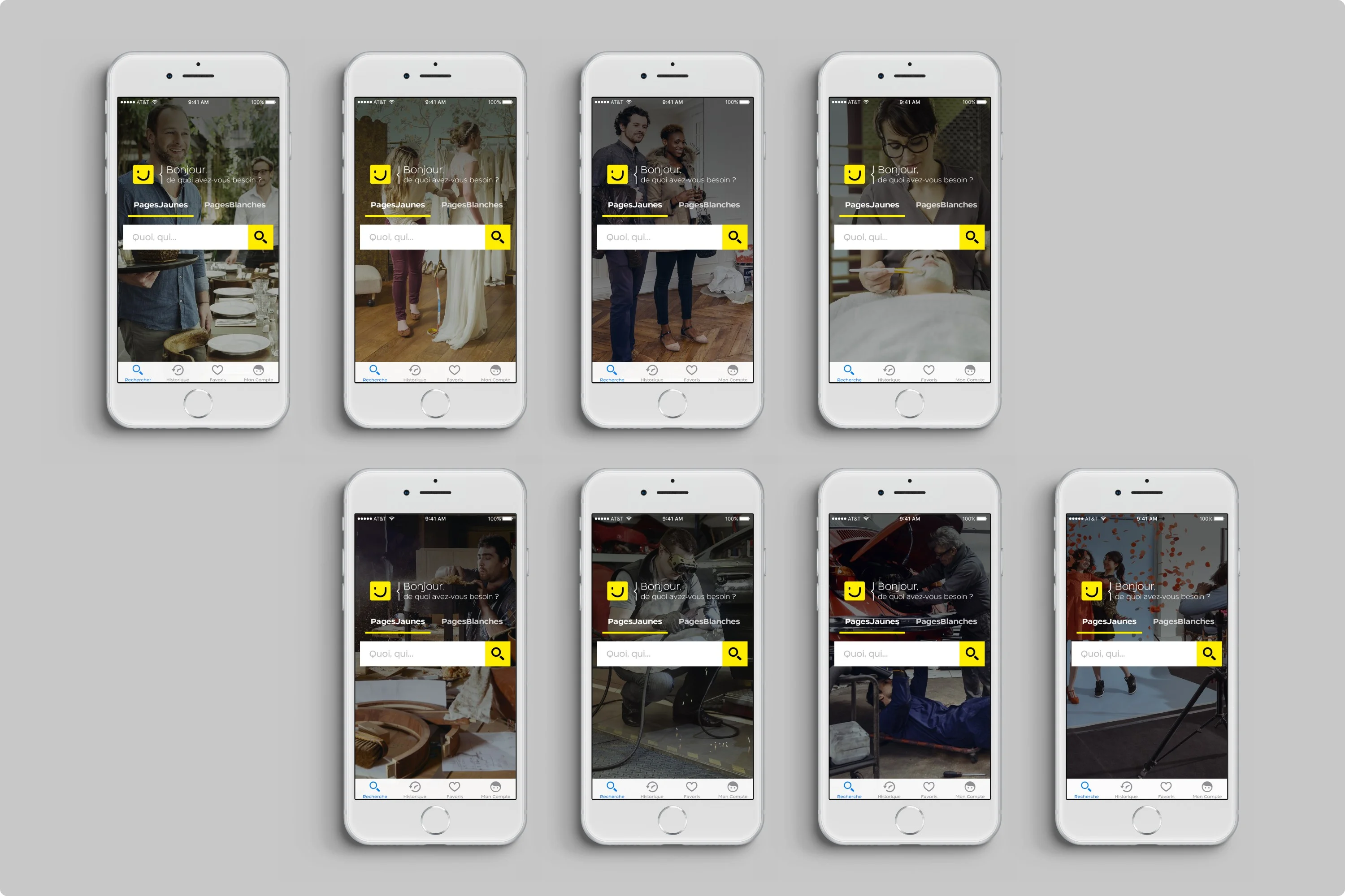
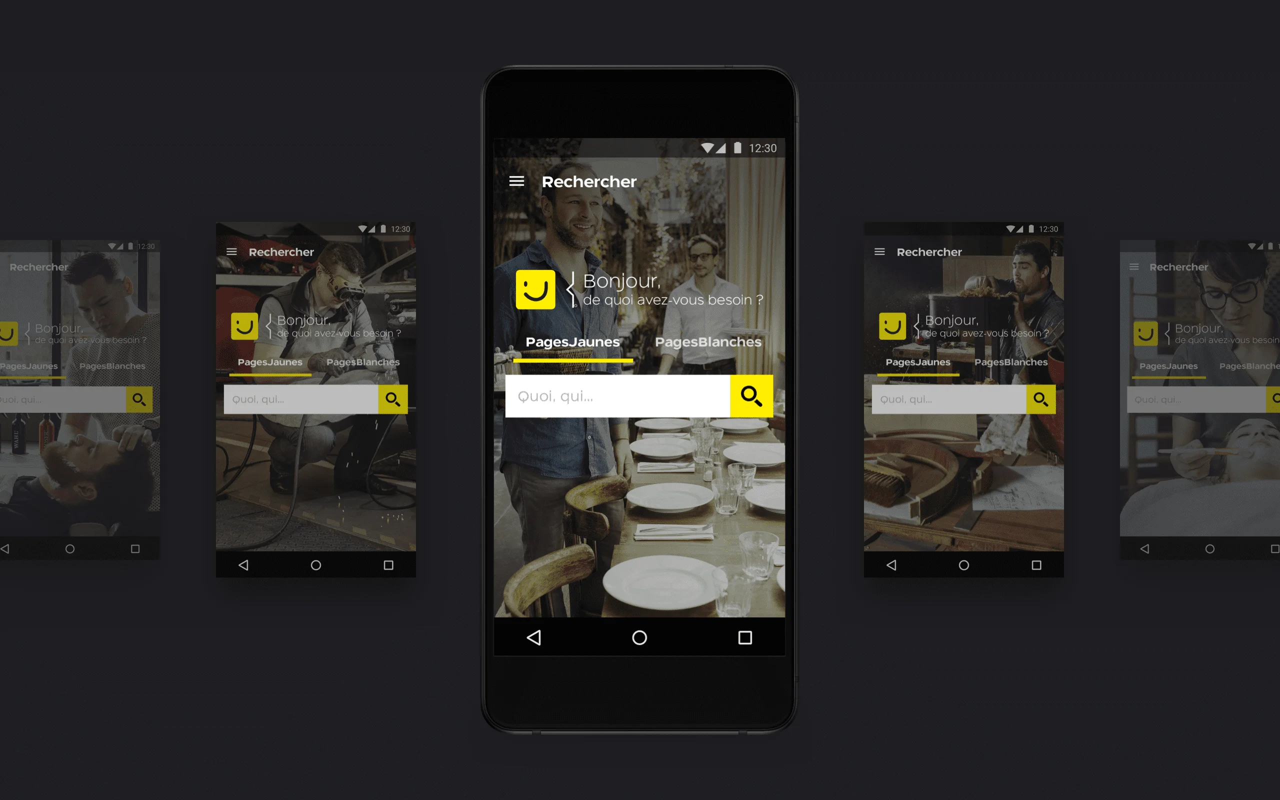
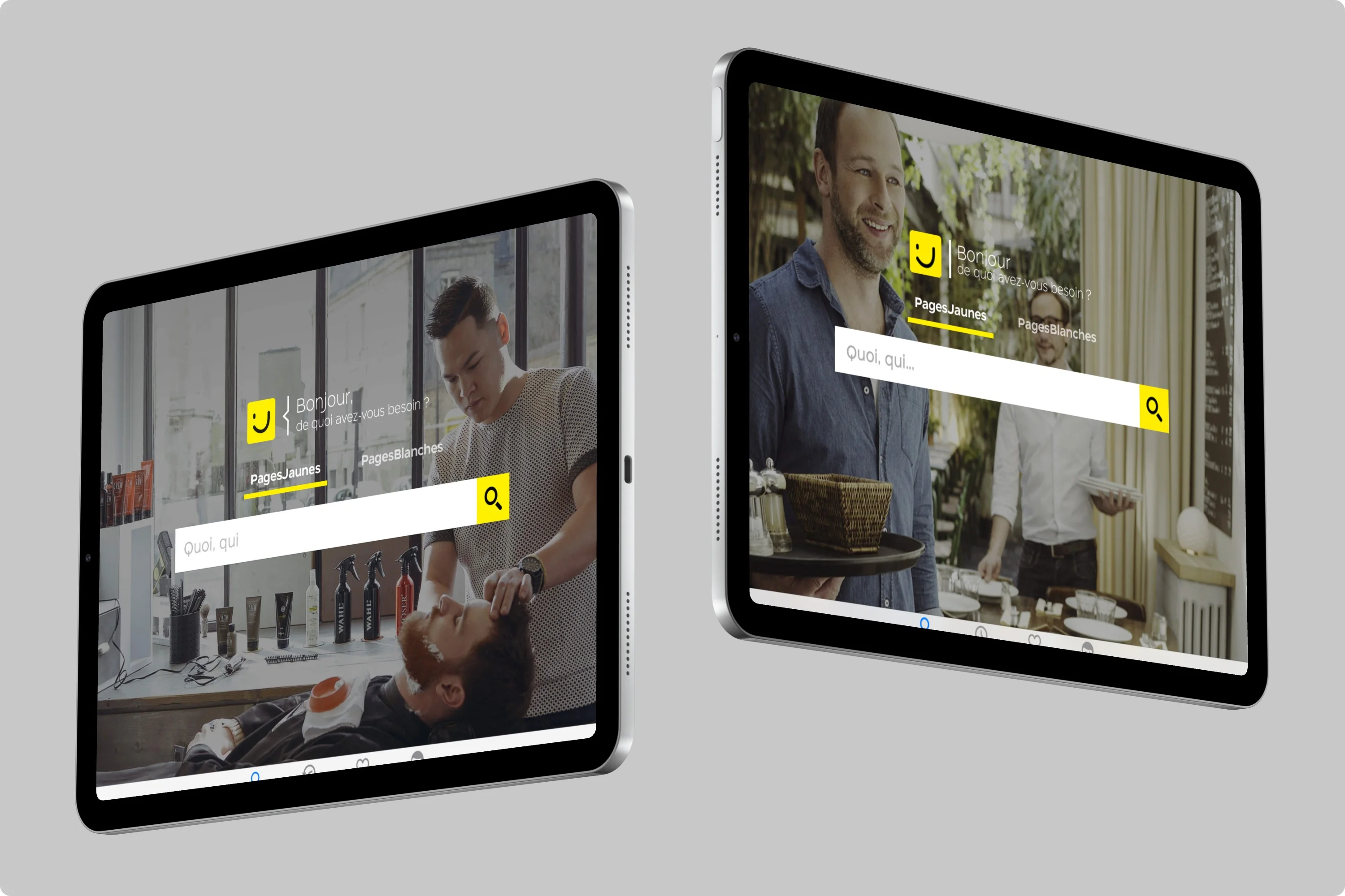
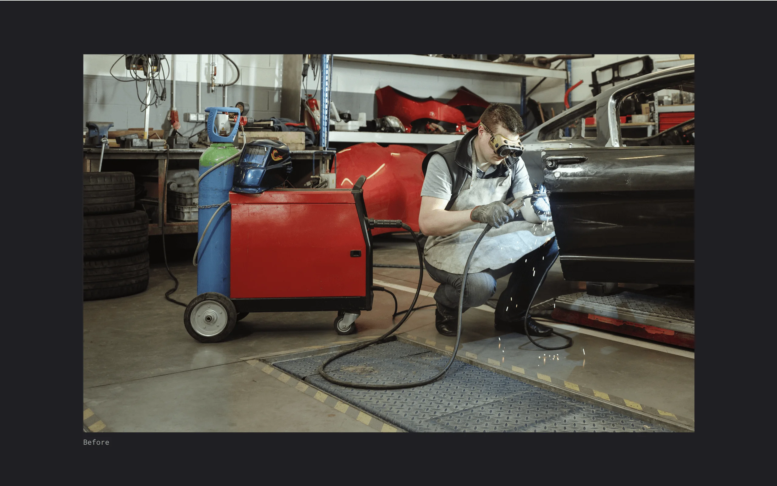
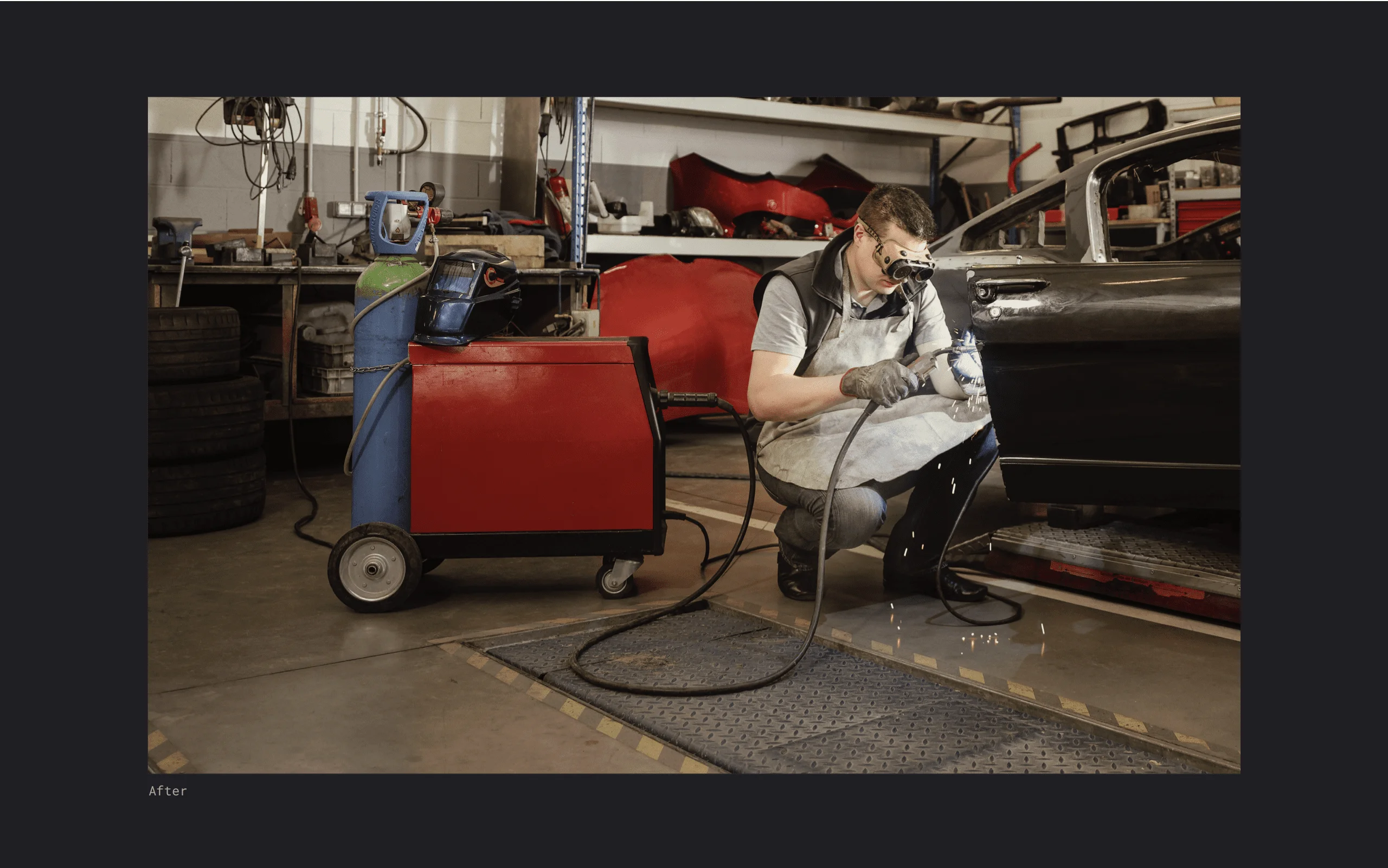
The old homepage showed two fields, “Who” and “Where”. It worked, but felt cold. A conversational greeting, “Bonjour, de quoi avez-vous besoin ?”, and a single search bar replace them, with one tab language across iOS and Android. Background photos show local professionals, the baker, the mechanic, the florist, according to the category searched. Art direction rules, set with marketing, frame and grade each photo so the professional’s expertise comes first.


The “What + Where” model stayed in place. It organizes search around two questions, which professional and where, and it protects the ranking that monetizes every query. The change is in the transitions: the search bar expands into full-screen results with Material Design shared element animations, which keeps the context and lowers perceived latency. The prototype became the version shipped on Google Play.

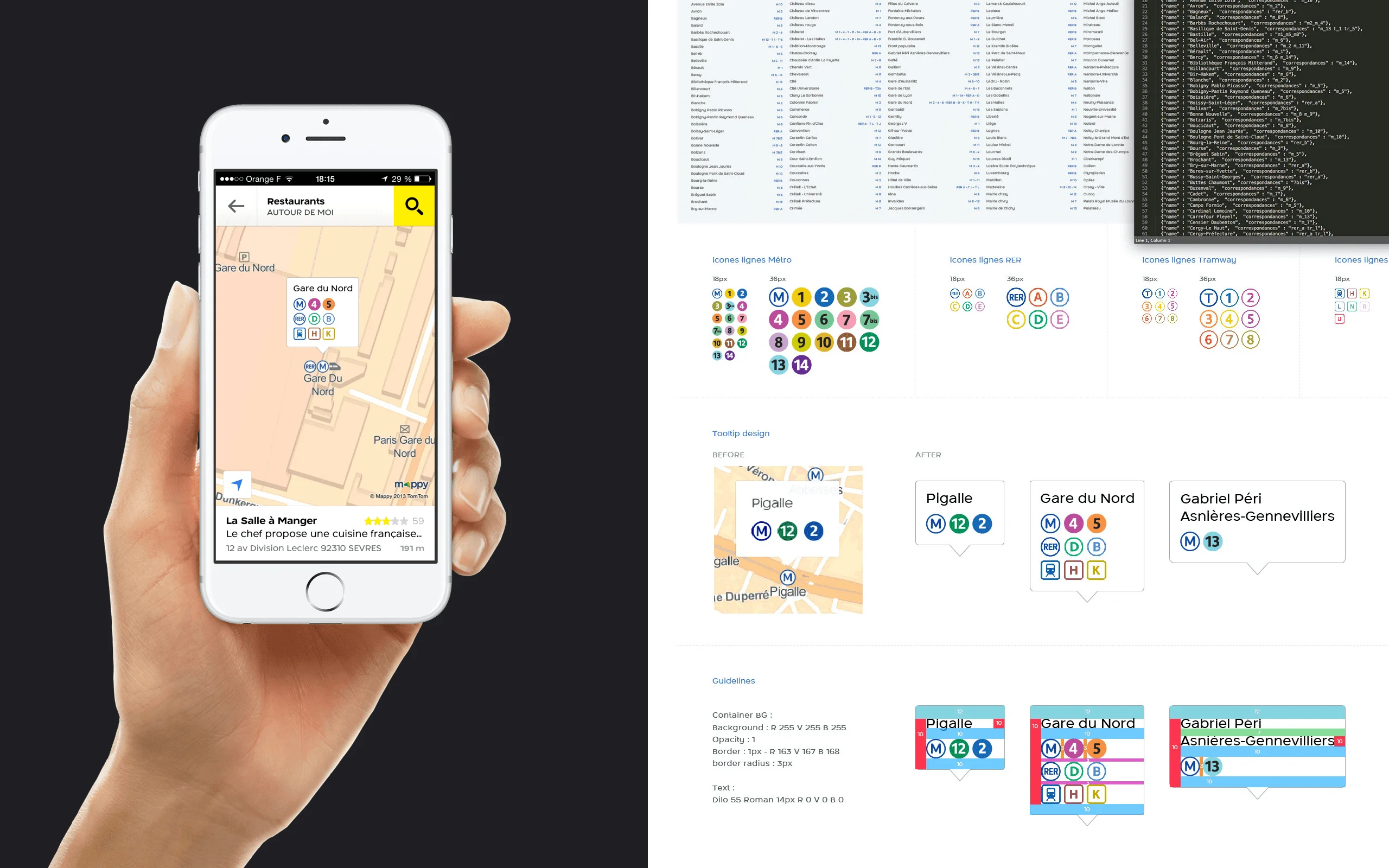
Finding a professional is half the job, users still have to get there. Pedestrian routes run on the Mappy API, with a route preview and turn-by-turn guidance, network optimization for 3G connections and handoff to Waze, Google Maps or Apple Maps for the car. Station tooltips on the map group the lines that serve each stop. On iPad a native split view puts the map beside the directions, with Dynamic Type and VoiceOver support.


The loyalty area was fragmented and underused. We rebuilt it around four zones: favorites to keep preferred professionals, history to find recent searches, contributions with photos and reviews, and an account that is simpler to create and open. Social login reduces friction by 60%, and email and password stay available. Every saved professional is a reason to return.


A major release meant users had to discover what was new without being blocked. Short, non-blocking animations at first launch: CAAnimation on iOS, Material Design transitions on Android, with motion specs agreed with the developers and iterations tested in our Paris UX lab. The goals were fewer support requests about navigation, better discovery of favorites and maps, and higher first-week retention.
Motion specs I delivered to the development teams. These animations shipped in production on iOS and Android.

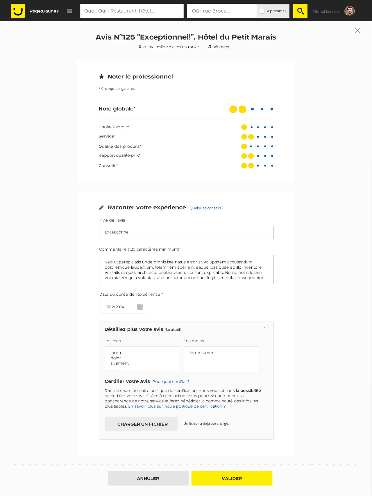
The web interface for writing a review offers multi-criteria star ratings, pros and cons fields and rich formatting. It adapts from desktop to tablet.

Teams now designed one feature across several operating systems, so questions came up between trades and between teams: which mockups are the latest, which deliverables to integrate. I led the first audit of the iOS, Android and web screens, with interviews of designers and developers across squads. I then delivered the Yellowstrap component roadmap: naming conventions, color usage, call to action styles and status indicators. The tools of the time were Zeplin, PDF kits and Sketch. My role covered strategy and requirements. I did not build the library myself.

These figures belong to the product, built by the whole team.
This project was not possible alone. I worked with the iOS and Android developers, the backend, marketing and the product owner. I led UI direction, component specs and the rituals of a team of 4 designers, with weekly critiques and retrospectives.