Related projects

Product Lead & Design Manager · EdTech Ecosystem & Design System · 2018-2024
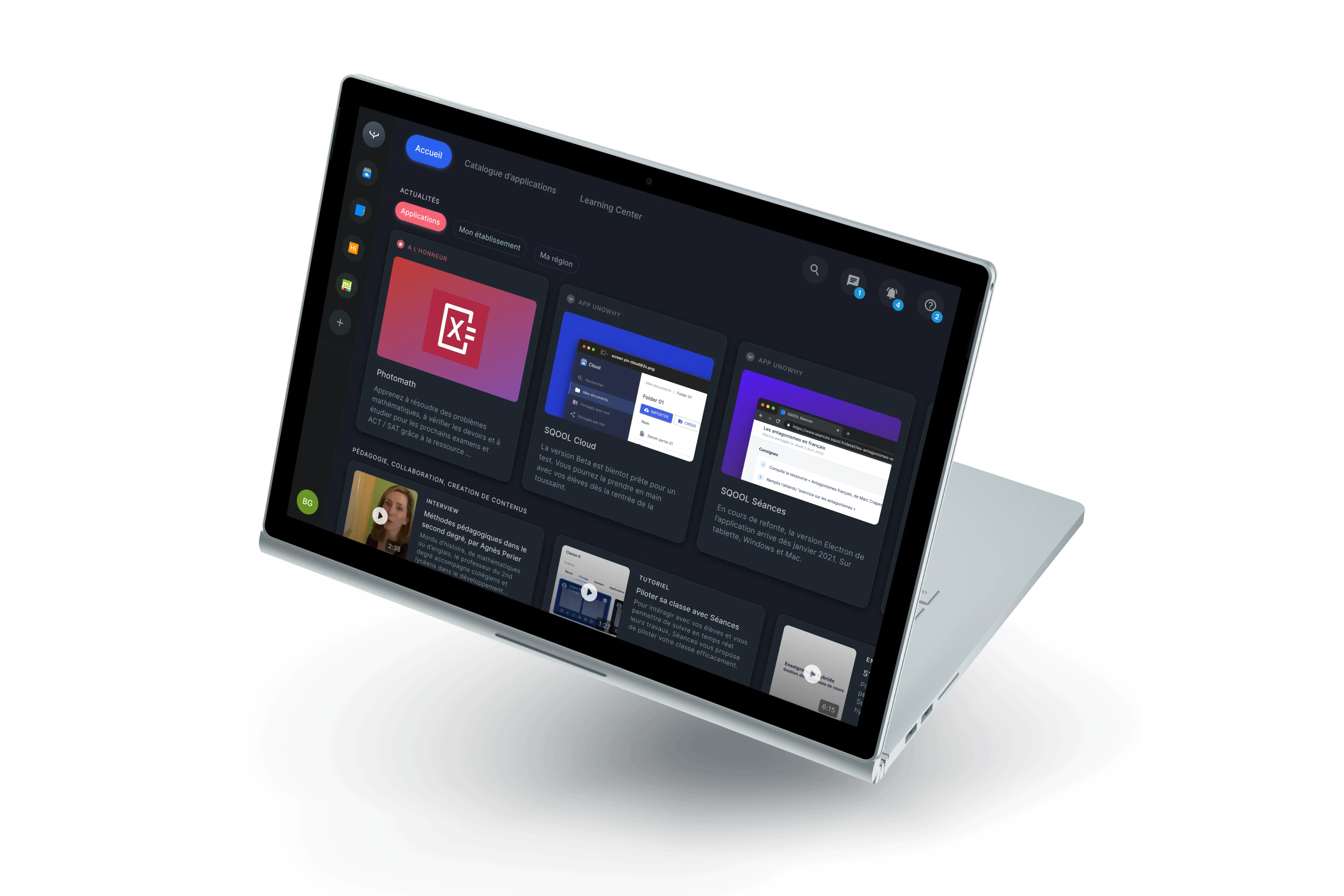
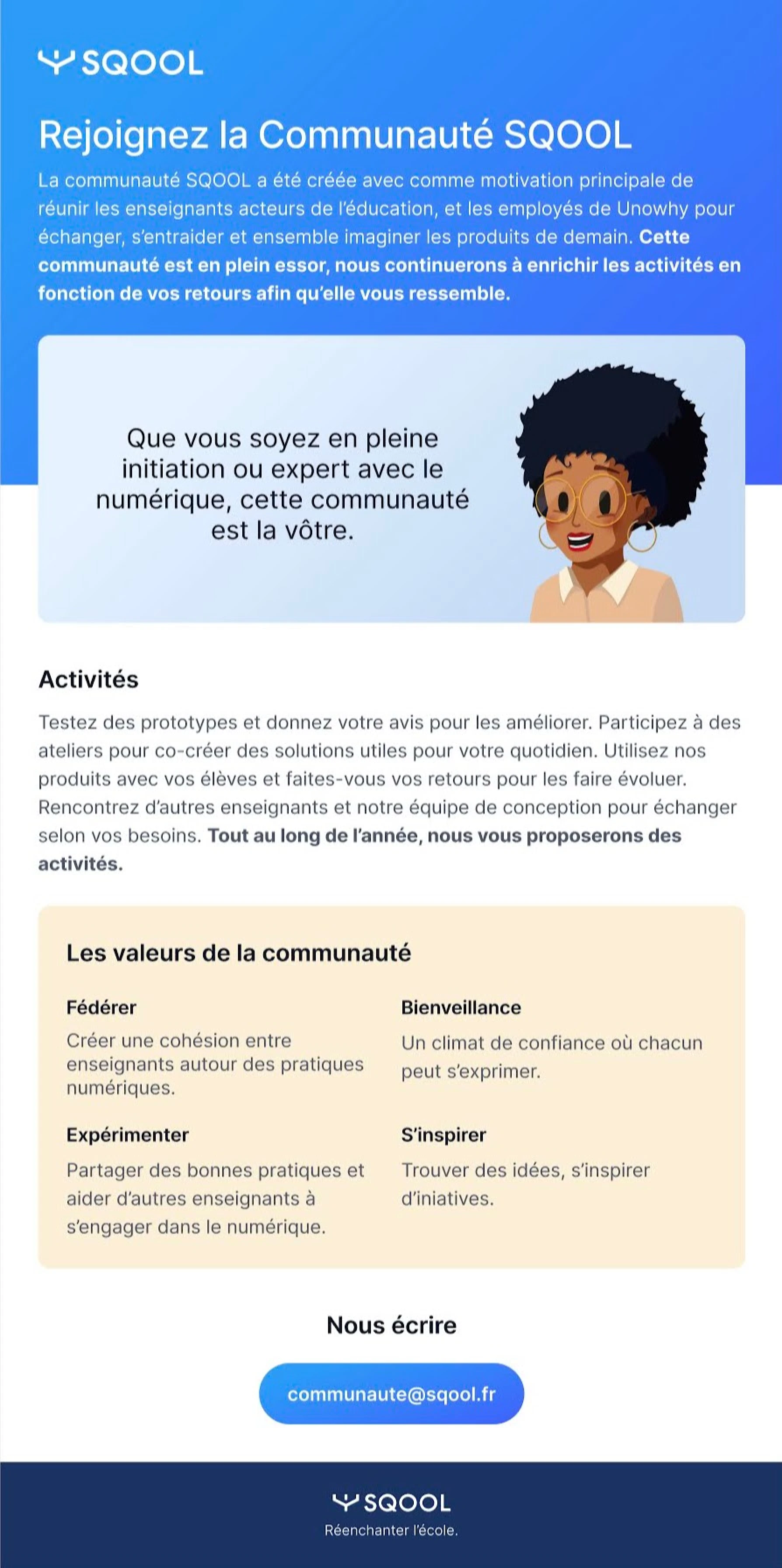
Building an EdTech Ecosystem for 500,000 Students
How we transformed a hardware company into a modern software platform
Over six years at UNOWHY, I led the design transformation from a legacy Android launcher to a suite of 7+ web applications serving high school students and teachers across 465 schools in Ile-de-France. This is the story of strategic pivots, user-centered design, and building a design system that scales.
Victor played a key role in our design transformation. He built the team, established our design system, and brought the rigor we needed to scale from one product to an entire ecosystem. His ability to balance strategic vision with hands-on execution was essential to SQOOL's evolution.

Charlotte Rifflet
CPO @ UNOWHY
TypeProduct Design, Design System
ScopeEdTech Ecosystem
Period2018-2024
CompanyUNOWHY / SQOOL
The Context
A massive deployment, a new challenge
In early 2019, the Ile-de-France region partnered with UNOWHY for the "Lycee Numerique" program. The goal: equip every student and teacher in 465 high schools with a personal device - that's 500,000 tablets and PCs deployed at the start of the 2019 school year.
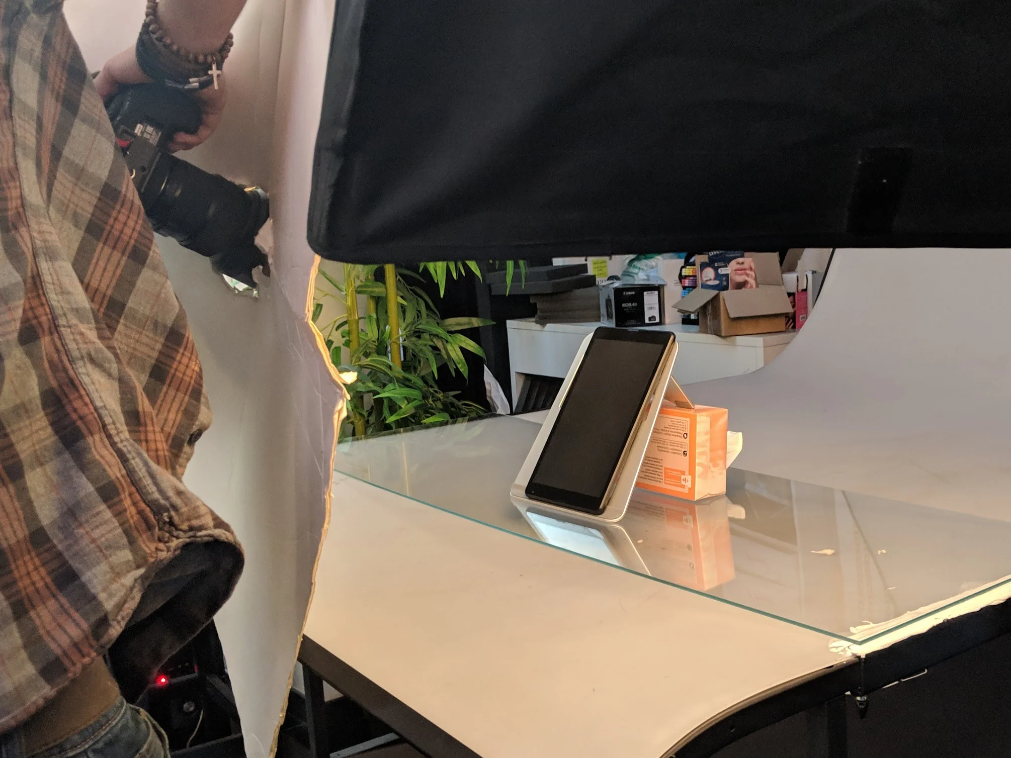
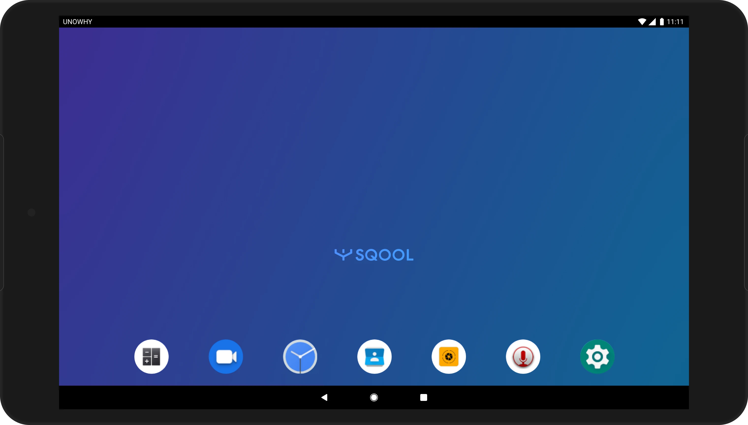
The existing SQOOL suite (2015-2018) was built for a different world: shared tablets on carts, teachers using heavy C++ desktop apps, and students locked into a custom Android launcher. None of this would work for personal devices used at school and at home.
The Challenge
Design a new software ecosystem that works on standard Android and Windows devices, accessible from any browser, while competing with government-mandated platforms (ENT) that schools were already using.
My Role
I joined as Senior UX/UI Designer in 2018, grew into Design Lead in 2020, then Product Lead in 2023. I recruited and managed a team of 5 designers, co-led product strategy with the CPO, and built the design system that unified the entire suite.
Transformation Journey
6 years of product and design evolution
2015-2018
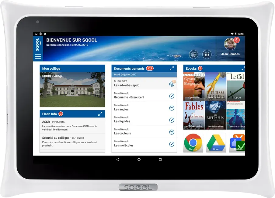
Legacy Foundation
The monolithic era
2019-2020
Finding Our Path
Web-first exploration
2021
Strategic Pivot
Simple, Fluid, Magical
2022-2024
Suite Delivery
Specialized applications
Click on a phase to see details
Phase 1: Finding Our Place
2019-2020
We needed to prove that web-based tools could work for education. Two projects shaped our direction:
Hi-SQOOL: A New Identity for Students
Our first challenge was creating a student-facing platform. Through interviews with high schoolers, we discovered they wanted something that felt different from the institutional tools they were forced to use.
Hi-SQOOL became a 6-week sprint to design a new brand identity and a web app that centralized student activities: chat, documents, class schedules, and educational content. We validated our web-first approach, even though adoption was limited by political conflicts with existing ENT platforms.
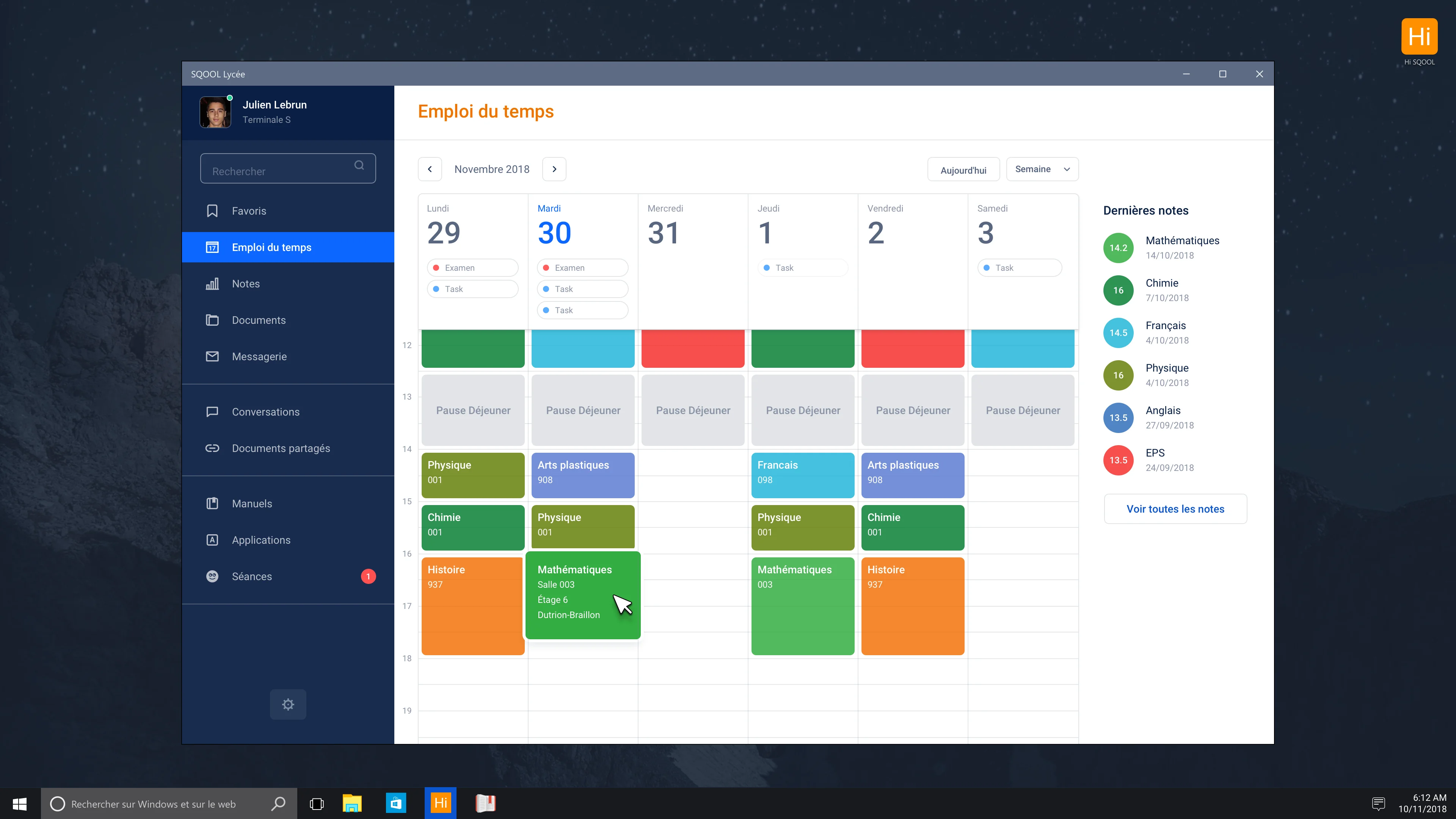
Outcome: Established new authentication system and cloud storage that became foundations for future apps.
Connect: The Dashboard That Taught Us to Pivot
In 2020, as COVID hit, we realized our apps weren't sticky. Without a native launcher, users had no reason to think of SQOOL. We designed Connect - a vision prototype for a unified dashboard that would be the entry point for everything.
We built a working React prototype with an innovative concept called "La Bulle" - a persistent floating menu for quick actions. The prototype proved the technology worked.
But it also revealed a fatal flaw: a dense dashboard would directly compete with ENTs. We were building something schools already had.
Outcome: The non-shipped prototype was our most valuable deliverable. It gave us evidence to stop and change direction.
Phase 2: The Strategic Pivot
2021
Instead of one big platform, we decided to build focused apps that do one thing well.
A New Vision: Simple, Fluid, Magical
I worked with the product leadership to define a new direction. We wrote a manifesto shared across the company: SQOOL apps should be simple to understand, fluid to use, and magical in the moments that matter.
This meant killing complexity. Each app would solve one clear problem. If teachers needed to share files, they'd use SQOOL Partage. If they needed to see what students were doing, they'd use SQOOL Classe. No more trying to be everything.
Building the SQOOL Brand System
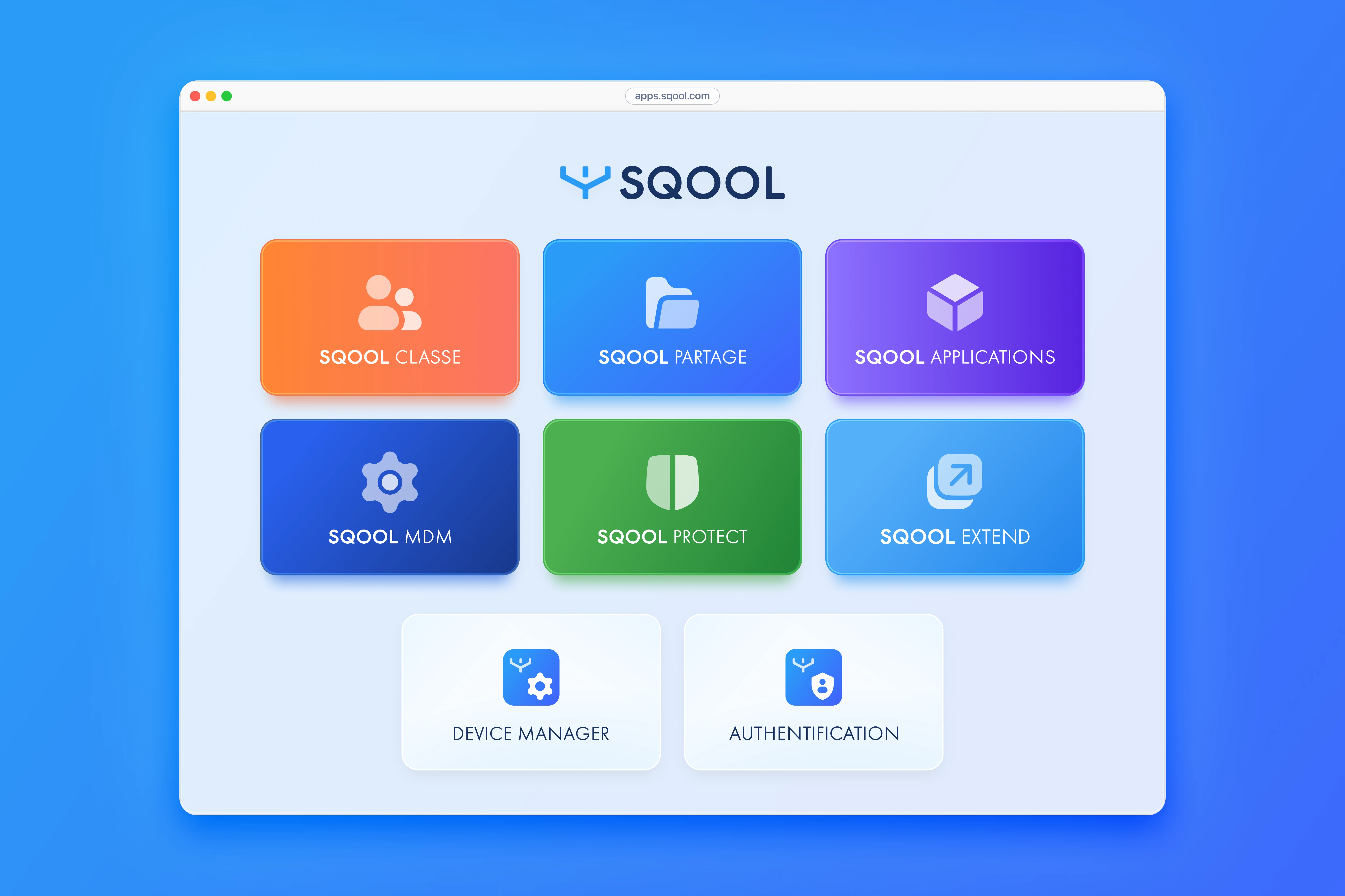
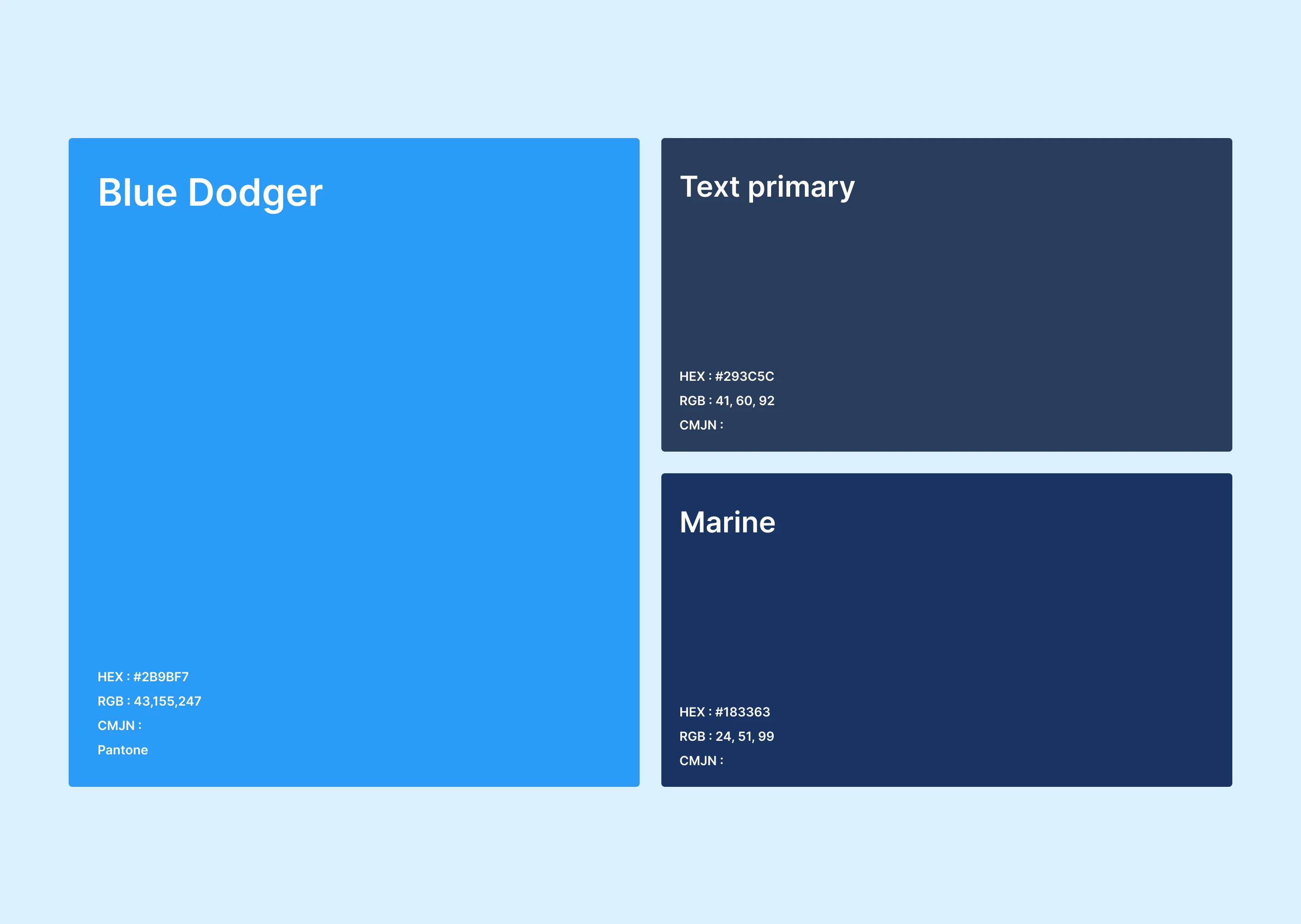
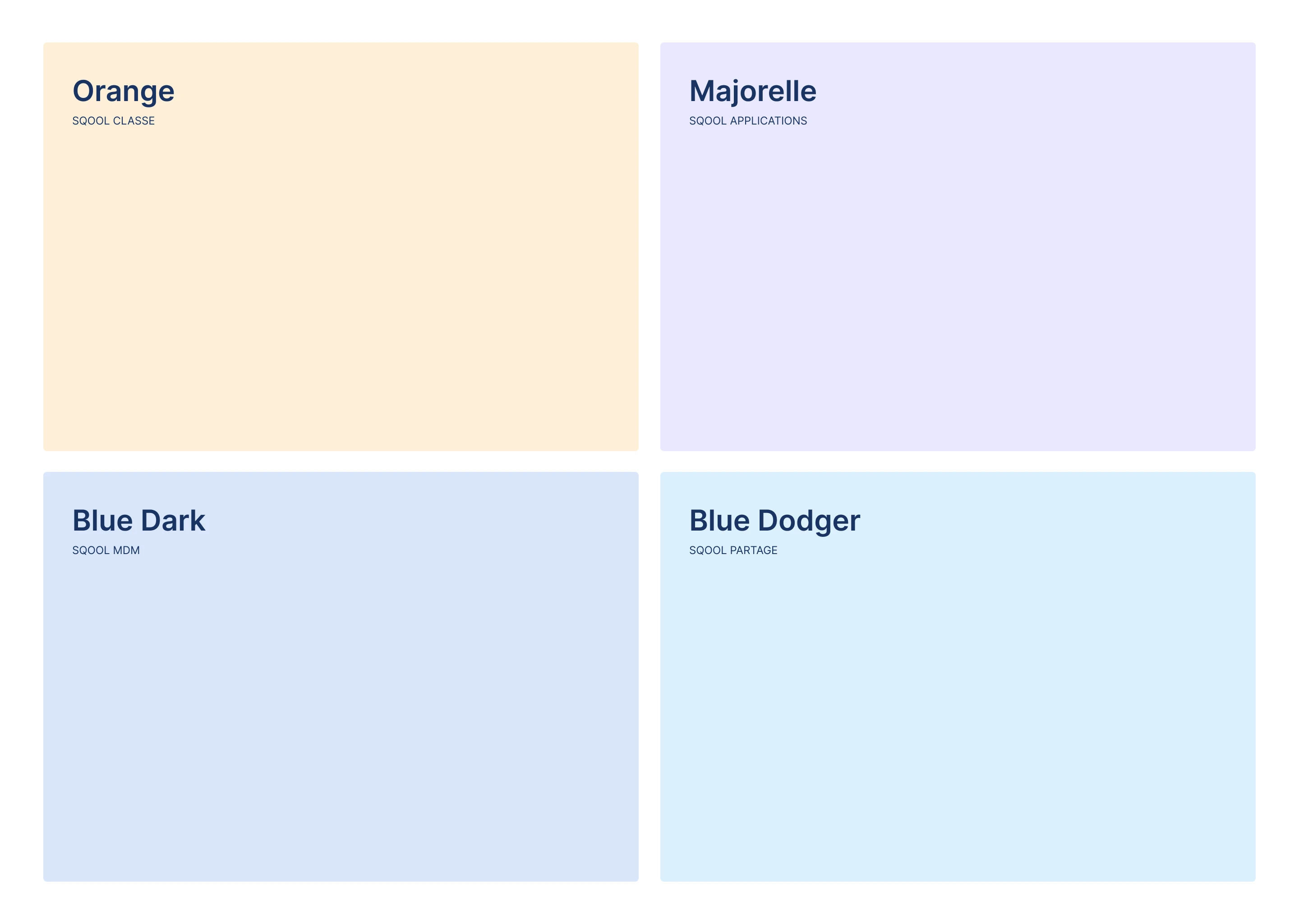
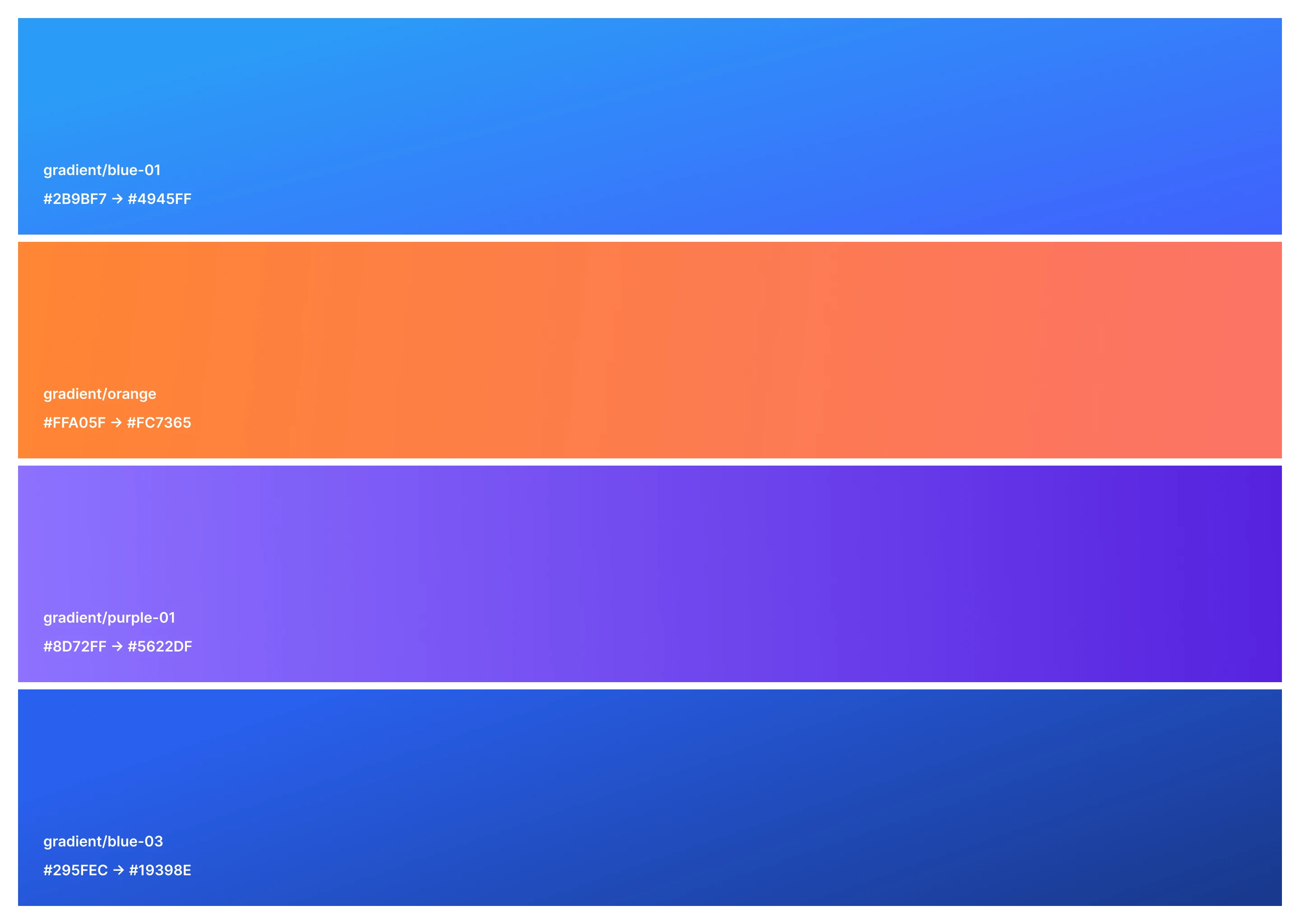
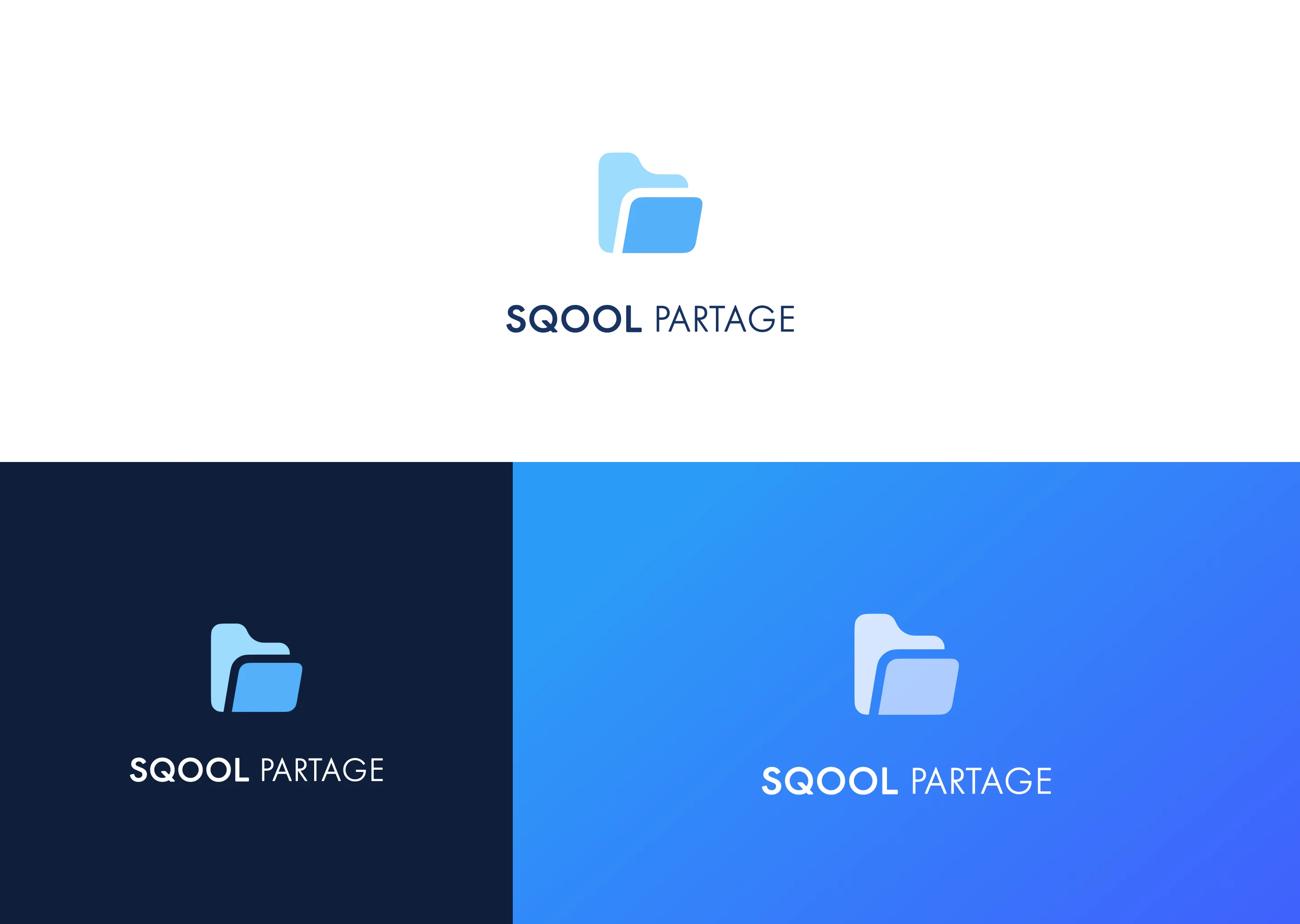
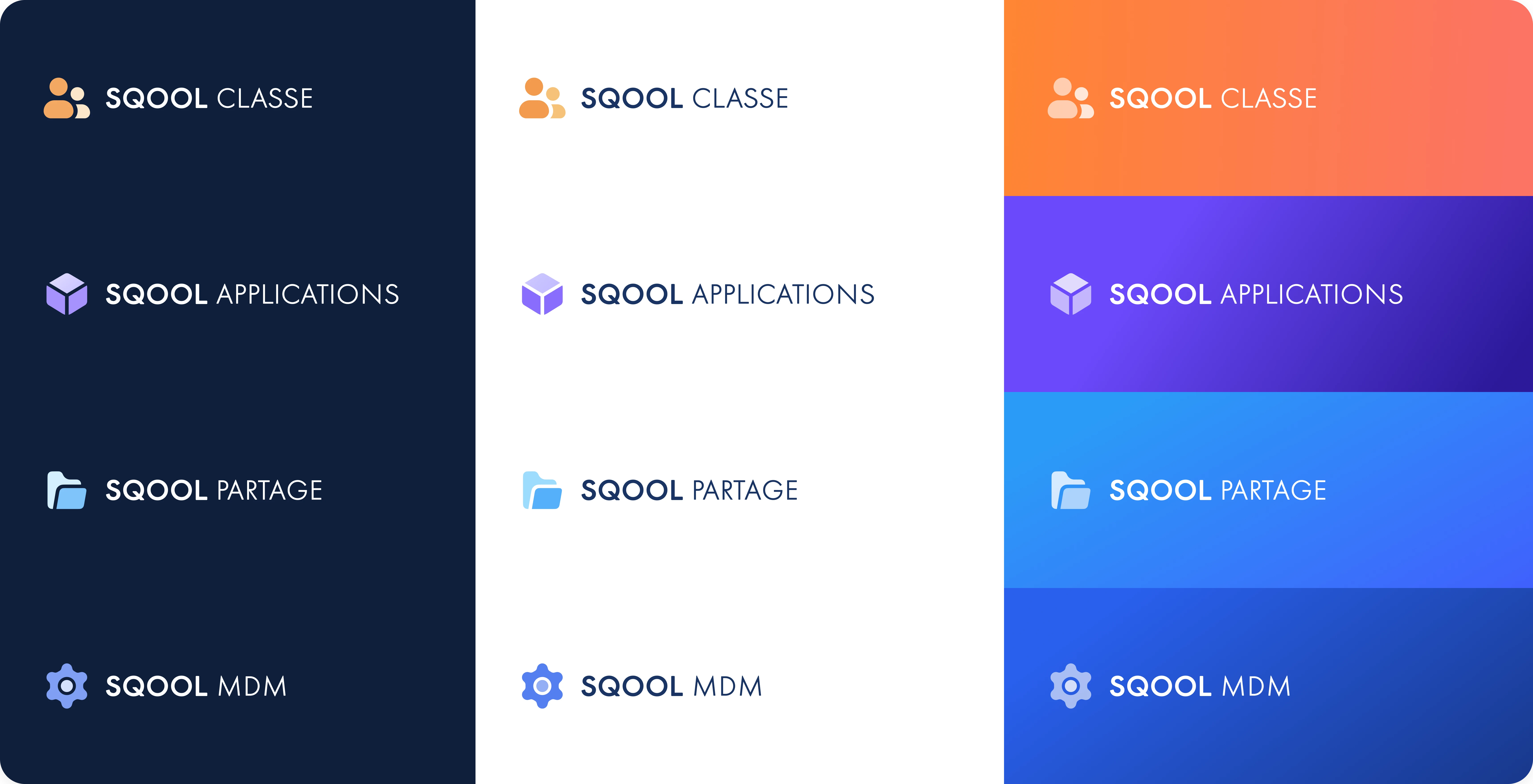
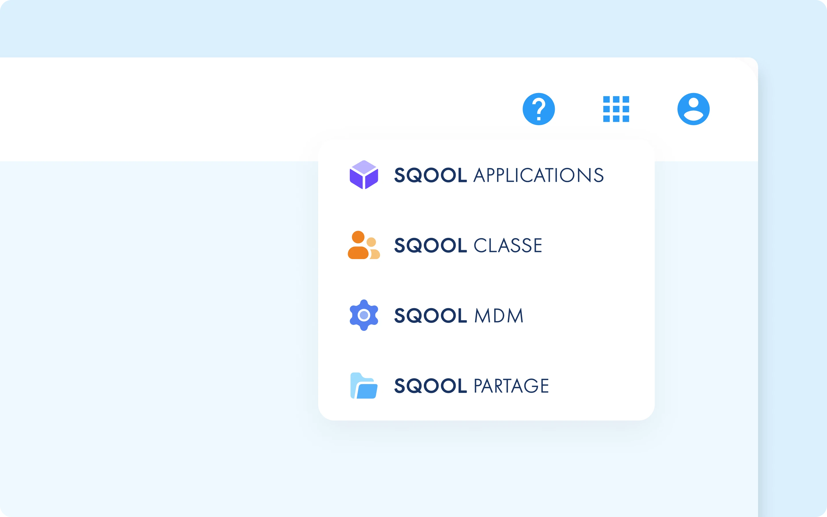
A suite of apps needs a shared identity. I designed the new SQOOL visual system: logos for each app, a color palette that distinguished them while keeping them part of a family, and interaction patterns that would feel consistent everywhere.
We partnered with agency Fllow to refine the brand. The result was a system that could scale to 7+ apps while maintaining recognition.
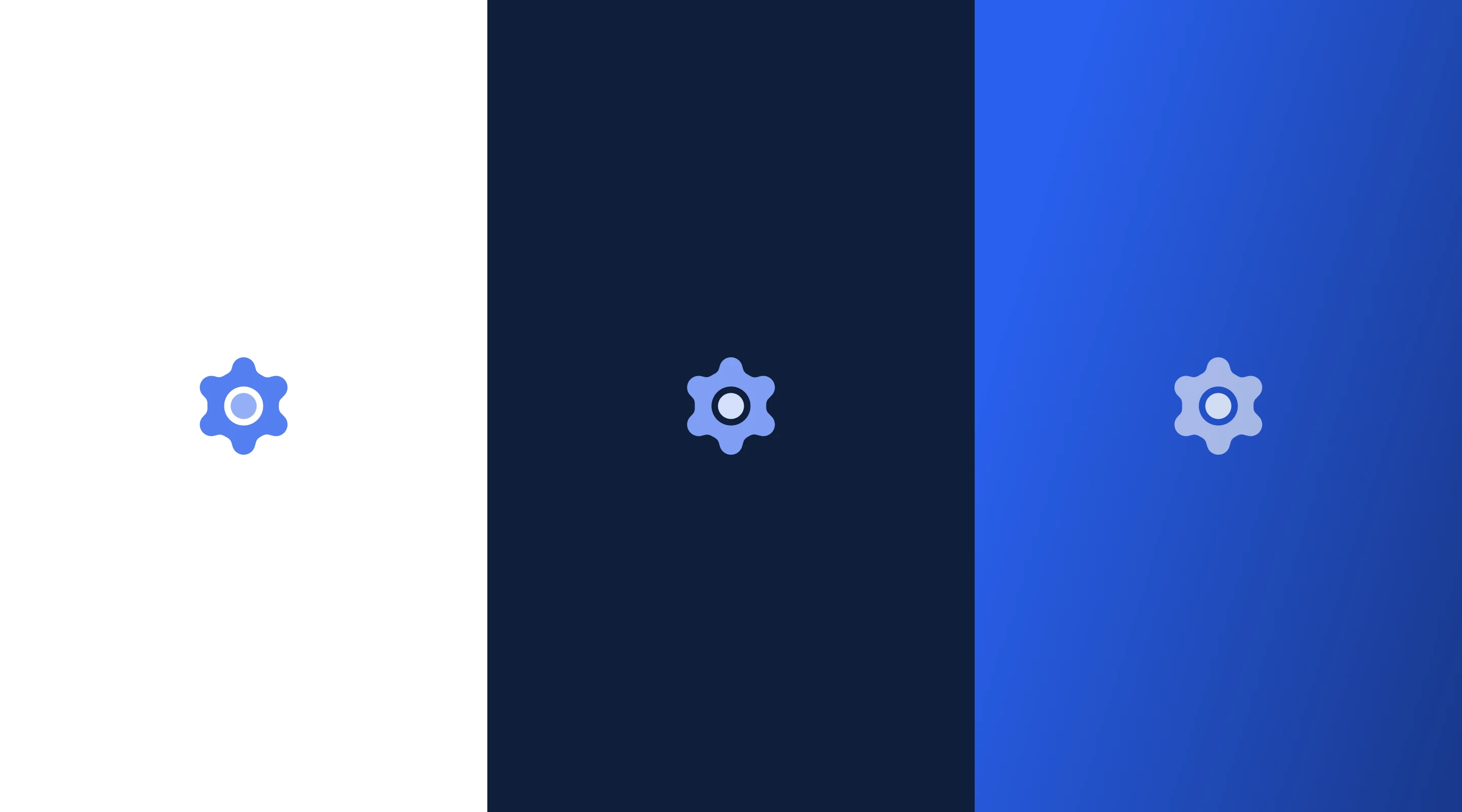
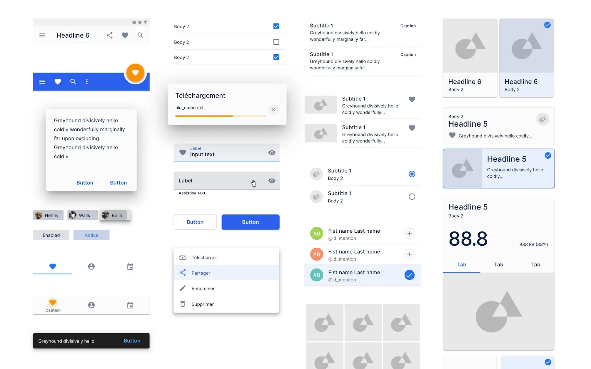
Design System as Infrastructure
With multiple teams building different apps, consistency became critical. I architected our Figma libraries and established documentation on ZeroHeight. The goal: any designer could start a new screen and have all the components they needed.
We implemented weekly design syncs and QA reviews to keep everyone aligned. When you use SQOOL Classe, then switch to SQOOL Partage, it feels like the same product family.
Phase 3: Shipping the Suite
2022-2024
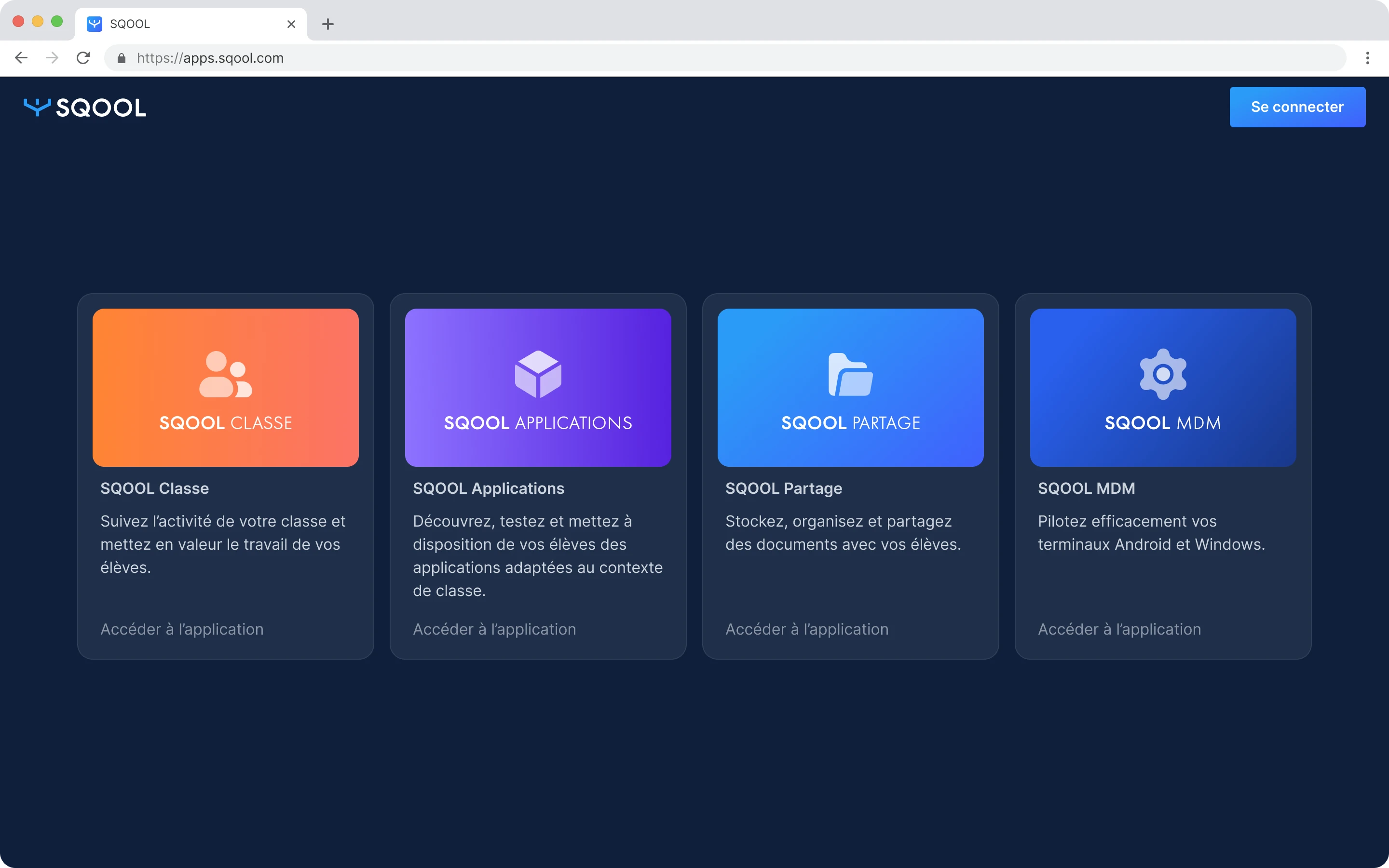
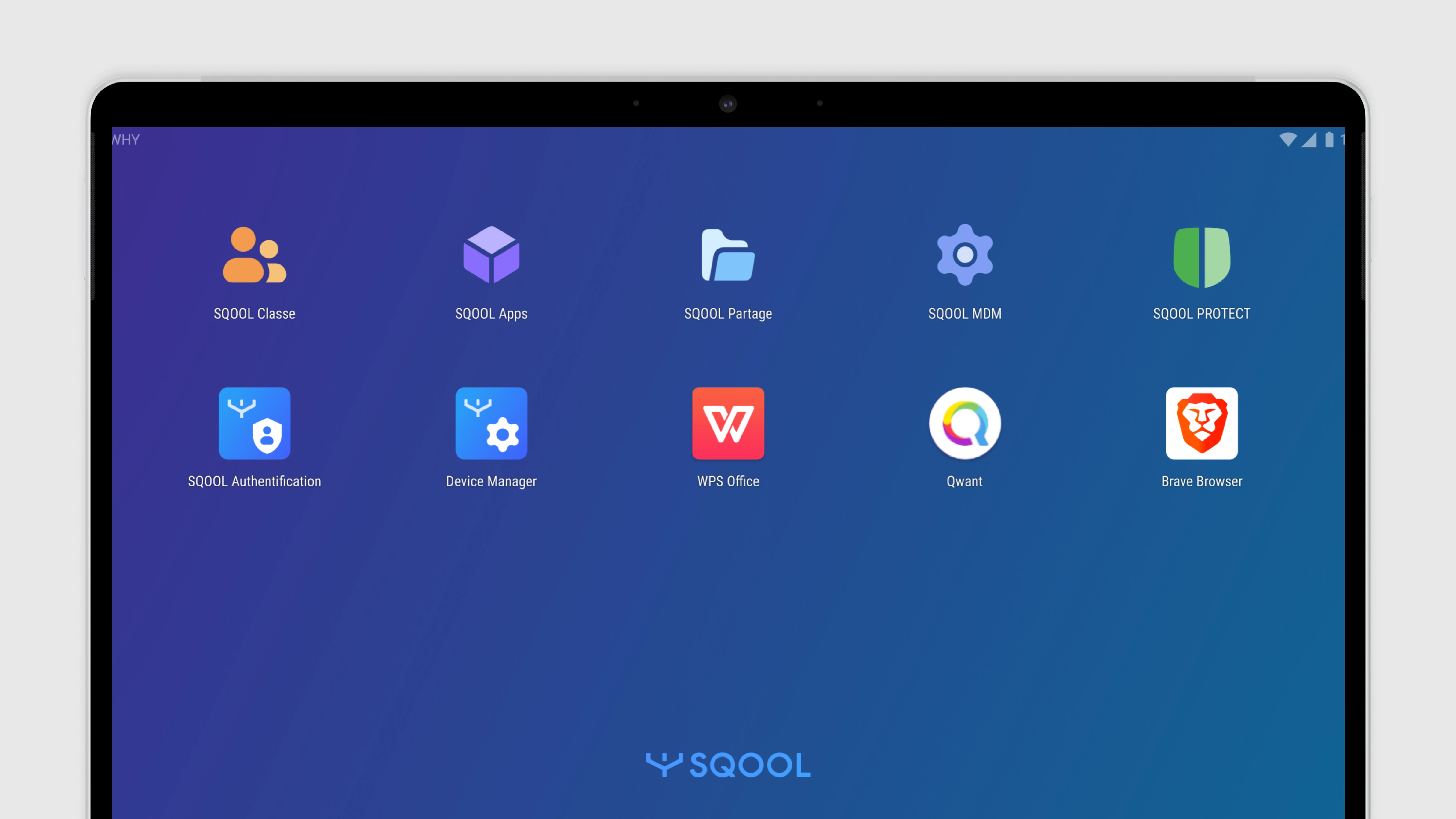
With our strategy defined and design system in place, we built and launched the specialized apps:
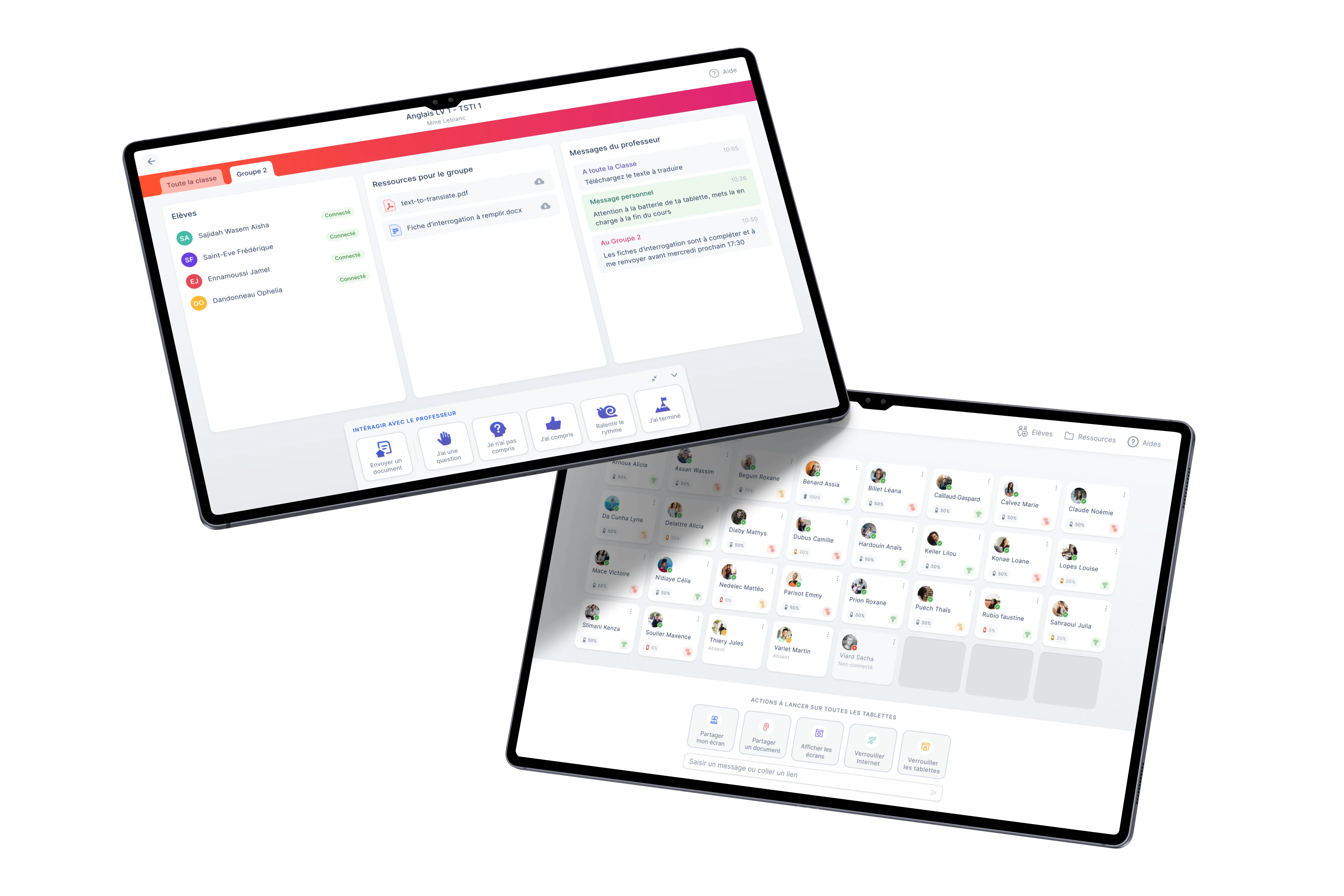
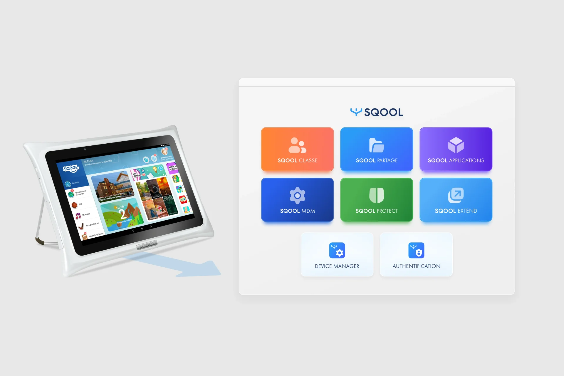
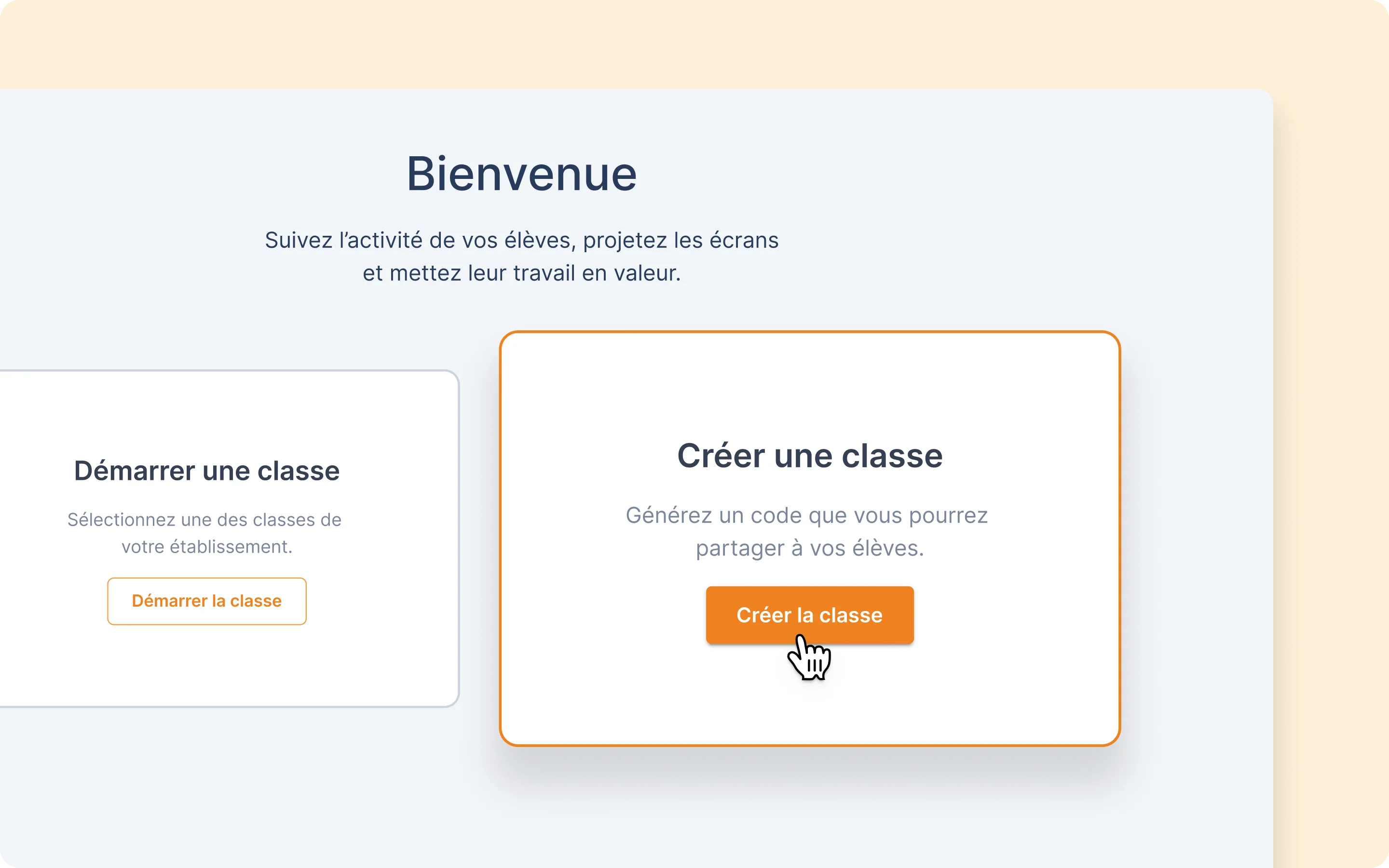
SQOOL Classe
Classroom supervision
Teachers see every student screen in real-time. They can lock devices, push content, and manage attention without leaving their desk. We learned that teachers don't want surveillance - they want to feel in control of their classroom.
User research insight: Teachers feared losing control when students had devices. Our grid-based view with color-coded status gave them confidence.
SQOOL Partage
File sharing
Drag and drop to share files with a class. No more USB keys, no more email attachments. We designed it to be as simple as AirDrop, but for classrooms.
User research insight: The biggest daily friction was getting a PDF to 27 students. We made it one gesture.
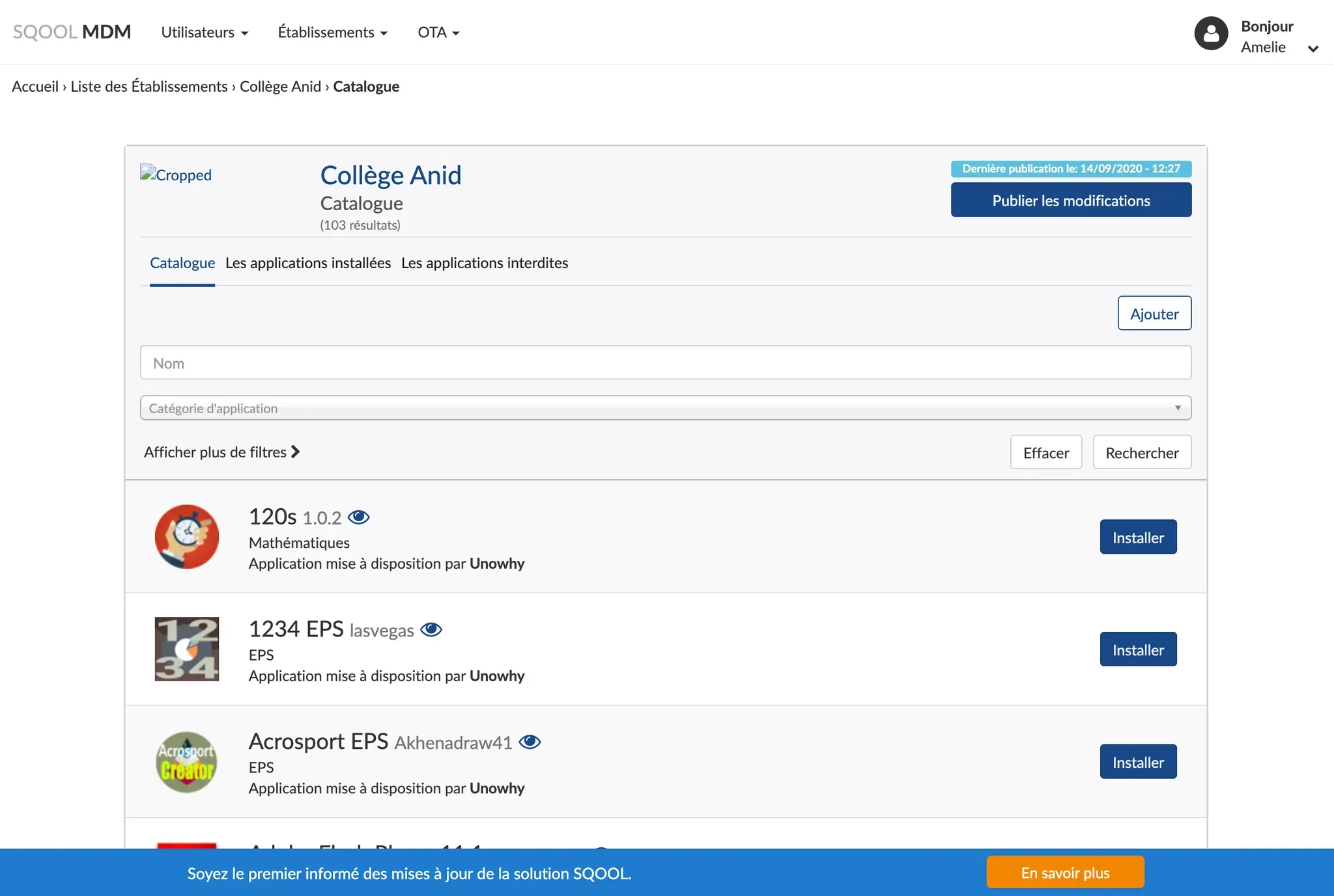
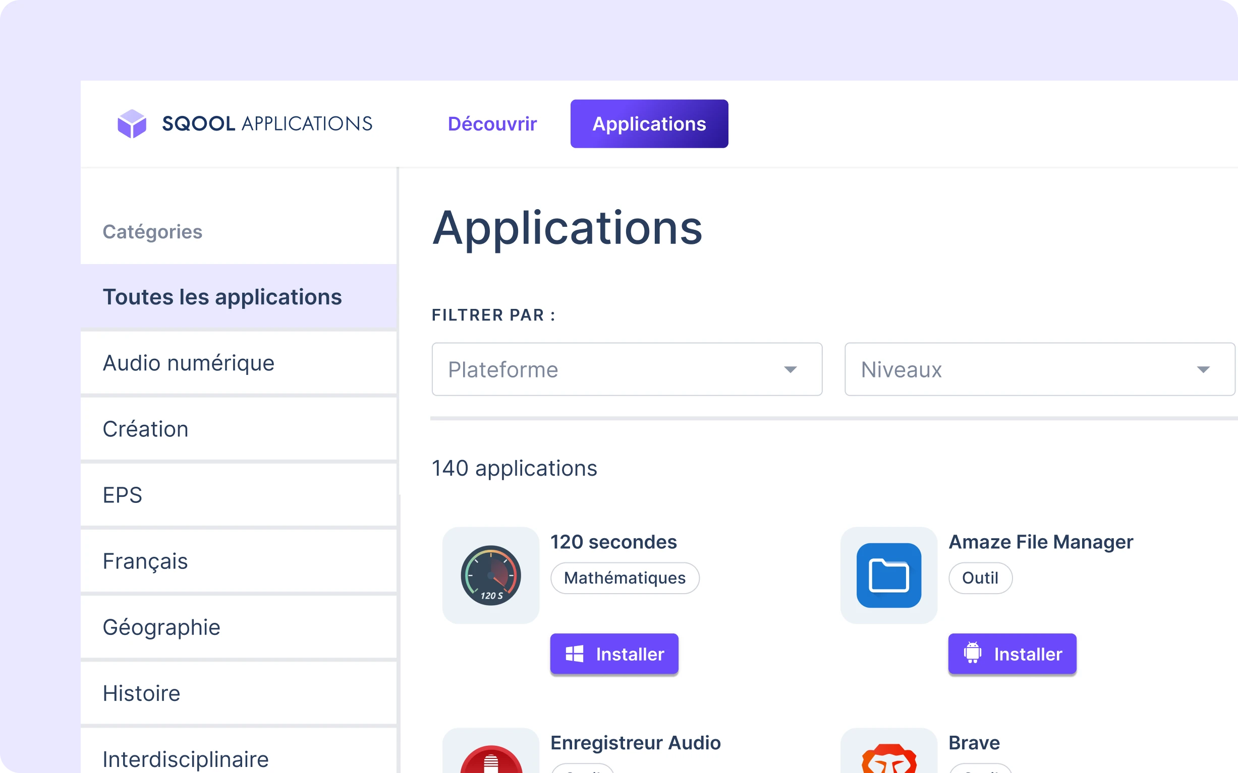
SQOOL Applications
App discovery
A curated catalog of educational apps. Teachers browse, IT admins deploy through the MDM. We pivoted from building an "app store" to being a discovery front-end.
SQOOL MDM
Device management
IT administrators manage 500,000 devices: security policies, app deployments, remote troubleshooting. We separated this complexity from teacher-facing tools.
SQOOL Protect
Parental controls
Parents set screen time limits for evenings and weekends. QR code pairing, 3-minute setup. We shipped in 3 months to thousands of devices.
SQOOL Extend
Cloud desktops
Heavy software on light devices. Students access virtual Windows desktops with professional tools installed. We designed loading sequences that reduced perceived wait time.
What We Learned From Users
Patterns that shaped our design decisions
Teachers don't collaborate in real-time
We tested Canvas, a collaborative whiteboard (like Figma). Teachers rejected it. They want to prepare content, distribute it, collect work, then grade. Sequential, not simultaneous.
Simplicity beats features
Every time we added options, adoption dropped. The apps that worked had fewer screens and clearer paths.
Design for bad WiFi
School networks are unreliable. We built graceful degradation into everything - apps show clear status when offline, not cryptic errors.
Consistency builds trust
When teachers move between apps, they don't want to relearn interfaces. Our design system paid off in user confidence.
Impact
Over six years, we transformed a hardware company into a modern SaaS platform. The design approach enabled scale across multiple products while maintaining consistency.
Students & teachers served daily500,000+
Schools equipped across Ile-de-France465
Web applications shipped7+
Designers recruited & managed5
Key Learnings
1. Prototypes can be more valuable than products
Connect never shipped, but it was our most important project. It proved our technology worked and showed us why our strategy was wrong.
2. Splitting the product was the biggest UX win
The decision to build focused apps instead of one platform reduced complexity more than any interface redesign could.
3. Design systems are about governance, not components
The hard part isn't building a button library. It's getting 30+ developers across 5 teams to use it consistently.