
Product Design, web, app, branding · Zero to one · 2023-2025
Designing construction management software that works
From Prototype to 2,000 Customers
Toolkit needed product design to secure funding and reach market fit in construction tech. Over 12 months, I led end-to-end design in a lean CEO-Dev-Designer team with continuous user validation. We shipped three major releases: funding prototype (3 months), feature-rich V2 (5 months), and mobile-optimized V3 (4 months). The product reached 2,000 paying customers within 24 months, secured enterprise adoption at launch, and raised Series A funding in November 2025.
Visit Toolkit"Victor worked with Toolkit as our UX/UI designer from the earliest stages. We ran discovery workshops together before even building the product, allowing him to deeply understand the construction industry. He transformed complex business requirements into perfectly adapted user flows, exactly what a startup like ours needed. Thanks to his experience, Victor also established foundational systems (UI kit, interaction patterns) that saved us considerable development time down the line."

Pierre-Marie Nigay
Founder @ Toolkit
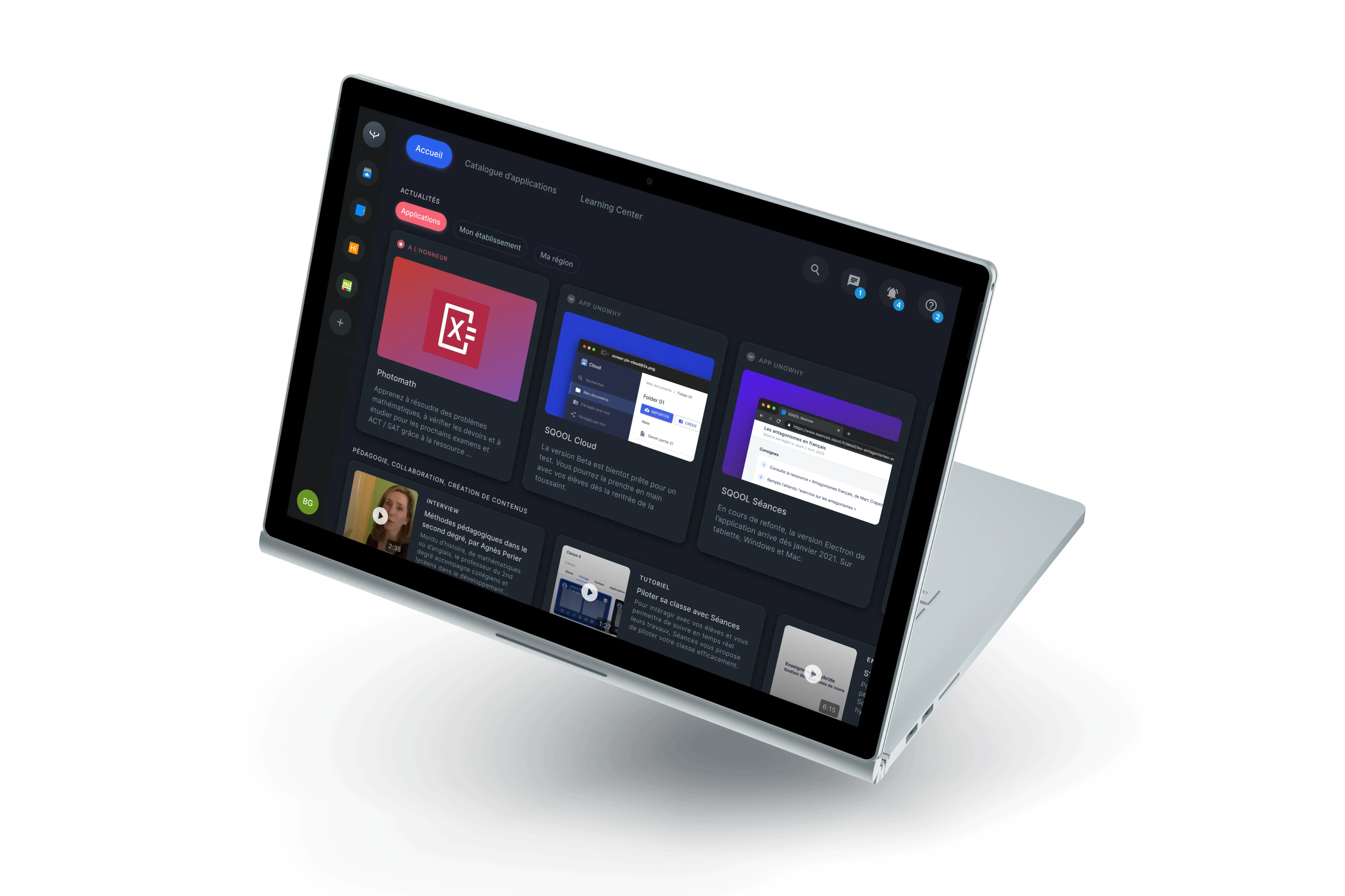
Toolkit App
Construction management software that works.
Overview
Introduction
Construction software is overwhelming. Legacy tools pack every feature into dense interfaces, forcing users through complex workflows to complete basic tasks. Site managers juggle multiple projects, field workers need quick status updates, and office teams require detailed planning. One interface cannot serve all needs equally.
Toolkit approached this differently. Rather than building another feature-complete solution, we focused on core workflows that construction teams use daily: planning tasks across zones, tracking progress, managing documents, coordinating teams. The challenge was delivering sophistication without complexity.
My role
I joined as sole designer in a three-person team. The CEO brought domain expertise from years researching construction workflows. The lead developer built the technical foundation. My role: transform business requirements into a scalable product that users would actually adopt. No design team, no researchers, no product managers. Just tight collaboration, continuous validation, and rapid iteration.
Project and impact
Over 12 months, we evolved from funding prototype to platform maturity. Each phase added sophistication while maintaining simplicity. Progressive disclosure hid complexity until needed. Context-aware interfaces adapted to user tasks. Batch operations reduced repetitive actions. Visual hierarchy prevented information overload at scale.
The approach worked. Enterprise customers deployed at launch. Users managing 15+ construction sites adopted the platform. The product reached 2,000 paying customers in 24 months and secured Series A funding. This case study shows how we got there.
Context and approach
Three phases from funding prototype to platform maturity. Phase 1 secured initial funding with core features. Phase 2 added sophisticated interactions and multi-project support. Phase 3 achieved mobile optimization and design system scalability. Result: 2,000 customers, enterprise adoption, Series A funding within 24 months.
Phase 1 · Months 1-3
Foundation
Establishing the core architecture and essential workflows.
Key Deliverables
•Core authentication & navigation architecture
•Project creation & management workflows
•Task library with drag-drop sequences
•Planning V1 with colorful task cards
•Subscription system (individual + enterprise)
•PDF export functionality
Core Design Challenge
Planning interface showing the fundamental tension: construction projects contain 50-100+ tasks across multiple zones and timelines.

Core Design Challenge
Research process
Lean validation in a three-person team. Microsoft Clarity provided behavioral analytics. CEO conducted 5-7 user calls weekly.

Research process
Foundation
MVP scope securing initial funding. Core infrastructure: passwordless auth, dual sidebar navigation, project workflows.

Foundation
Product Creation Workflow
Four-step process from project basics to team launch. Progressive disclosure design: setup steps prominent during creation, automatically collapse once project active.

Product Creation Workflow
Core Interaction Principles
Design principles preventing feature bloat. Progressive disclosure, context awareness, batch efficiency, visual hierarchy.

Core Interaction Principles
Phase 1 - Foundation
1st time experience
Passwordless authentication
Magic link login eliminates password friction for field workers sharing devices.

Passwordless authentication
Empty state
Greeting new users with primary sidebar navigation introduced.

Empty state
Form design pattern
Mobile-first approach used across all the application.

Form design pattern
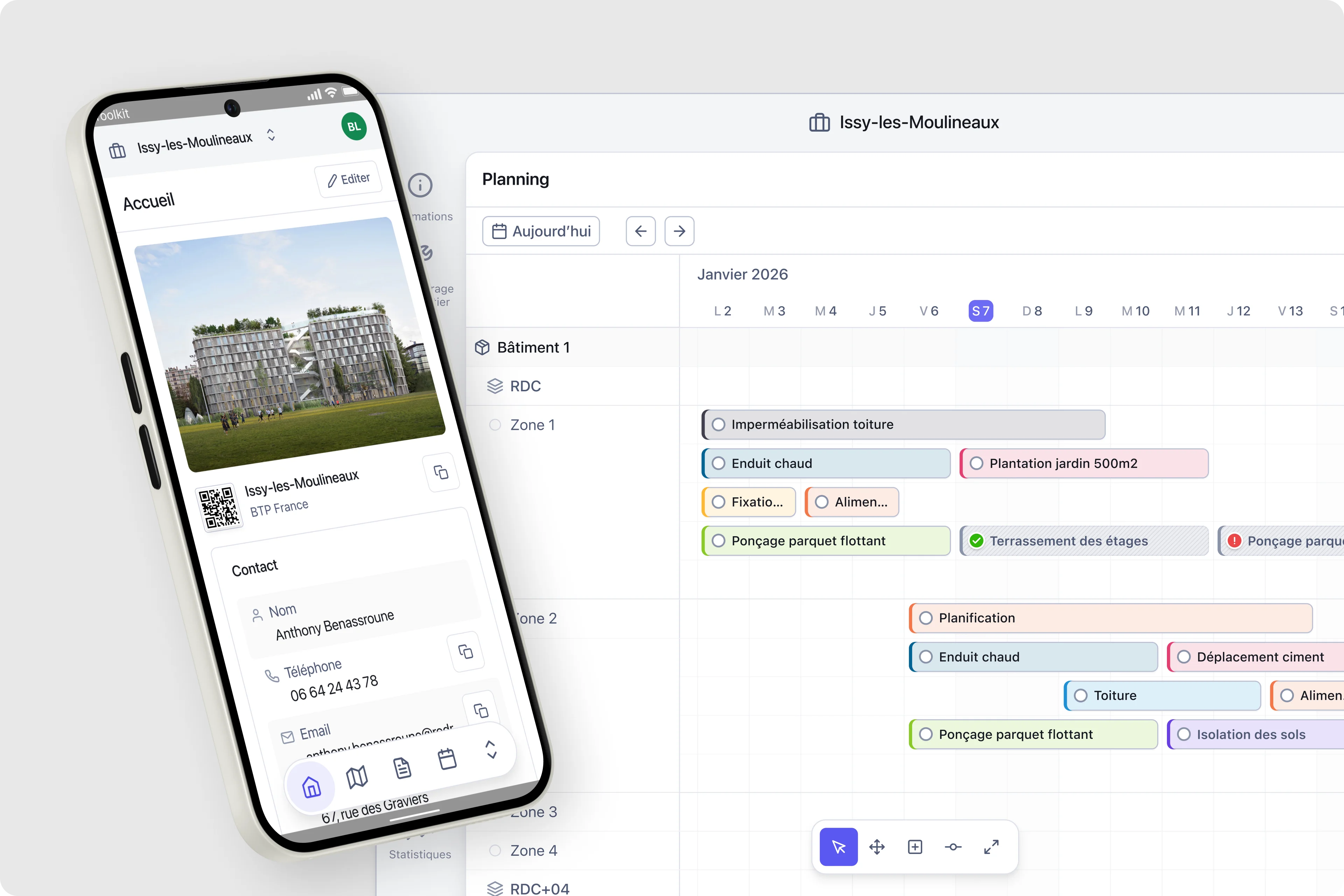
Chantier Detail v1
Early desktop layout establishing dual sidebar architecture.

Chantier Detail v1
Chantier Detail v2
Removed the metadata informations to the edit view. We only kept contact information display at 1st sight.

Chantier Detail v2
Show and Hide navigation
Secondary sidebar collapsing and expanding on demand. Setup sections (zones, companies, task libraries) prominent during project creation, collapsing once project active. Operations sections (planning, documents, observations) surfacing as primary navigation. Progressive disclosure: complexity hidden until relevant, interface adapting to project lifecycle stage.
Navigation show/hide
Secondary sidebar collapsing and expanding on demand.
Tasks
Reusable templates with title, estimated duration, and responsible trade. Grouped in libraries by site type, they reduce repetitive data entry and ensure consistent information across projects.

Task creation
Assisted task creation for quick addition and task setting for each phase of the project.
Sequences
Ordered sets of tasks that populate the planning automatically when applied to a project. Sequences encode team expertise into repeatable workflows, cutting setup time significantly.

Tasks sequences
Templating is part of Toolkit DNA. The construction planner can set and save task sequences in a library to speed up site planning.
Planning
Gantt-style canvas organized by trade or zone. The initial version used colorful task cards for quick visual parsing. Later iterations refined the task component design and the interaction model around scheduling and multi-select.

Planning v1
First planning canvas with colorful task card aesthetic. High visual weight worked well with 10-15 tasks but became overwhelming at 50-100+ tasks.
Task component v1
Multiple sizes and variations for different display contexts.

Task component v1
Task component v2
Refined system with four interaction states. Height reduced, colors desaturated, contrast improved.

Task component v2
Planning v2
Planning canvas evolution with refined visual system. Multiple zones and 50+ tasks visible simultaneously without overwhelming interface.

Planning v2
Multi-select
Rectangle drag enabling batch operations across zones and timeline.

Multi-select
Context menu
Adapting to selected task with prioritized actions.

Context menu
Adaptive zoom
View controls toggling between day, week, month scales.

Adaptive zoom
Expand layout on planning view
To enhance ease of use on the planning we implemented a way to expand the layout to focus on task management, without getting confusion with navigation panel.
Expand layout
Zoom in and out on the planning canvas for better focus.
Phase 2 - Feature expansion
With the foundation validated, Phase 2 focused on expanding capabilities while maintaining simplicity. We introduced a dynamic menu system that adapts to user context, reducing cognitive load and streamlining workflows. The challenge was adding power features without cluttering the interface.
Dynamic menu system
The dynamic menu adapts to the current task context. When editing a task, relevant actions surface immediately. When viewing activity logs, filtering options take priority. This context-awareness reduces navigation steps and keeps users focused on their current workflow.

Dynamic island menu
Contextual task modification with quick actions and status updates.
Task manipulation in planning
Edit duration and task information on the fly directly from the planning canvas.
Task manipulation
Edit duration and task information on the fly.
Batch edition
Select a zone or multiple tasks on the canvas, apply parameters in 20 seconds. Users managing 50-100+ tasks need efficient ways to apply changes across groups.
Batch edition
Select a zone or multiple tasks on the canvas, apply parameters in 20 seconds.
Interface system
Component architecture for the dynamic menu, ensuring consistency across different contexts.

Interface system
Activity section behavior
Task detail view with dynamic menu showing activity log and contextual actions.

Activity section behavior
Phase 3 - Platform maturity
Phase 3 brought platform maturity with the project hub and mobile evolution. Enterprise customers needed to manage multiple construction sites from a single dashboard. Field workers needed mobile access that matched the desktop experience. We delivered both without compromising either.
Project hub
The project hub provides a bird's-eye view of all construction sites. Managers can quickly assess progress, identify bottlenecks, and drill into specific projects. Visual indicators surface urgent items without requiring deep navigation.

Project hub v3
Multi-site dashboard with progress indicators, quick actions, and filtering capabilities.
Mobile evolution
Construction happens on-site, often in challenging conditions. The mobile experience needed to be robust, fast, and usable with gloves. We redesigned the navigation system for touch-first interaction while maintaining feature parity with desktop.

Mobile navigation evolution
Touch-optimized menu system with gesture support and thumb-friendly action zones.
Design system foundation
A three-person team cannot afford to redesign components for every feature. We built a design system that scaled with the product: reusable components, consistent patterns, and a shared visual language. This foundation enabled rapid iteration while maintaining quality.

Design system
Component library with tokens, patterns, and usage guidelines for consistent implementation.
Icon system
Custom icon set for files and folders, optimized for construction document management.
Icon system
Impact
The design approach delivered measurable business results. By focusing on core workflows and progressive complexity, we created a product that both enterprise customers and small teams could adopt quickly. The numbers tell the story.

Project impact
Key metrics and milestones achieved over the 12-month product development cycle.
2,000+
Paying customers within 24 months of launch
Series A
Funding secured in November 2025
Enterprise
Customers managing 15+ sites adopted at launch