
Product Design Lead · UX Strategy, UI Design, Prototyping · 2020-2021
A web-based dashboard concept and persistent interaction prototype for classroom orchestration
Replacing a legacy Android launcher with modern, modular interfaces
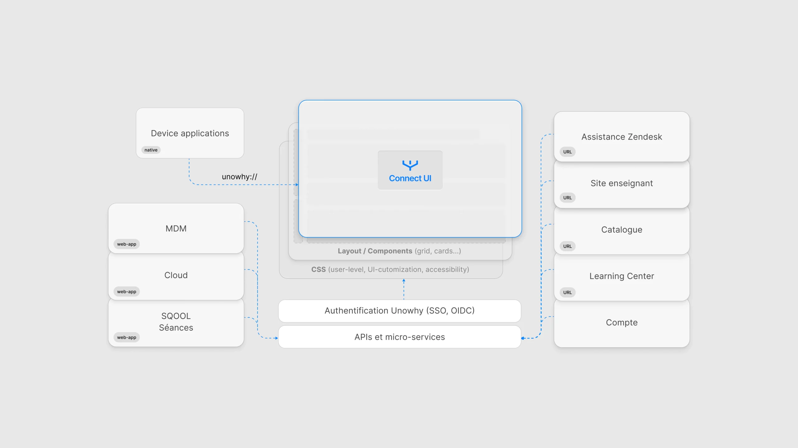
By 2020, UNOWHY's Android launcher was increasingly difficult to maintain and evolve. The launcher acted as the main interface for students to access content, but it had become outdated and unsustainable on new Android systems. We envisioned Connect as a modern, web-based dashboard to replace the launcher for teachers and students, offering modular access to apps, session tools, and notifications. In parallel, we conceptualized "The Bubble", a persistent contextual UI prototype that would float above Android UI, offering quick and smart interactions.
Overview
Introduction
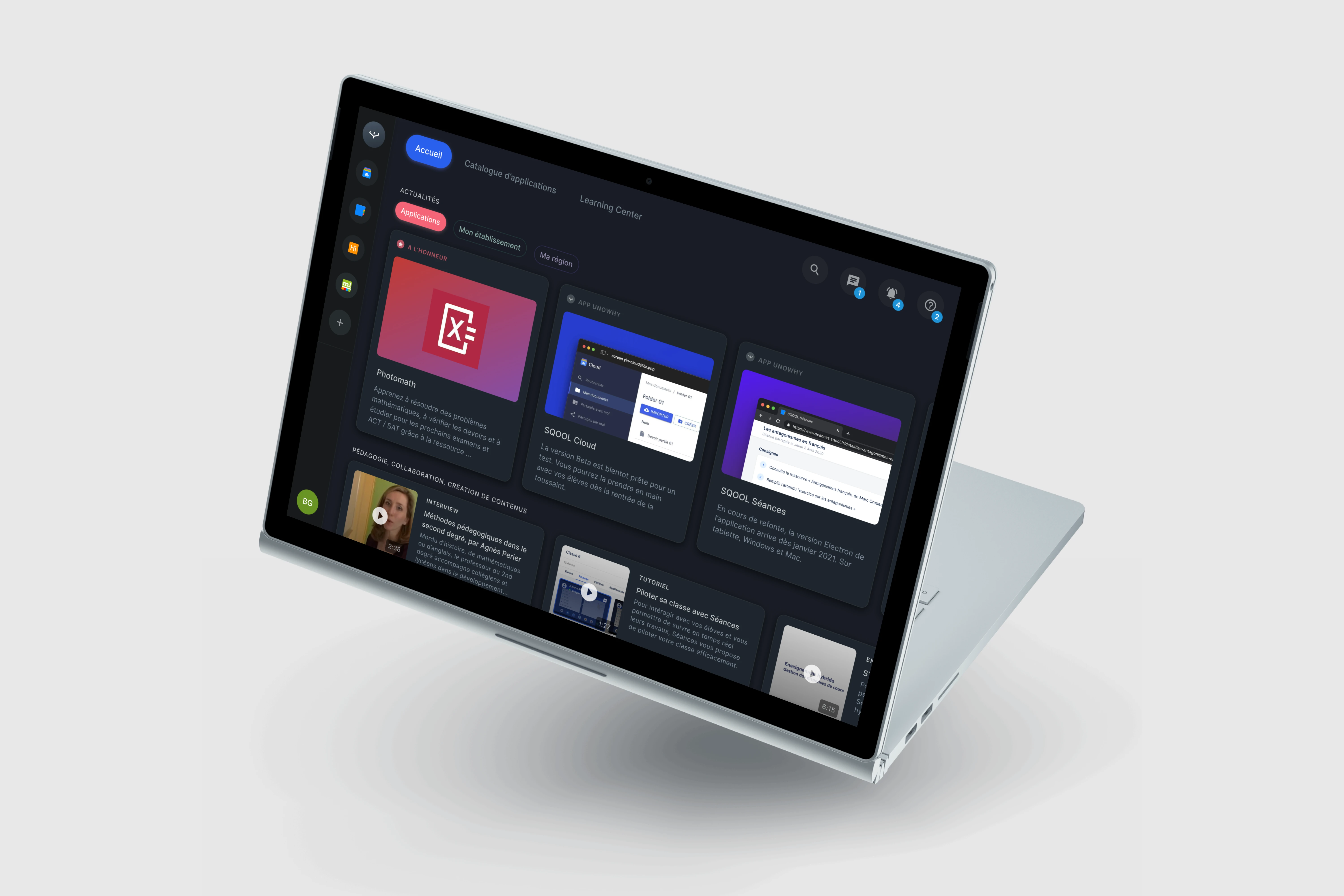
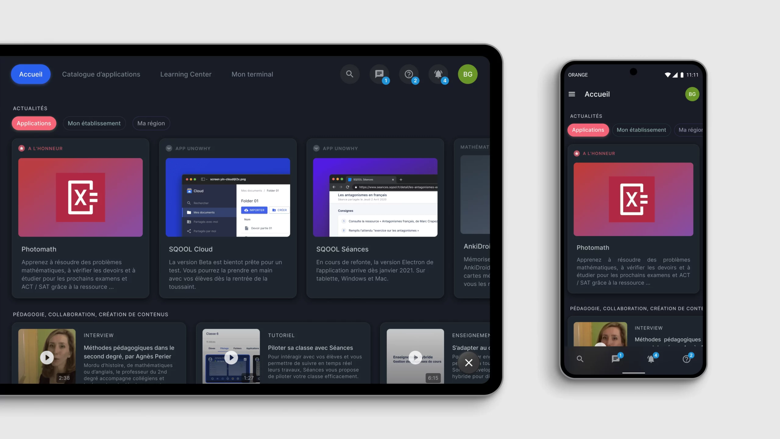
Between 2020 and 2021, the French EdTech company UNOWHY faced a turning point. Its long-standing Android-based launcher had reached technical and conceptual obsolescence. Originally built for primary and middle schools, the launcher offered limited flexibility and a user experience that no longer reflected modern pedagogical practices, especially for high schools entering France's ambitious Plan Lycée Numérique. At that critical juncture, I led the design of a proof-of-concept platform we called Connect: an integrated web-based dashboard interface that brought together classroom control, onboarding, app access, and persistent UI experimentation. Its goal wasn't to be shipped as-is, but rather to crystallize a vision for the future of educational interfaces at UNOWHY and provide a tangible experimentation platform.
Goals
- •Replace the obsolete Android launcher with a web-first, modular alternative
- •Centralize classroom pilotage features in one interface
- •Offer application store, onboarding, notifications, and search
- •Provide a simple, extensible UI system that could scale to future tools
- •Experiment with new interaction paradigms (e.g., persistent modules like "la Bulle")
Role and scope
Product Design Lead (UX strategy, UI design, prototyping, interaction design). Initiator and co-author of the project vision and interaction model. Designer and presenter of motion prototypes, interaction flows and specs. Contributor to the PRD and onboarding flows. Designed all core UI systems: app grid, quick actions, notifications, modals. Collaborated daily with our React developer to shape the prototype dashboard.
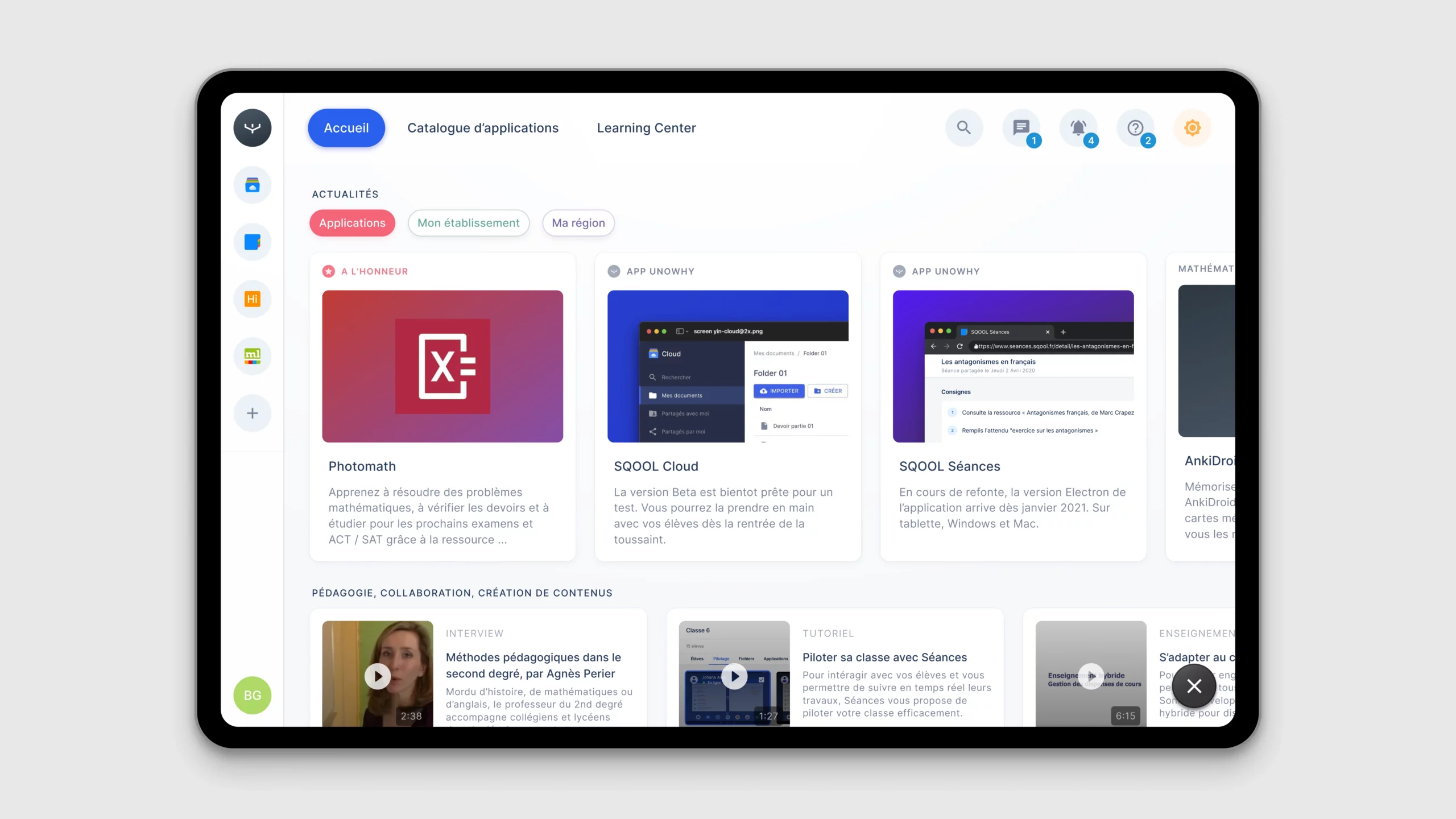
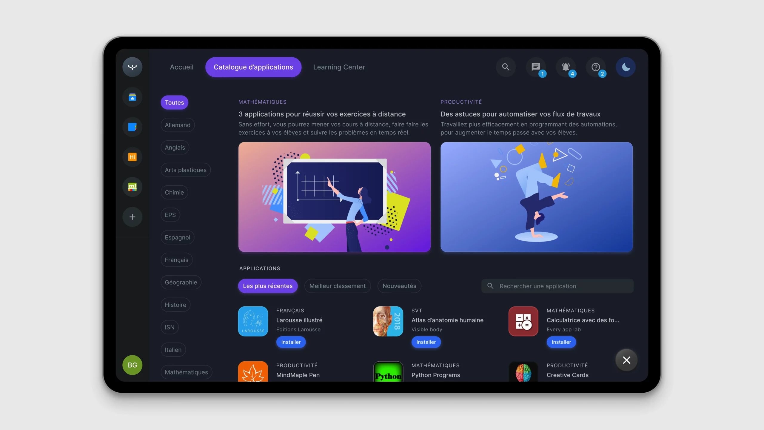
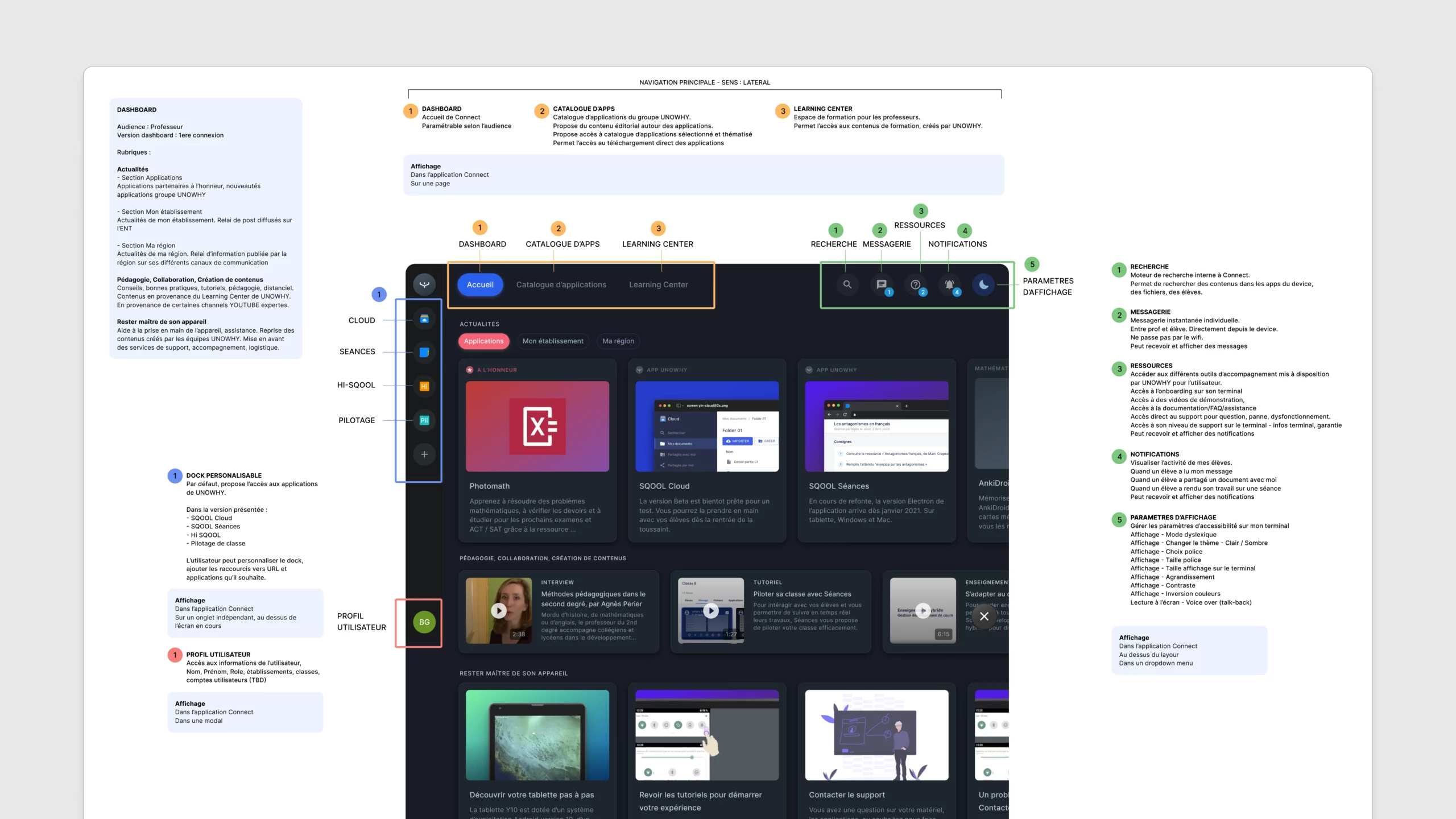
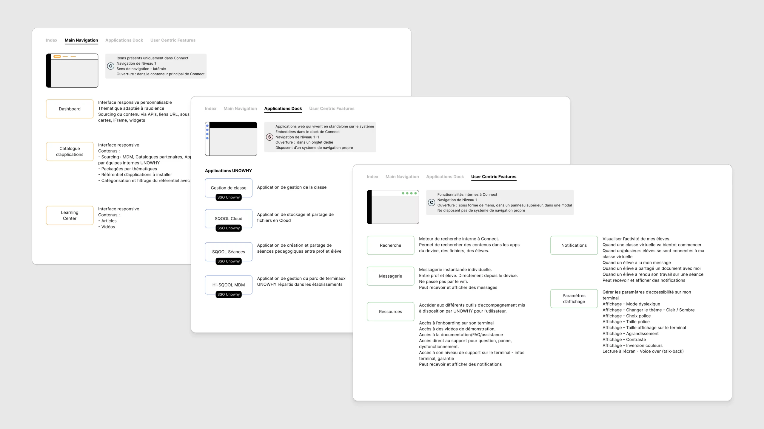
The Dashboard: A New Starting Point
The core of Connect was a modular dashboard interface. Inspired by desktop operating systems, it enabled teachers to access quick actions (e.g., lock screens, share files, open apps remotely), visualize class status (who's connected, device health, participation), browse and launch apps from a personalized catalog, and receive and manage notifications such as work submission or session events.
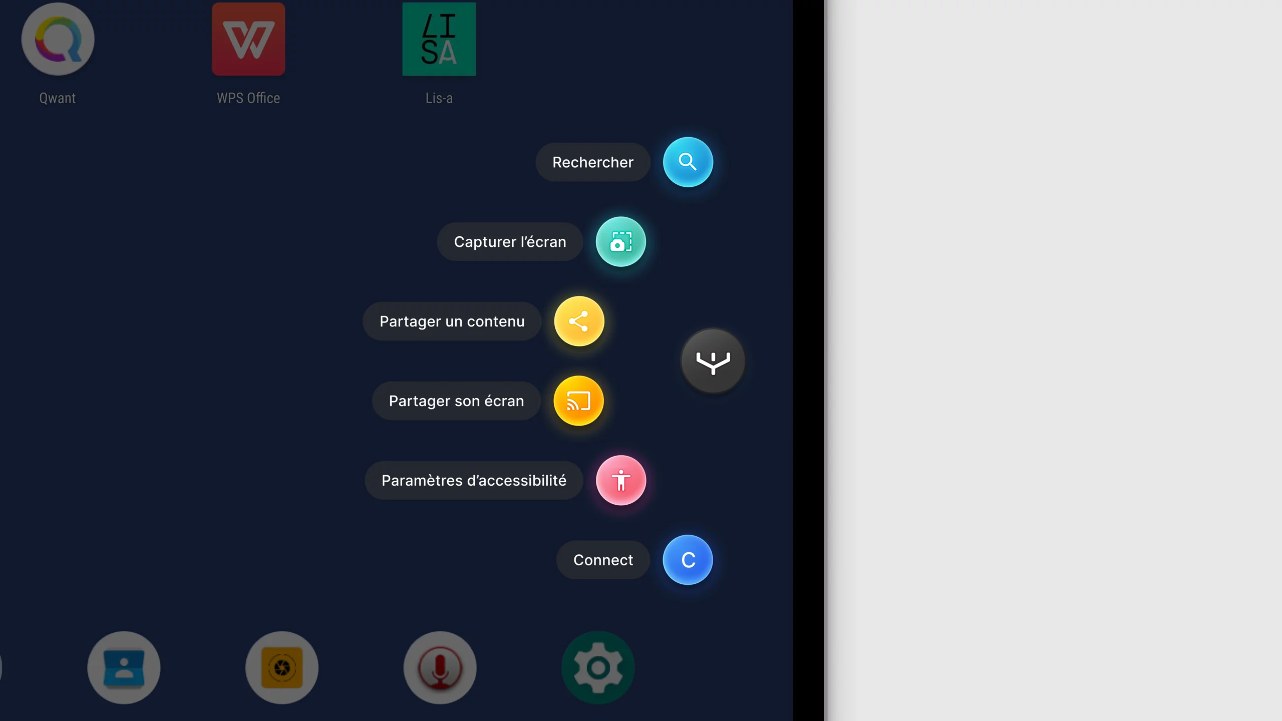
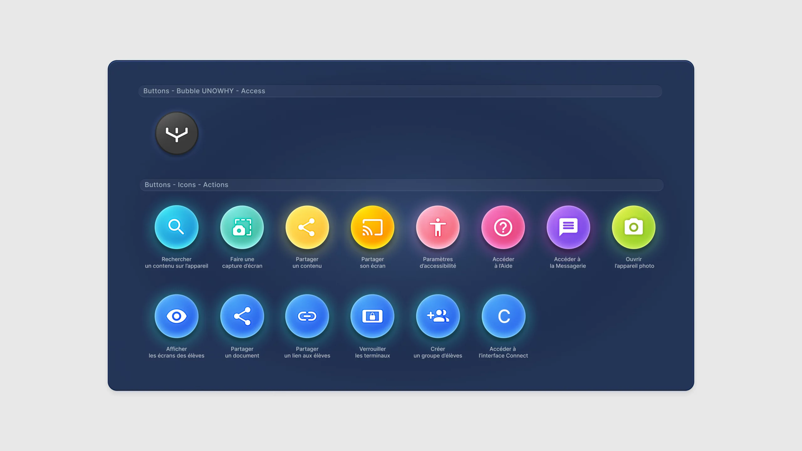
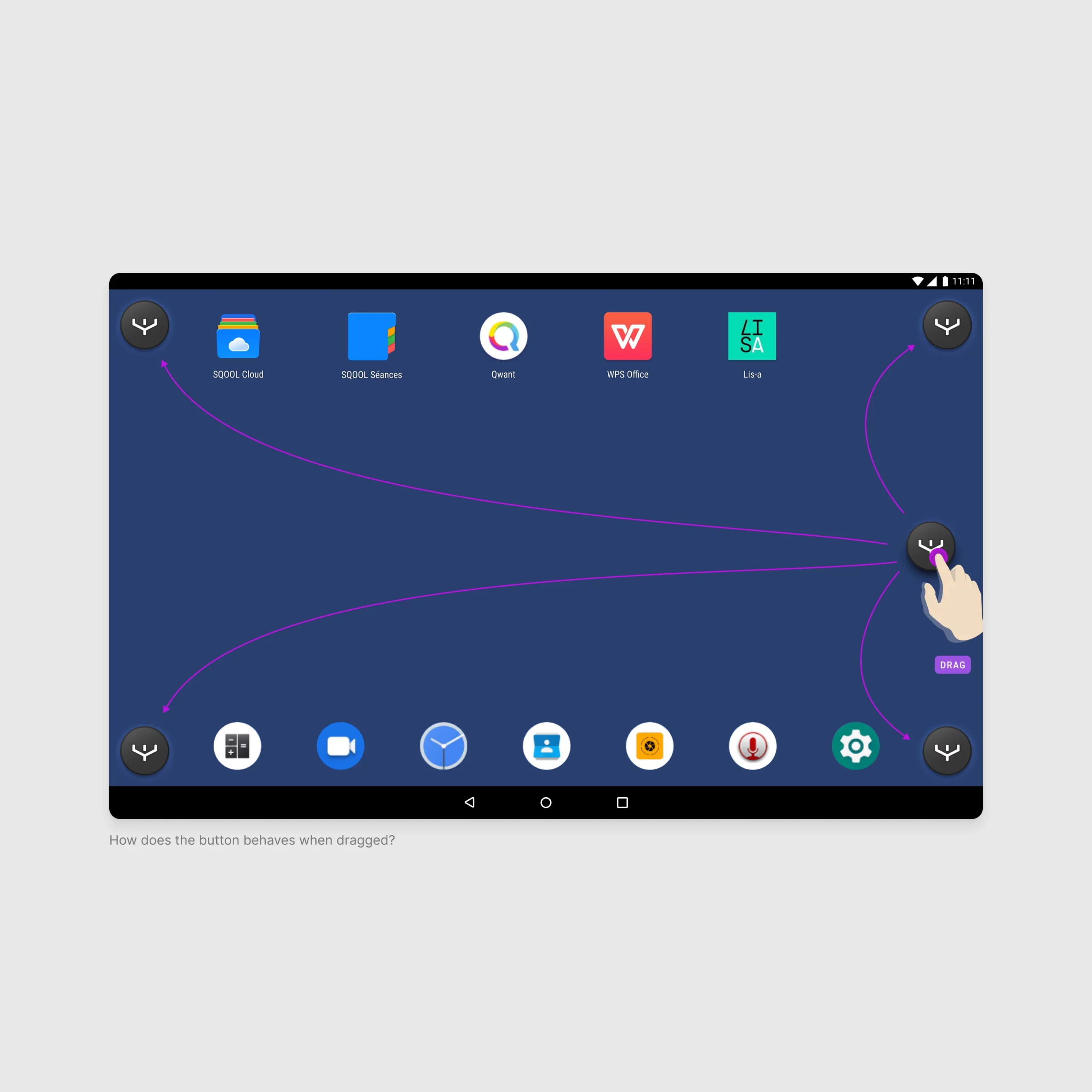
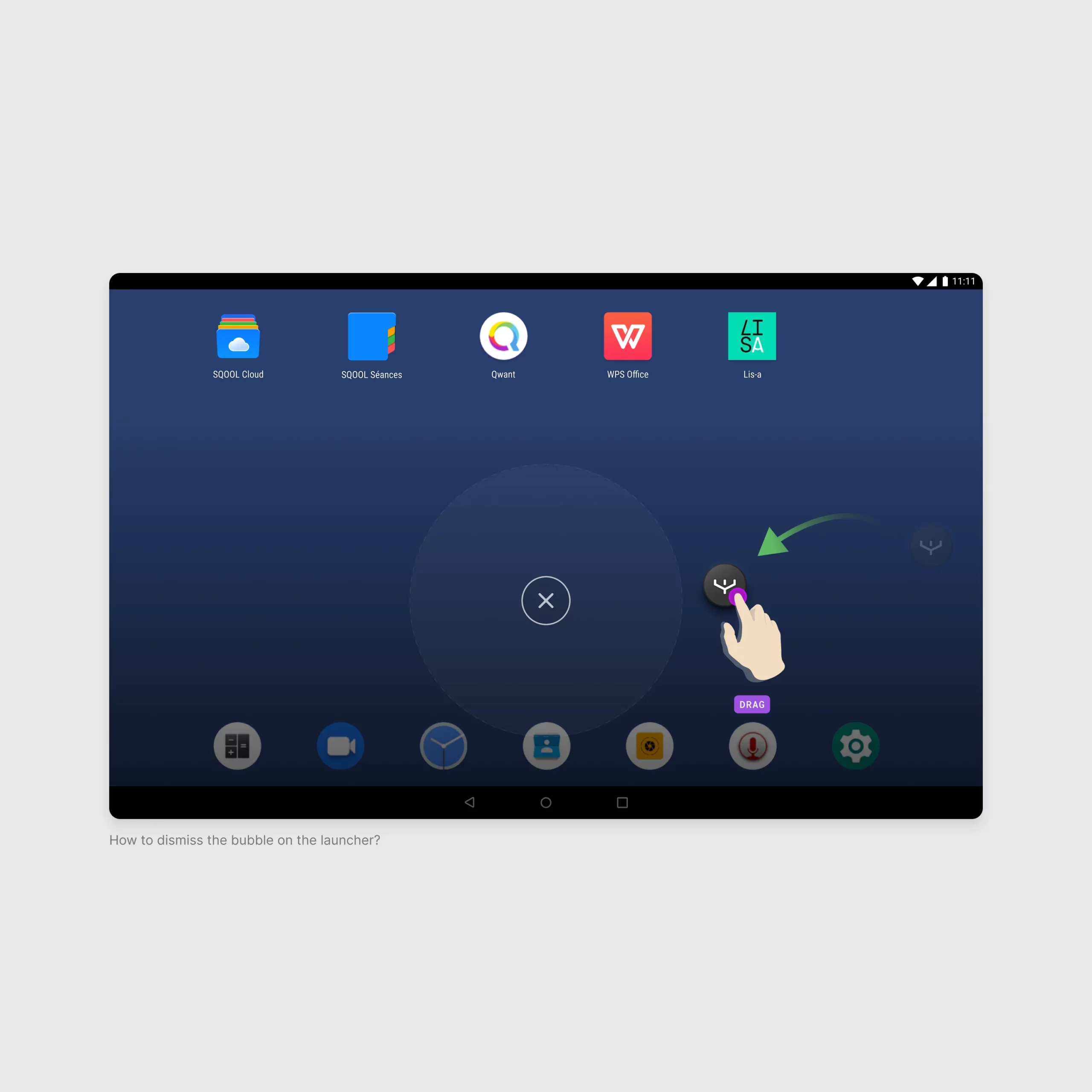
La Bulle - A Vision-Driven Experiment
One of the boldest explorations was "la Bulle": a floating, persistent UI module inspired by gaming overlays or stylus menus (e.g., Samsung Galaxy Note's radial shortcuts). We imagined it as a visual presence on student tablets, a motion-rich bubble that opened a radial or vertical menu, and a context-aware assistant offering shortcuts, search, capture, and sharing capabilities.
Prototype d'interaction
Full demonstration of the bubble's capabilities including shortcuts, search, and sharing features.