Product DesignerAndroid Wear, Material Design2015
Bringing PagesJaunes to Your Wrist
Designing a glanceable local search experience for Android Wear
A two-month design sprint to bring France's leading local directory to wearables. Working in a tight duo with Android developer Thibault Fighiera, we shipped a fully functional Android Wear app from concept to Google Play.
TypeWearable App
ScopeProduct Design
PeriodOct-Dec 2015
CompanyPagesJaunes
"Victor designed a complete wearable experience from scratch in two months. His ability to understand the constraints of a new platform and translate them into a coherent design language was impressive."
TF
Thibault Fighiera
Android Developer @ PagesJaunes
Overview
The Context
PagesJaunes wanted to experiment with wearable technology. Android Wear was emerging as a platform, and we saw an opportunity to help users find local professionals in the most contextual way possible: right from their wrist.
The Challenge
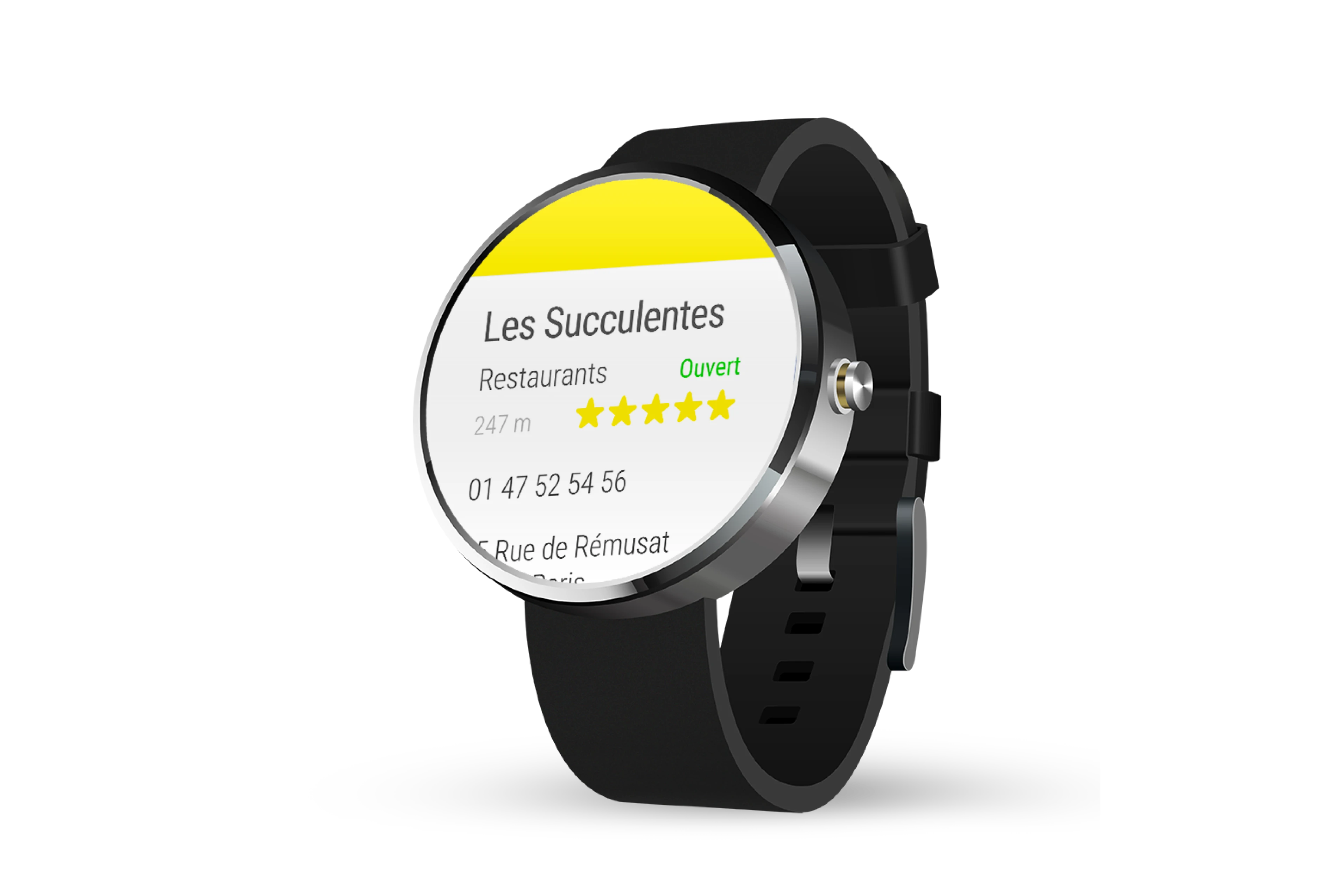
Design a complete local search experience for a 280dp circular screen. Users needed to find businesses, view key info, and take action (call or navigate) in seconds, not minutes.
My Role
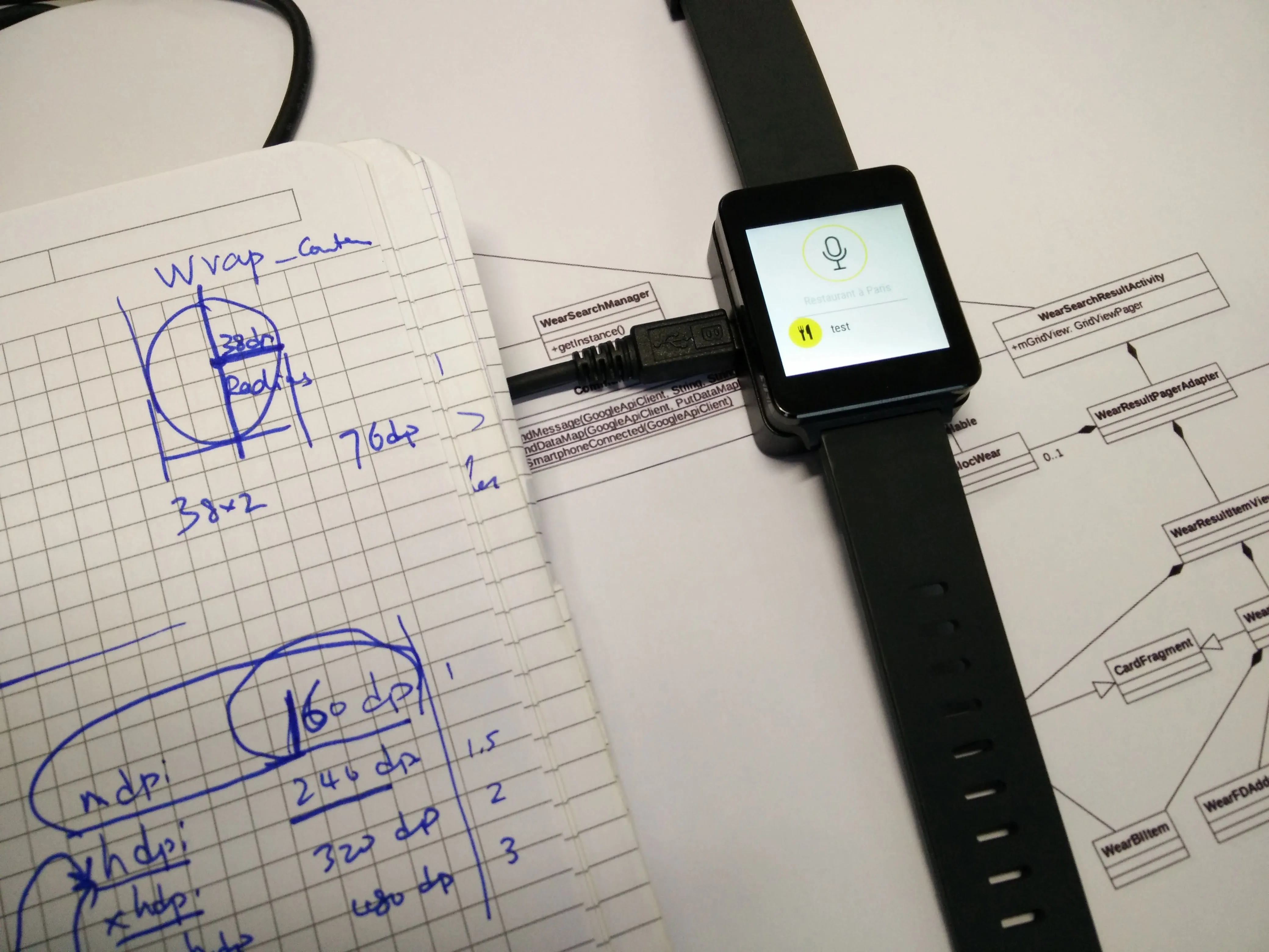
I owned the full design process: user research, persona creation, sketching, wireframing, UI design, interaction specs, prototyping, and stakeholder presentations. Working back-to-back with our developer for rapid iteration.
User Scenario
""It's noon, Julien is hungry. He wants to quickly find a restaurant near the office and get directions.""
Julien, 25 years old
Busy professional, always on the go. Uses his phone for everything but wants faster access to quick tasks. Early adopter of wearable tech.
- •Find nearby businesses in seconds
- •Get key info at a glance (open/closed, rating, distance)
- •Take action quickly (call or navigate)
- •Minimal interaction, maximum result
Design Approach
Learn the Platform
Deep dive into Android Wear guidelines. Understanding the constraints: circular screens, ambient mode, voice input, phone handoff patterns.
Define the Flows
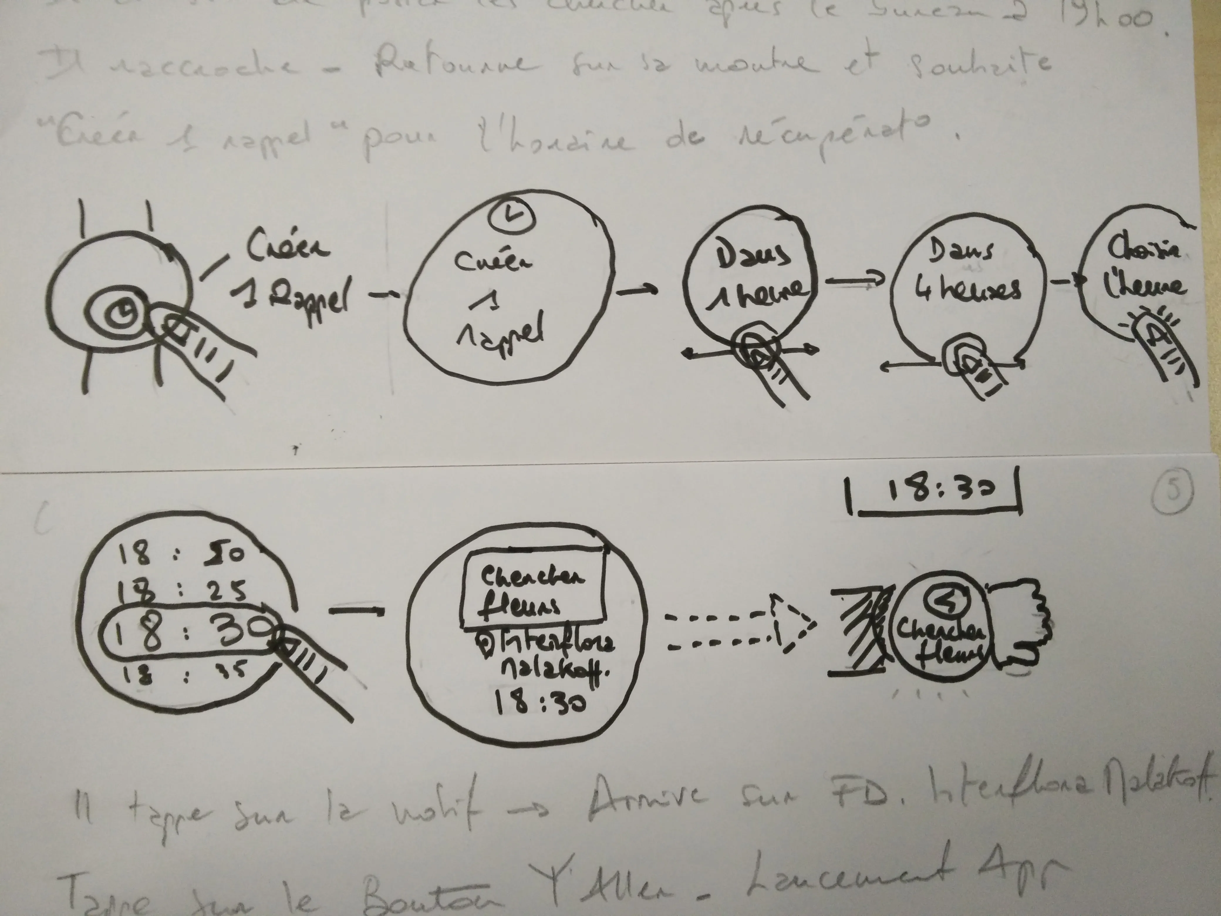
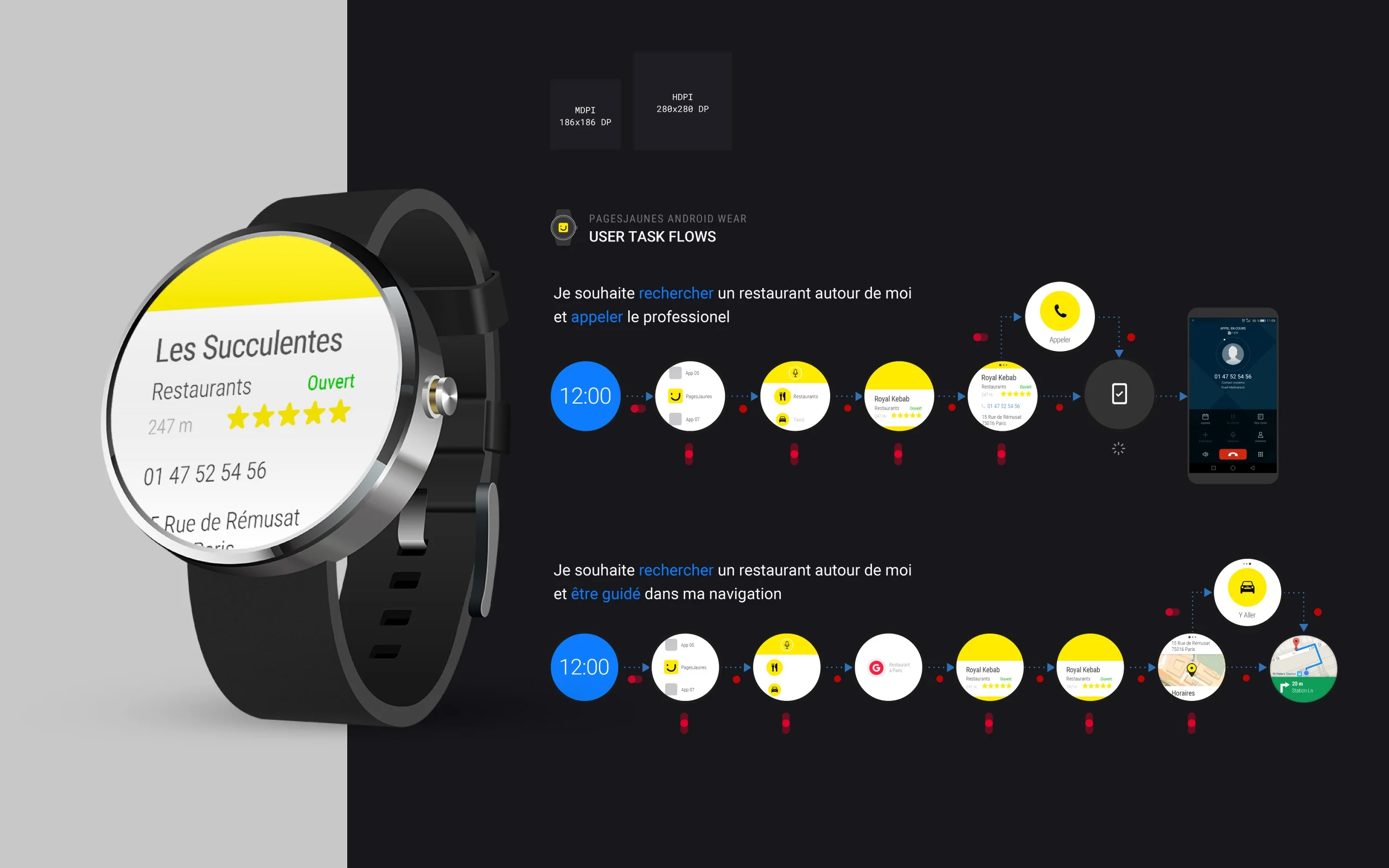
Two primary user journeys: "Find and Call" and "Find and Navigate." Each path optimized for minimum taps and maximum clarity.
Design for Glanceability
Every screen needed to communicate its purpose in under 2 seconds. Information hierarchy became critical on a 280dp display.
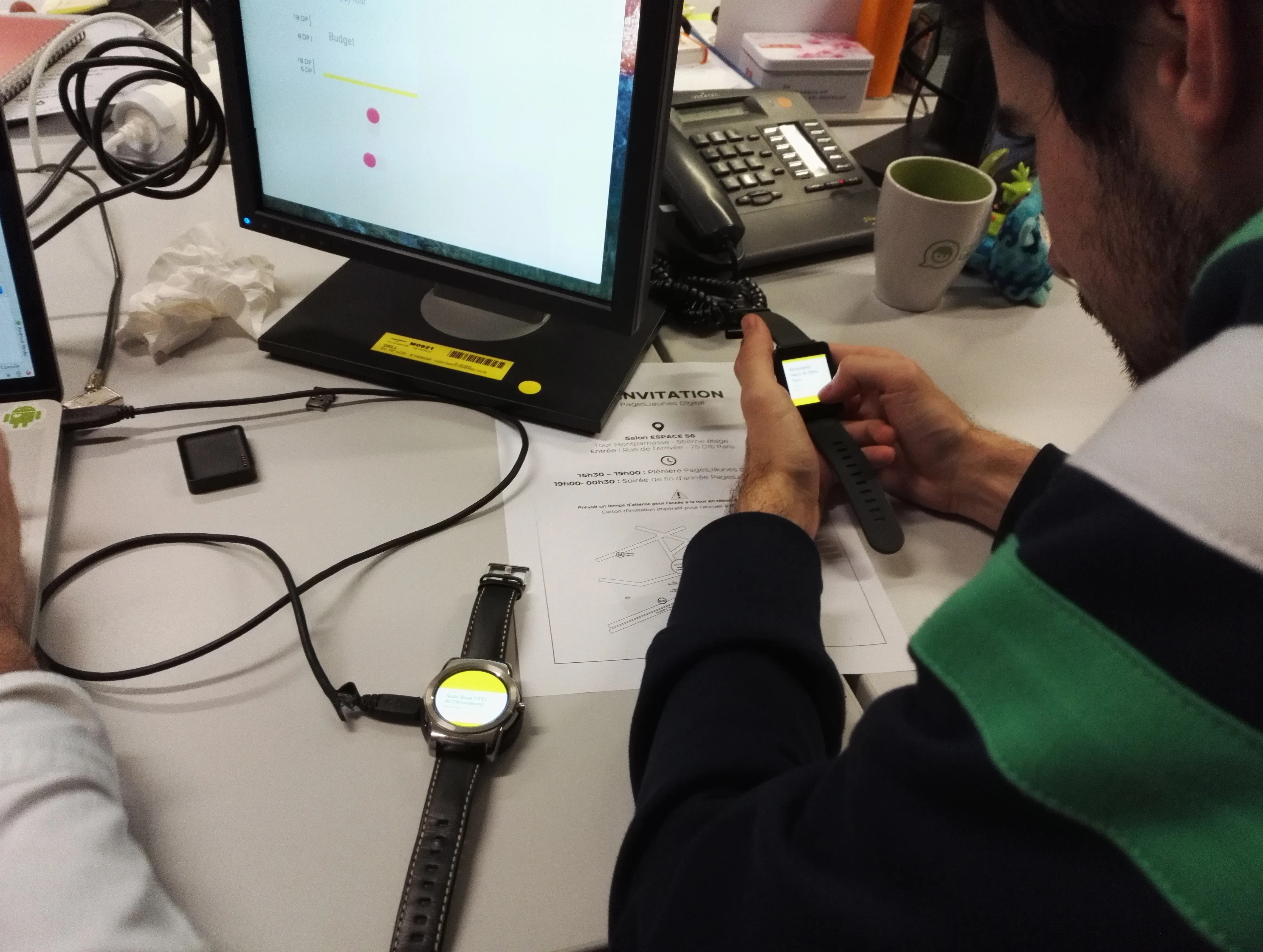
Iterate on Real Hardware
Weekly sessions with actual watches. Testing with real constraints revealed issues that mockups couldn't surface.
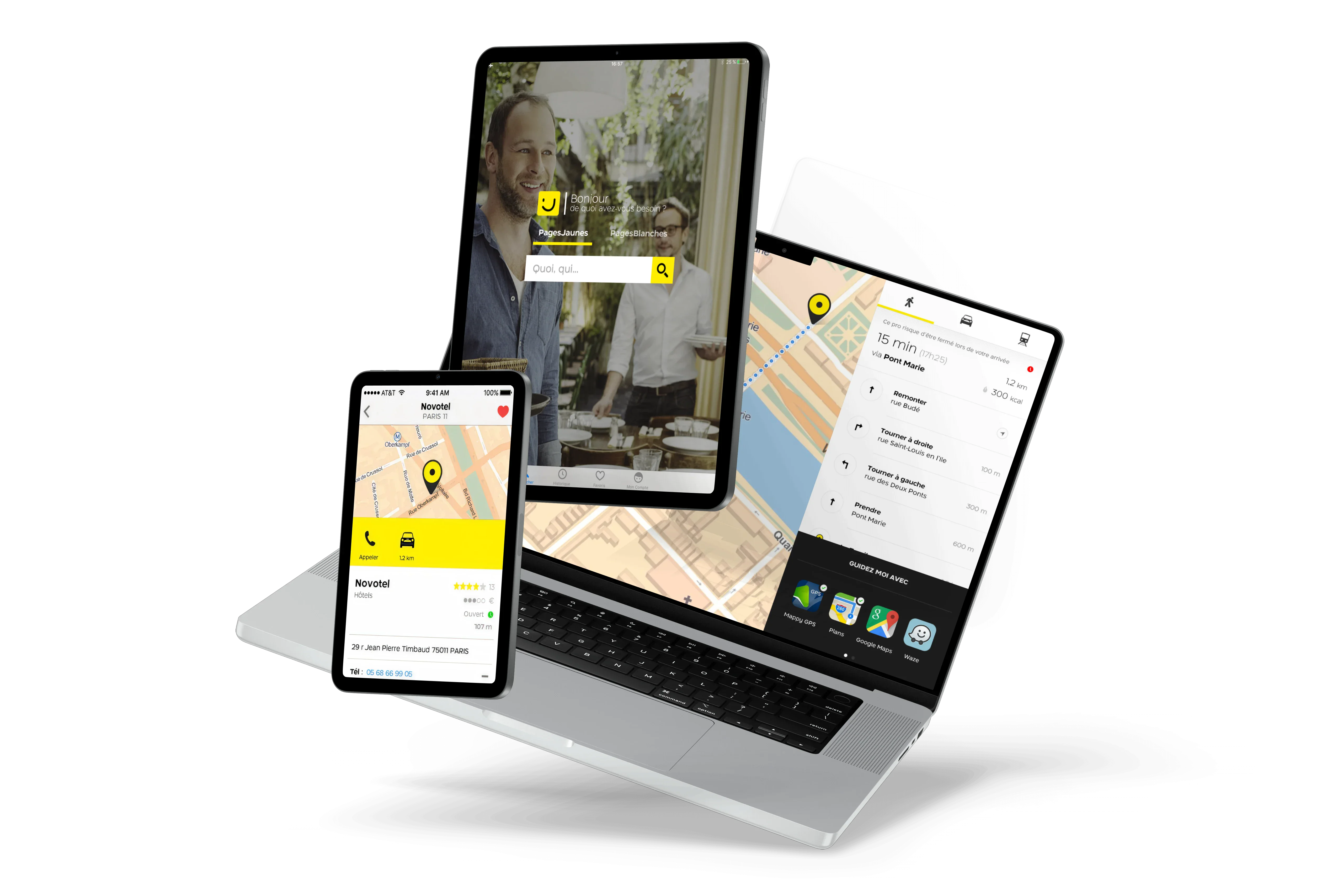
What We Built
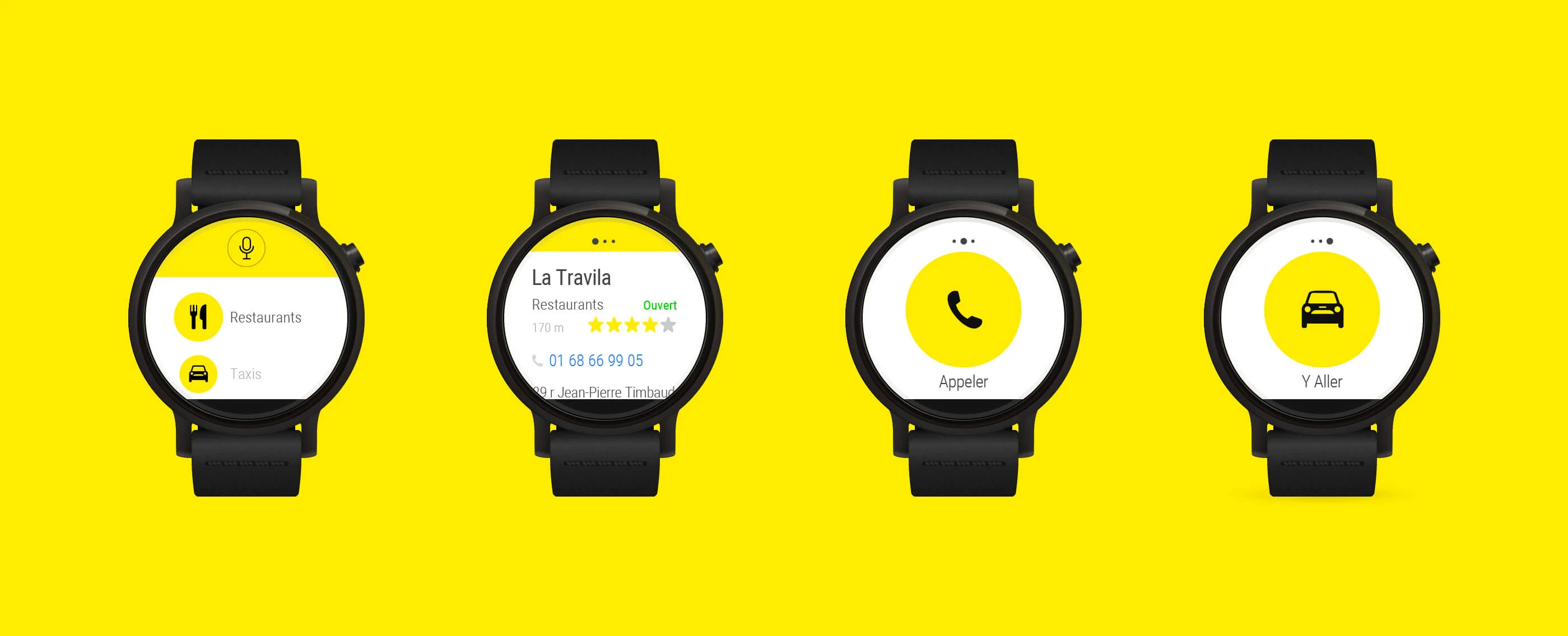
- •Card-based UI with ratings, status, and contact CTA
- •Two optimized user flows: search→call and search→navigate
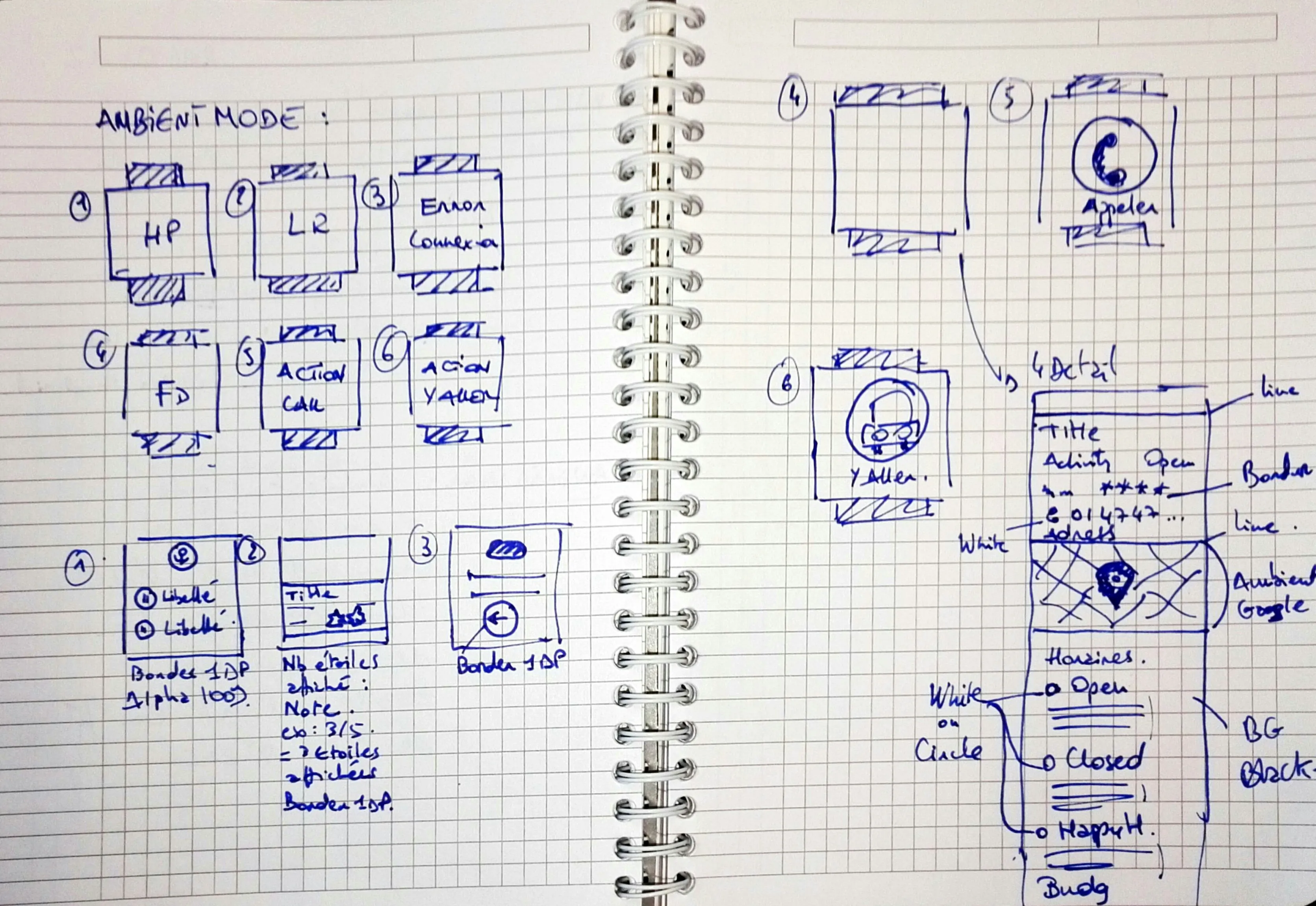
- •Regular mode (high-contrast yellow) and ambient mode (monochrome)
- •Voice search integration with "Ok Google"
- •Phone handoff for calls and Google Maps navigation
- •Category shortcuts for quick access to common searches
My Deliverables
Persona and user story documentation
Sketching and wireframing
Full UI design for circular and square displays
Interaction specs and motion design
Prototyping and demo videos
Stakeholder presentation deck
Phase 1
Research & Discovery
Deep dive into Android Wear guidelines, studying hardware constraints, defining user journeys, and exploring dozens of concepts on paper.
Phase 2
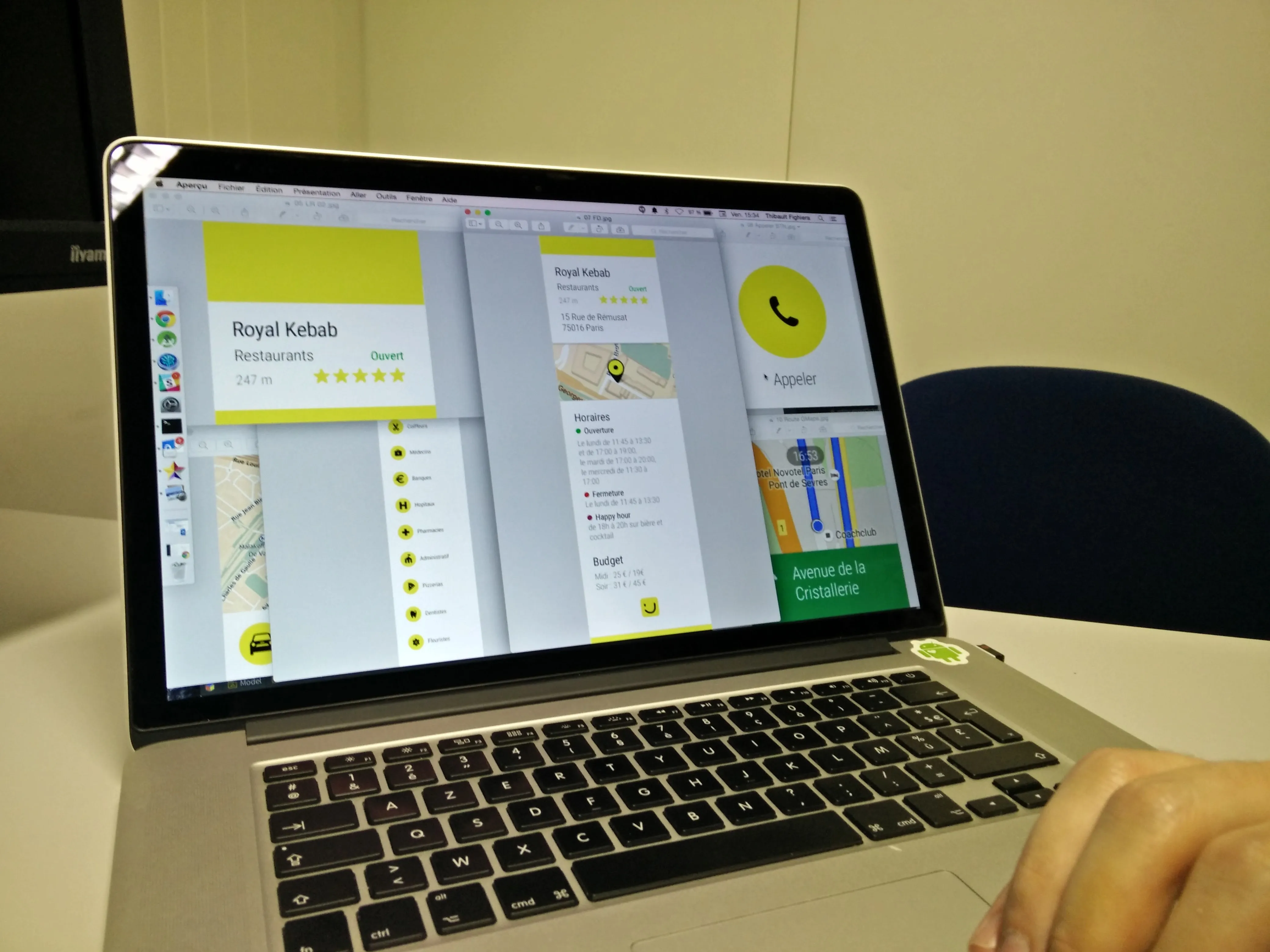
Screen Design
Creating the complete UI for circular and square displays. Each screen needed to communicate its purpose in under 2 seconds on a 280dp display.
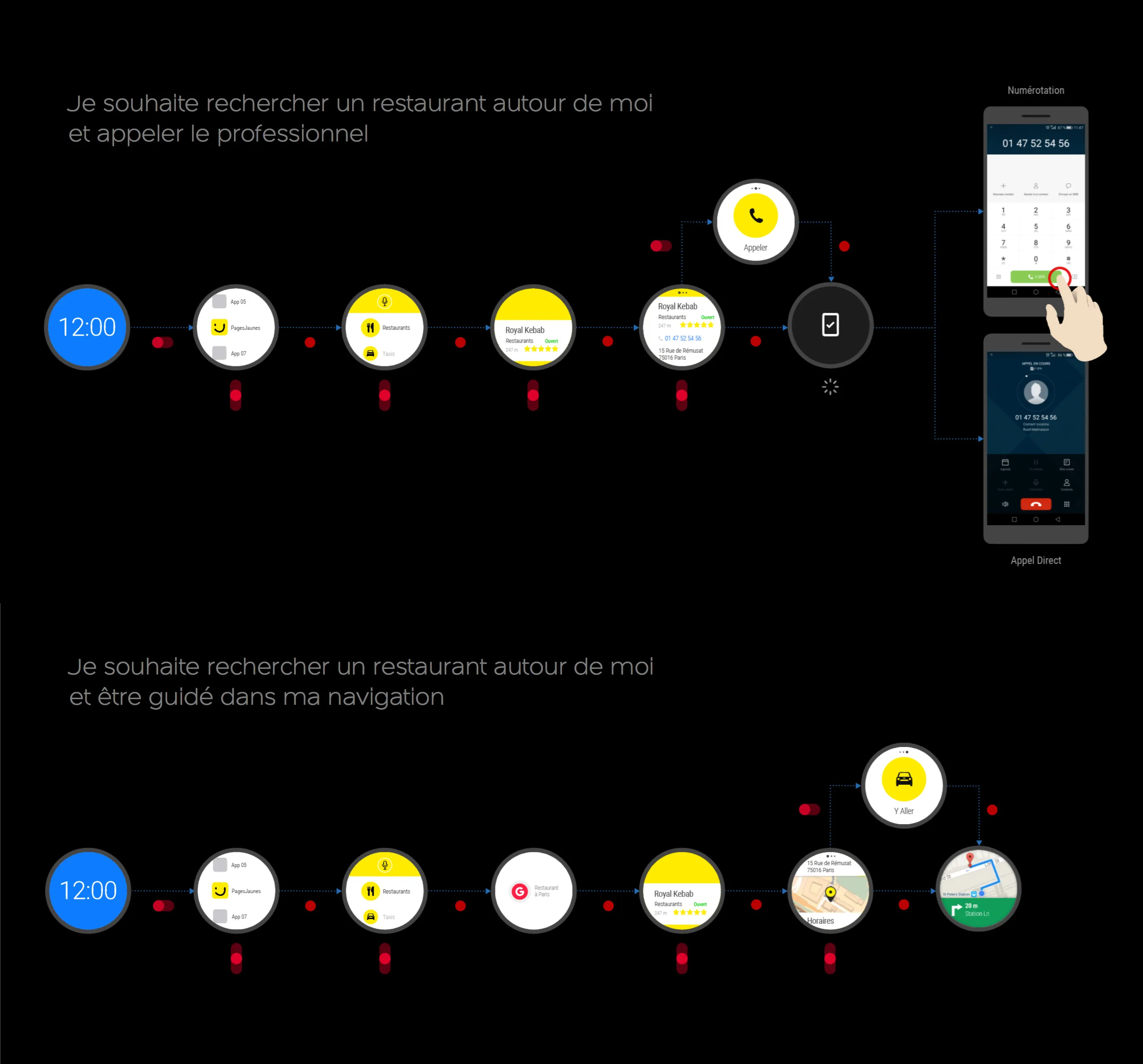
The system spans 8 distinct states. Each screen communicates its purpose independently, readable at a glance on a 280dp circular display.
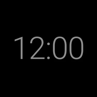
Watch face. Entry point and quick return.
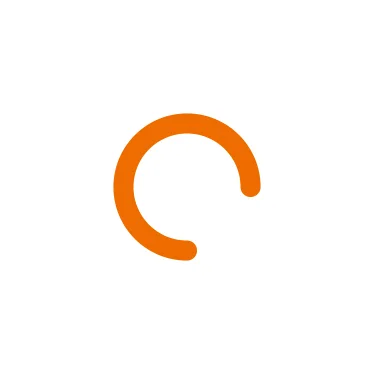
Loading. Immediate feedback on launch.
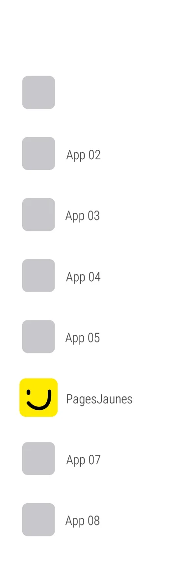
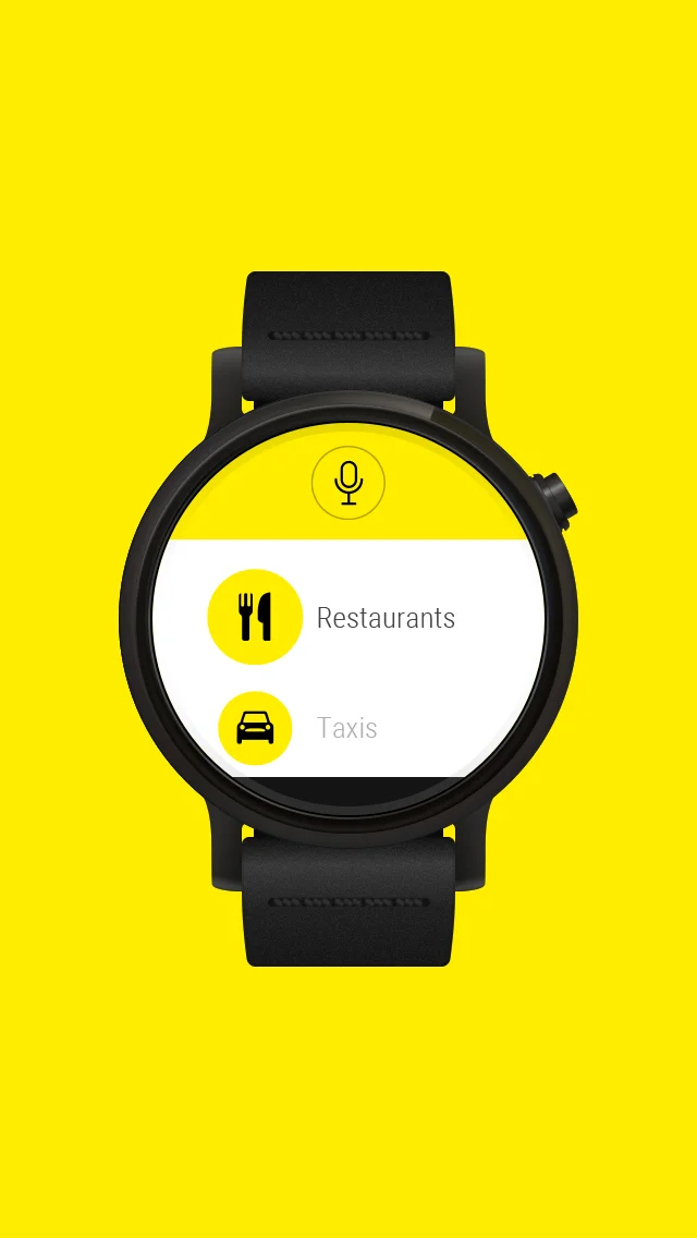
App list. Category-first navigation.
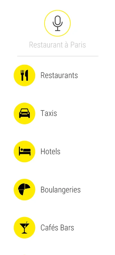
PagesJaunes categories on the wrist.
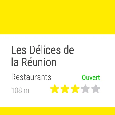
Result 1/3. Name and distance first.
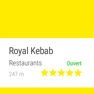
Result 2/3. Swipe to browse.
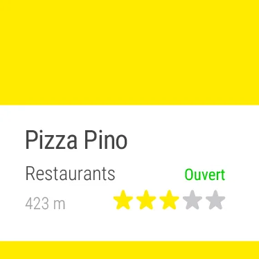
Result 3/3. End of list.
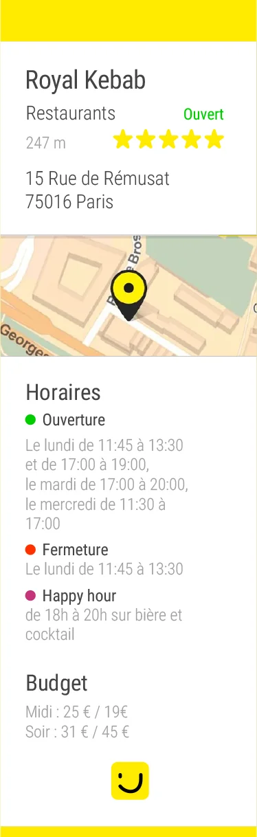
Detail card. Call or directions in one tap.
Screen inventory. 8 states, from loading to detail card.
Visualizing screens on an actual wrist reveals real-world conditions: readability in sunlight, viewing angles, tap comfort.
.webp)
Phase 3
Specifications & Guidelines
Comprehensive documentation of active and ambient modes, component library for round and square variants, and interaction specs for developer handoff.
Phase 4
Implementation & Launch
Daily pair sessions with the developer, iterating on real builds, video prototypes, and preparing assets for Google Play submission.
Result
From concept to Google Play2 months
Optimized user journeys2 flows
Screen real estate mastered280dp
Designer + Developer duo1 team
What I Learned
Constraints breed creativity
A 280dp screen forced every design decision to be intentional. No room for filler.
Platform fluency matters
Deep understanding of Android Wear patterns made our app feel native, not ported.
Tight collaboration accelerates
Daily syncs with the developer meant problems were caught and solved in hours, not days.